MOBIS-COVID19/63
Results as of 01/11/2021 (LINK)
A Project of IVT, ETH Zurich and WWZ, University of Basel
This work is licensed under Creative Commons. 
Contact: Joseph Molloy (joseph.molloy@ivt.baug.ethz.ch)
Previous and future reports can be found at: https://ivtmobis.ethz.ch/mobis/covid19/en
1 News
1 September:
- This is a separate report generated for the LINK subsample, without the pre-Pandemic baseline
2 Introduction
On March 16, 2020, 3700 participants who completed the MOBIS study between September 2019 and January 2020 were invited to reinstall the GPS Logger and Travel Diary App ‘Catch-My-Day’, developed by MotionTag. This voluntary recording of their mobility behaviour allowed us to track the impact of the various special measures during the unfolding pandemic. The pandemic is still going on one year later and many participants are still tracking.
The results are shown in comparison to those of the first weeks of mobility data from the original MOBIS Study which were recorded between 1st September and 1st November 2019, and thus serve as a baseline well before the pandemic hit Switzerland. Only trips inside Switzerland are currently considered, although data on cross border travel is available.
Participation decreased from about 1’300 participants to around 500 by the start of the second COVID19 wave in autumn/fall 2020 for any number of good reasons, such as a new smartphone, operating system updates, etc.. About 250 rejoined the panel after a second invitation in October 2020. We are very grateful for their engagement. Still, we happily agreed, when LINK offered to recruit more participants to the panel. This further increase of our sample allows us to complement the existing core. By mid-January a total of 393 additional participants had joined via LINK.
For the MOBIS study, participants were only eligible if they used a car at least 3 days a week - which skews the sample away from the Swiss general population. We did not impose a similar condition on the LINK-recruited participants as we are now aiming towards a more representative sample of the population. However, this means that the sample as of 2021 is no longer comparable to 2019 and 2020, as the mobility behaviour is quite different between the two groups. As such, for any analyses which makes comparisons to the pre-pandemic era, only link participants who meet the MOBIS-criteria are included.
The number of tracking participants each day used to calculate the average daily values, includes all participants who recorded tracks before or after that date. This allows the consideration of those who stay at home while still allowing for survey dropouts.
The GPS Travel diary used, Catch-My-Day (for iOS and Android) can have a 2-3 day delay before the tracks are available for analysis. The scaling by active participants accommodates for this, but the results of previous reports may change when the report is updated. The scales are calculated against the representative sample we obtained as part of the MOBIS recruitment process.
The colors in the graphs below are selected to indicate transport mode groupings. The greens indicate active modes, and the blue/purples public transport. brown is Car, and black is the total. These colors are consistent through following transport mode related graphs.
3 Average daily distance
Here, the average daily distance travelled by participants is presented, differentiated by gender. To aid readability, a 7-day rolling average is used. The clear reduction in travel caused by the lockdown at the start of the pandemic is visible, as well as the gradual increase over the following months. The amount of travel is slowly recovering to pre-pandemic levels, as seen during the relatively normal period before the second wave in Autumn 2020.
4 Active days
5 Sociodemographics
The graphs below present the change in average daily kilometers by various sociodemographic variables. The lines have been smoothed to improve readability. For some demographics, be aware that there are however only a small number of participants (see the distributions section). The difference by household size during and after the lockdown are particularly interesting, as is the behavior of the 25-35 age group in summer 2020. During the first lockdown higher income groups reduced their daily travel more.
5.1 Age
5.2 Education
5.3 Employment status
5.4 Gender
5.5 Household Size
5.6 Monthly Income
5.7 Correspondence Language
5.8 Access to car
6 Analysis of trip purpose
The purpose of each trip is taken from the activity performed at the destination of the trip. The purpose was imputed using a random forest model, using training data from those who voluntarily recorded the purpose of their activities. Some trip purposes show a larger shift in modal split than others. For shopping, during 2020, cycling became more popular for going to the shops. Grocery shopping and discretionary shopping are not differentiated. The train is almost never taken to go shopping, whereas local public transport is still used.
For commuting, public transport usage lost most of its share during the lockdown. Since the lockdown walking has a continually increasing share, which can mostly likely be attributed to the shift towards home office and the resulting fewer work trips.
6.1 Assistance
6.2 Education
6.3 Errand
6.4 Home
6.5 Leisure
6.6 Other
6.7 Shopping
6.8 Work
7 Reduction in kilometers travelled by working arrangement
Participants in MOBIS-Covid19 were asked to indicate their current working situation on multiple occasions using short online questionnaires, with the understanding that this can change frequently. The following charts use these results. For those that didn’t respond, the first response from the MOBIS study is retained. Specifically, we asked for the number of days working both at home and out of home, and these were then grouped into the categories used below:
- Working only at home
- Only working out of home
- A mix of home office and normal conditions
We also asked if they were assigned to Kurzarbeit (Furlough), though this was last updated at the end of 2020.
The first chart shows the percent of working participants working outside of home, on a 7-day rolling average. The difference between those allowed to do home office, and those who cannot is very clear. However, even the non-home-office group is not commuting nearly as much as pre-pandemic, as the economy is not yet fully open. There is still some evident resistance to returning to the office for home-office workers.
8 Reduction in kilometers travelled by canton
The grid of Cantonal charts shows the reductions in daily average kilometers by Canton of the home postcode. Cantons are the regional level of government in Switzerland. Where a postcode overlaps multiple Cantons, the Canton with the largest areal share of the postcode is assigned. Only cantons with enough participants are shown (N > 5). The data are smoothed over 6 weeks. The dashed grey line indicates the overall average. In particular, Geneva stands out for its lack of mobility reductions compared to other cantons.
9 Trip duration by transport mode and gender
For some modes, there are differences in the average trip duration between genders. In particular, men tend to cycle longer, and also drive longer as well. For cycling, the trip length increased during the lockdown, and while it reduced after measures were relaxed, it remains elevated compared to before the pandemic, even taking the winter months into account. For Car and Train, the difference in trip duration between the genders has been reduced dramatically.
10 Average stage length by transport mode (km)
The trends by mode for the stage length are not as clear. All modes except cycling and walking saw a reduction in the average stage length (in Kilometers) during the lockdown.
11 Activity space and daily travel radius
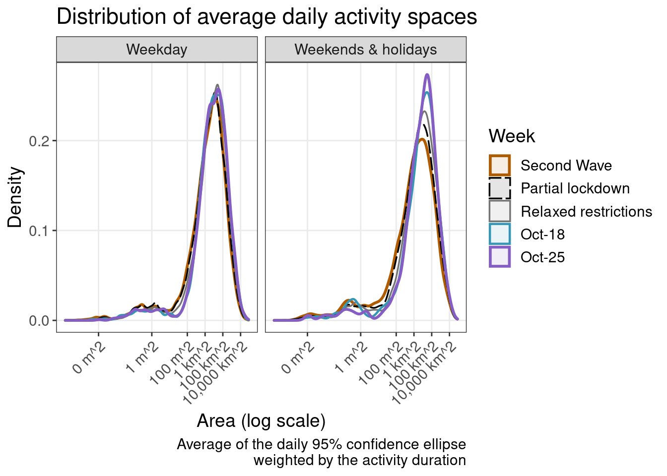
The activity space is an attempt to describe the space, which a person regularly performs most of their activities. A commonly used measure of this activity space is the 95% confidence ellipse of the activity locations, in this case weighted by duration. In the following analysis, the activities at the home location are included, for those that had the app activated on that day. This is an important metric which gives an idea of the area in which travel is being performed. The daily travel radius is also presented. Here we use the radius of the activity space ellipse (on the largest axis).
In the first chart, a large increase in the activity space after the lockdown is evident, as a ‘compensation’ for the lockdown during the time when most facilities were closed. In the second graph, the distribution of activity spaces is presented. A value of 1mˆ2 essentially means that the participant stayed at home. Also evident is that while many stayed at home during the lockdown (the left blip in dotted-black), many were still relatively mobile. Since the lockdown, the average activity space has been increasing slowly, but is still far below the pre-pandemic distribution (red).
The third chart shows how the median activity space varied over time by age group. The mobility of the younger groups post lockdown is evident.
12 Hourly counts
The number of trips started per hour. The y axis is normalized by the maximum hourly value in the graph.
13 Participation
14 Differences in the distributions
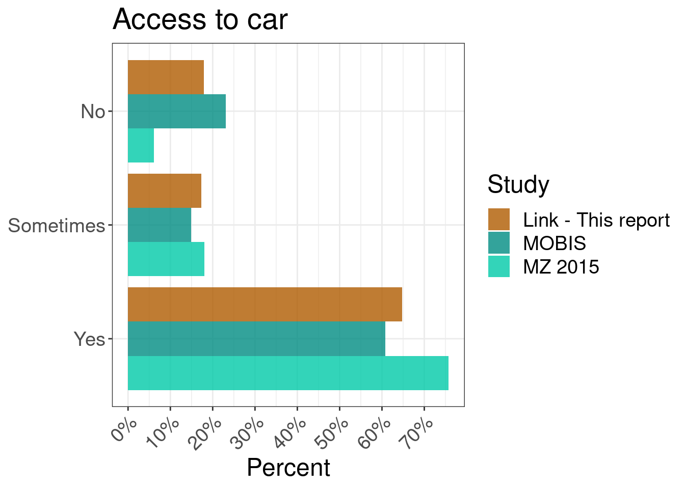
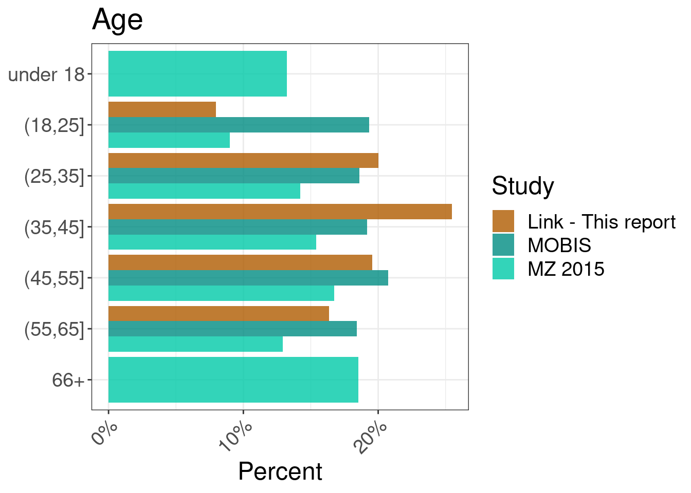
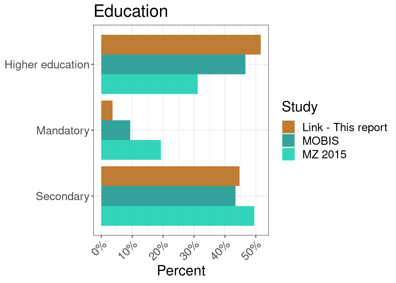
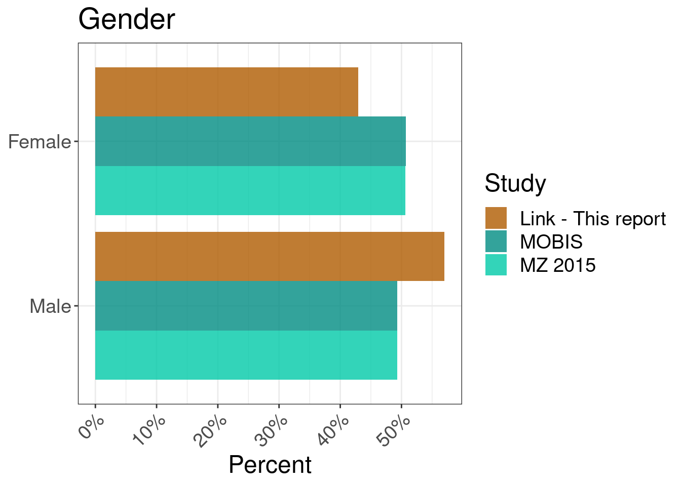
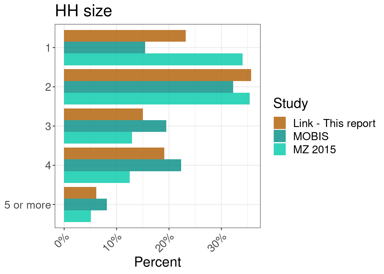
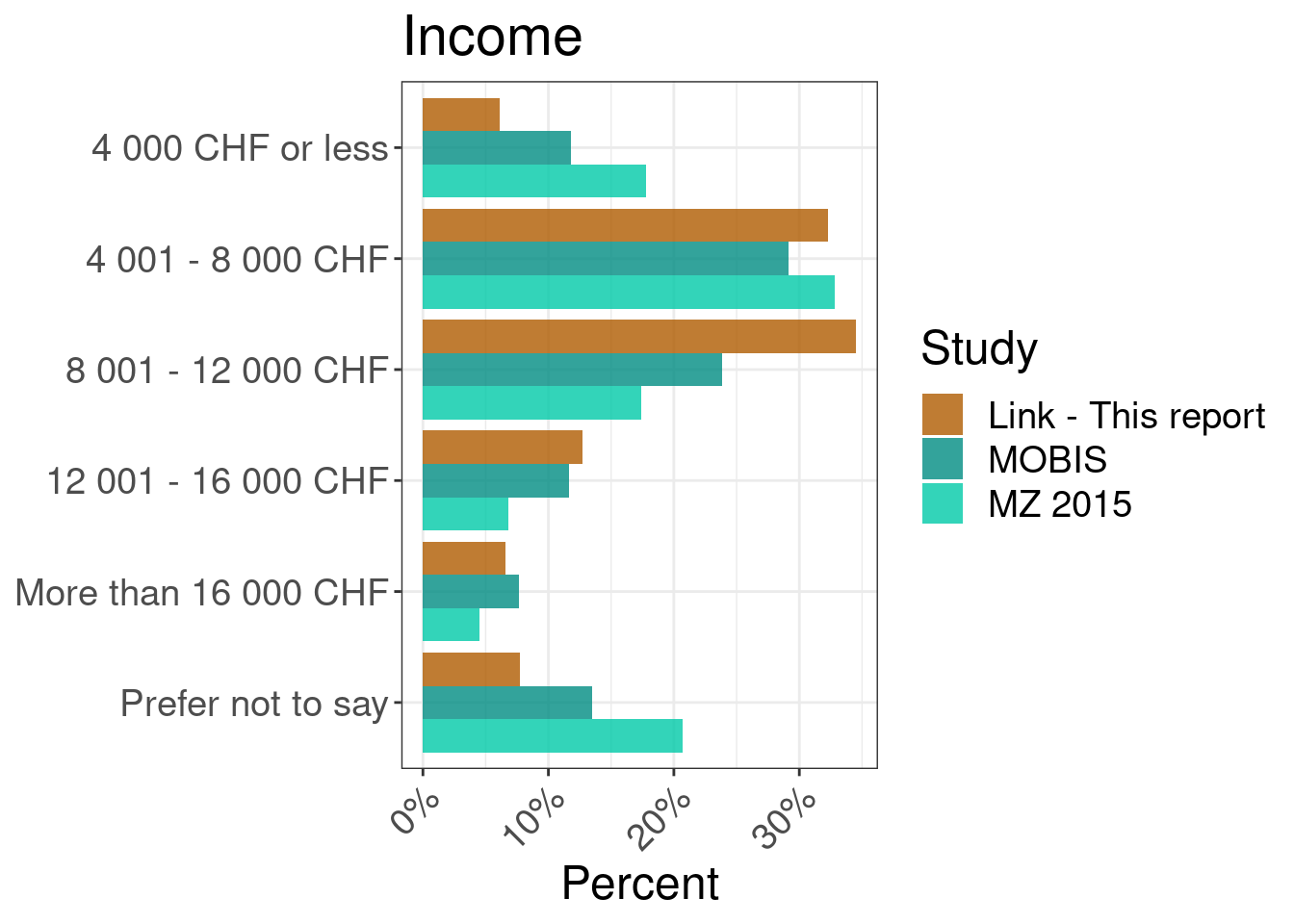
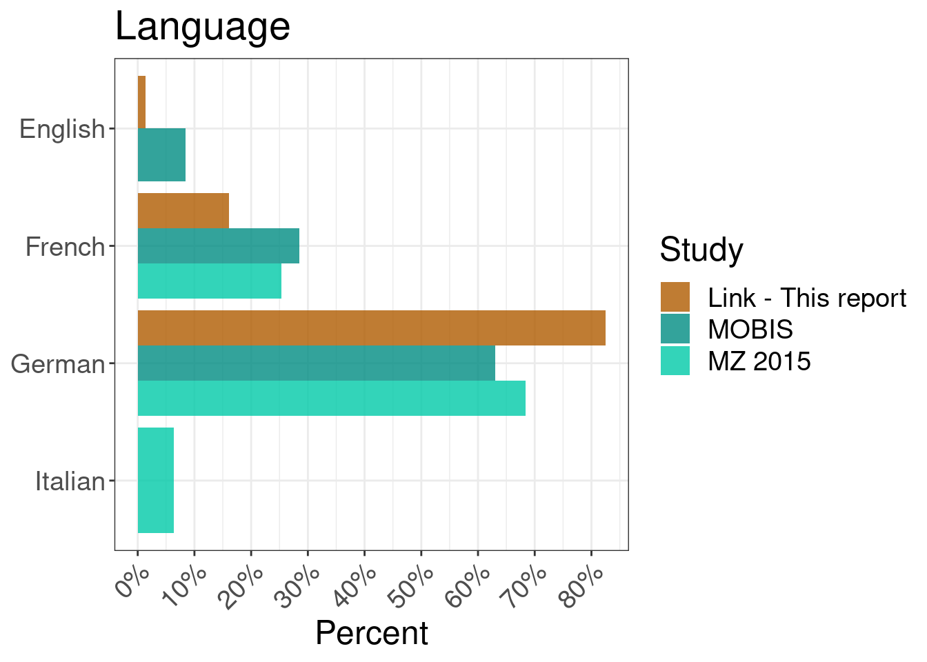
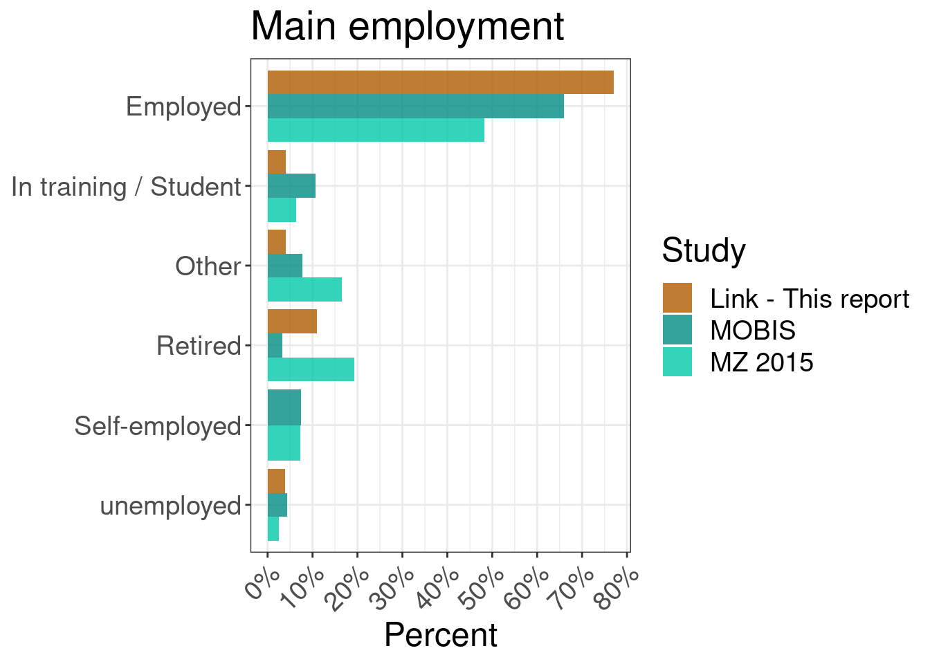
The following charts show the characteristics of the MOBIS:COVID-19 sample compared to the original MOBIS Sample. There are some small differences, but generally the samples are consistent. This chart will be extended to compare to the relevant census data.
Die Zahlen des Mikrozensus beziehen sich nach wie vor auf die ganze Schweiz. Dies wird in den folgenden Berichten aktualisiert.
| N | % | N | % | |
|---|---|---|---|---|
| Aargau | 37 | 8.4 | 4,325 | 7.6 |
| Appenzell Ausserrhoden |
|
|
369 | 0.6 |
| Appenzell Innerrhoden |
|
|
92 | 0.2 |
| Basel-Landschaft | 25 | 5.7 | 1,940 | 3.4 |
| Basel-Stadt | 9 | 2.0 | 1,555 | 2.7 |
| Bern | 62 | 14.1 | 7,244 | 12.7 |
| Fribourg | 13 | 3.0 | 1,942 | 3.4 |
| Geneva | 11 | 2.5 | 3,062 | 5.4 |
| Glarus |
|
|
285 | 0.5 |
| Graubünden | 6 | 1.4 | 1,385 | 2.4 |
| Jura |
|
|
481 | 0.8 |
| Luzern | 40 | 9.1 | 2,658 | 4.7 |
| Neuchatel |
|
|
1,290 | 2.3 |
| Neuchatel | 8 | 1.8 |
|
|
| Nidwalden |
|
|
282 | 0.5 |
| Obwalden |
|
|
239 | 0.4 |
| Other | 19 | 4.3 |
|
|
| Schaffhausen |
|
|
560 | 1.0 |
| Schwyz | 11 | 2.5 | 1,005 | 1.8 |
| Solothurn | 19 | 4.3 | 1,813 | 3.2 |
| St. Gallen | 29 | 6.6 | 3,286 | 5.8 |
| Thurgau | 14 | 3.2 | 1,799 | 3.2 |
| Ticino |
|
|
2,539 | 4.4 |
| Uri |
|
|
243 | 0.4 |
| Valais | 9 | 2.0 | 2,172 | 3.8 |
| Vaud | 29 | 6.6 | 5,303 | 9.3 |
| Zug | 9 | 2.0 | 812 | 1.4 |
| Zurich | 90 | 20.5 | 10,410 | 18.2 |
15 Sample weighting
In order to account for the fluctuating size and composition of the sample, participant weights have been calculated and applied for each week of MOBIS-Covid Study (including the weeks in the baseline period). Hence, the results are corrected for weeks where more participants from a certain demographic group started or stopped tracking. The weighting was performed against the original 21,571 participants who completed the introductory questionnaire in the MOBIS Study using IPF (Iterative Proportional Fitting) using the following variables: age, gender, income, education, mobility tool ownership and accessibility. The weighting of the data did not lead to large changes in the results.


