MOBIS-COVID19/12
Results as of 29/06/2020 (Post-lockdown)
A Project of IVT, ETH Zurich and WWZ, University of Basel
This work is licensed under Creative Commons 
Contact: Joseph Molloy (joseph.molloy@ivt.baug.ethz.ch)
Previous and future reports can be found at: https://ivtmobis.ethz.ch/mobis/covid19/en
- 1 News
- 2 Introduction
- 3 First key points
- 4 Risk perception
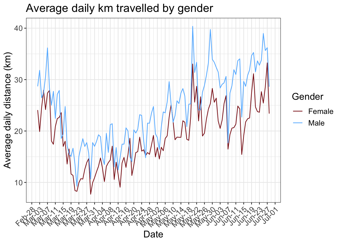
- 5 Average daily distance
- 6 Active days
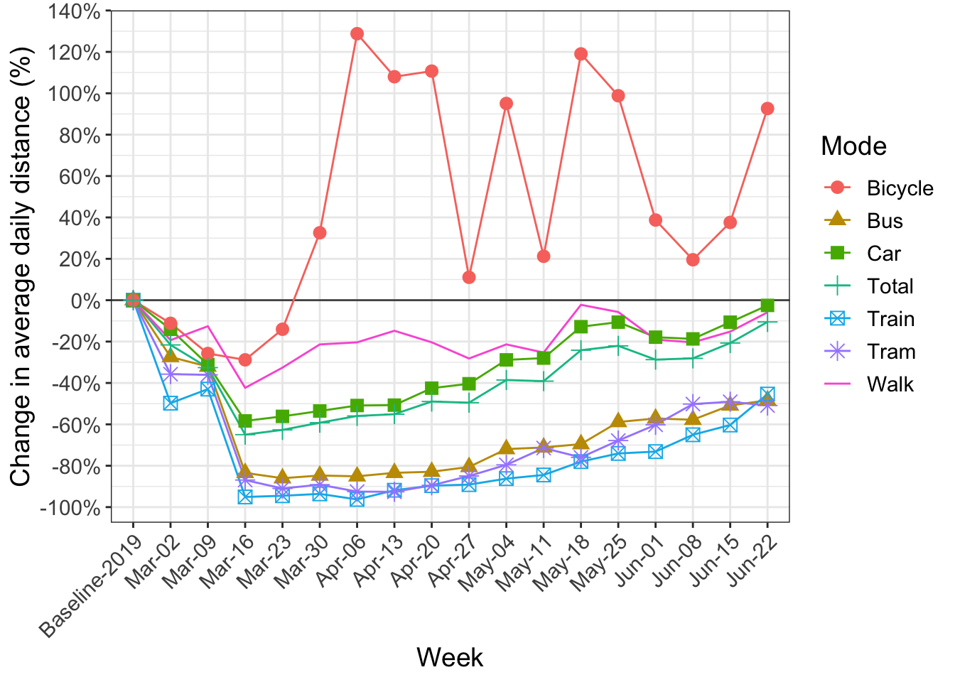
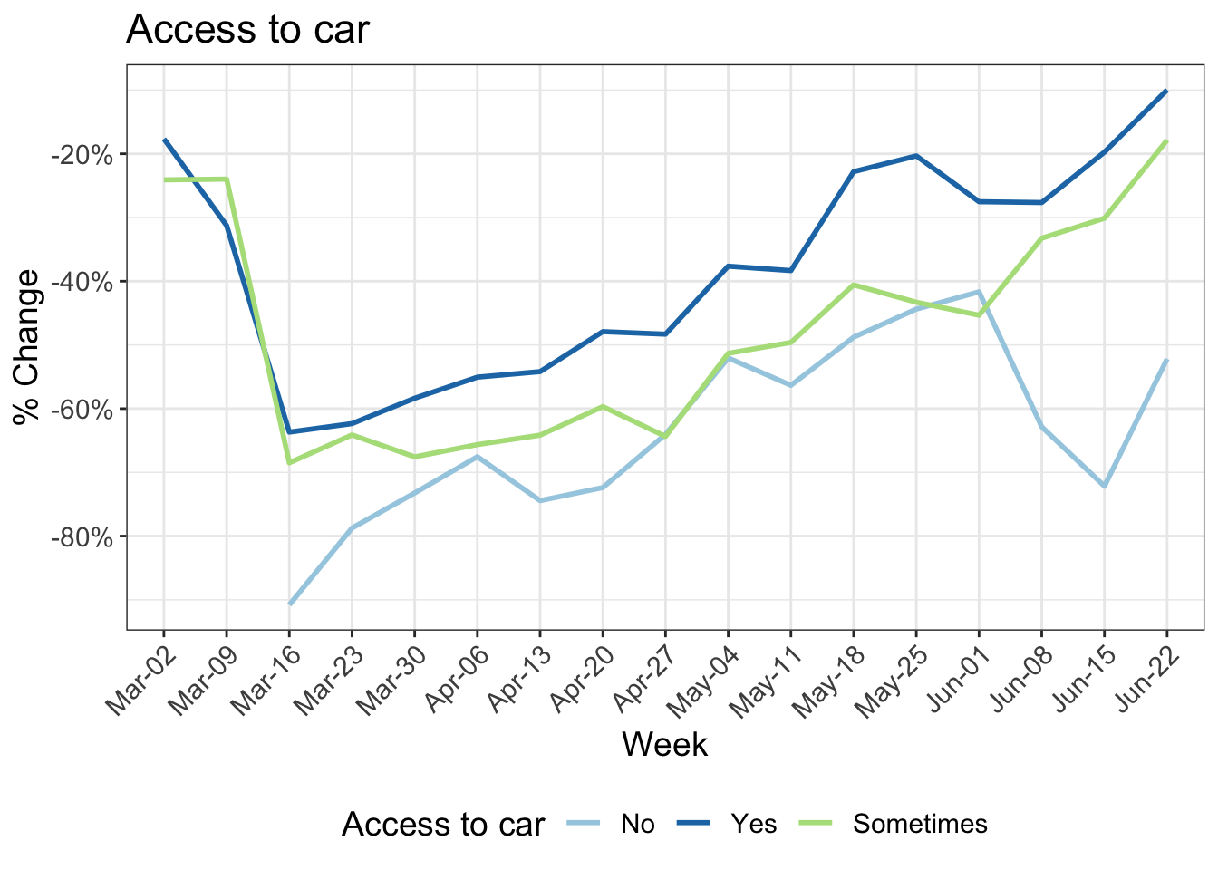
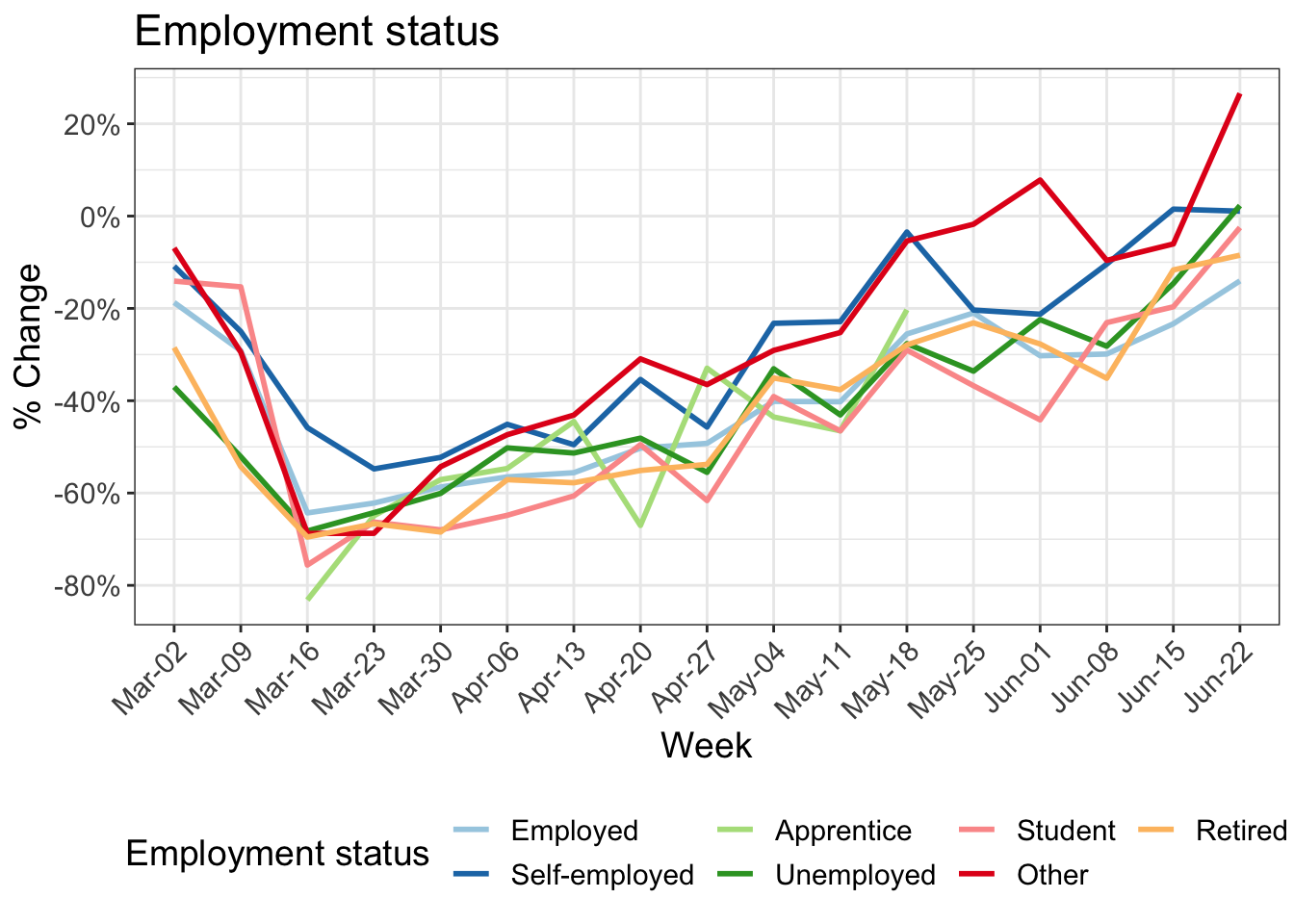
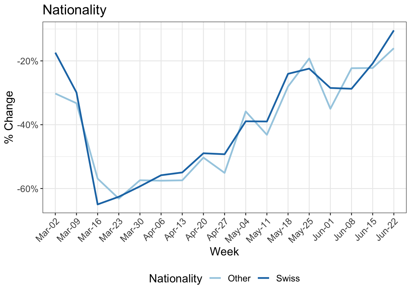
- 7 Change in kilometers travelled by transport mode
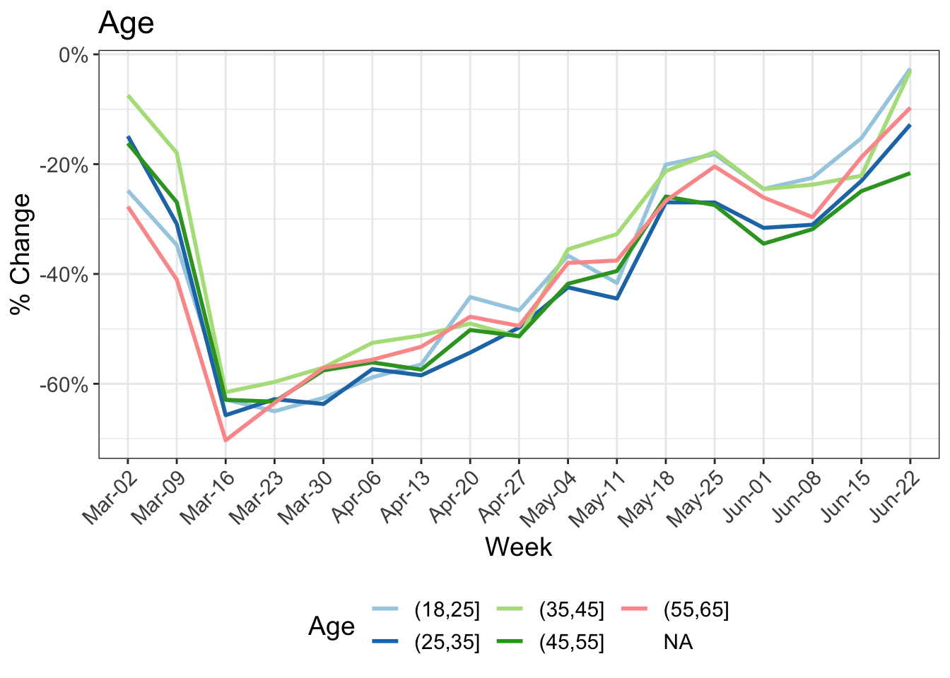
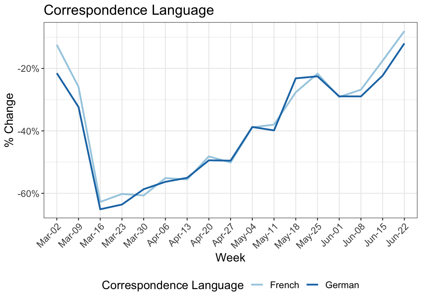
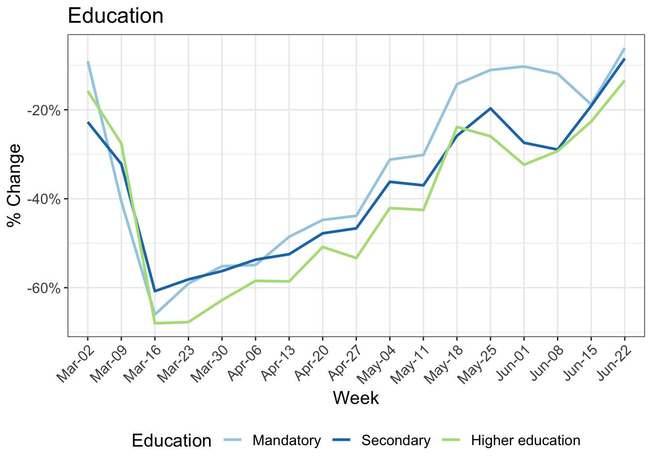
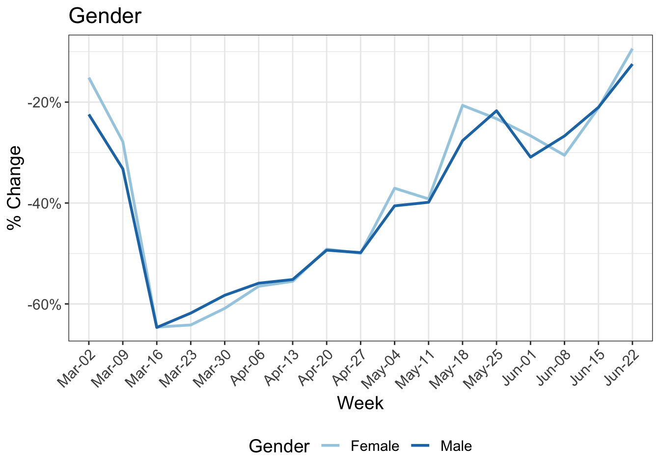
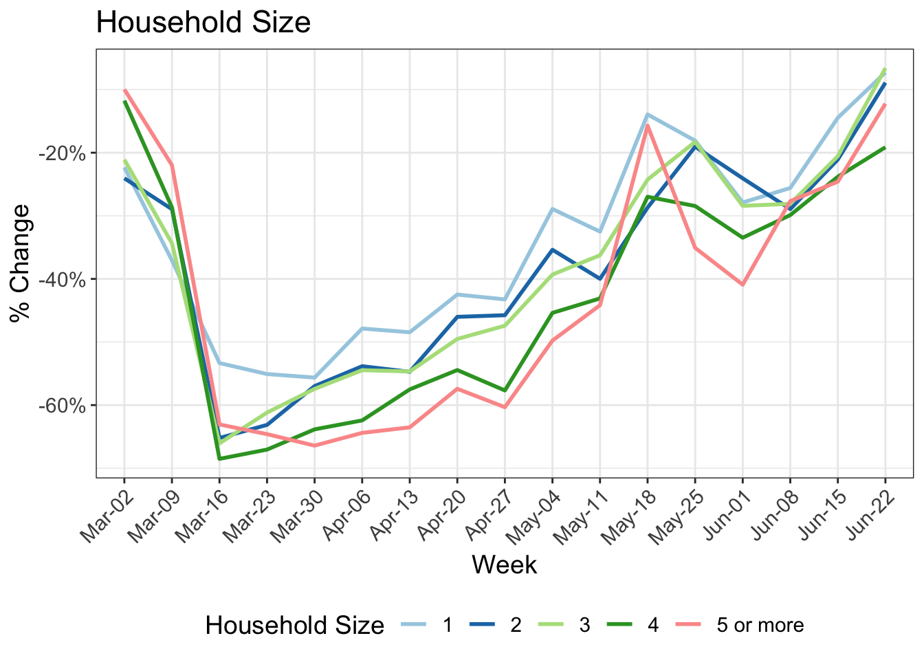
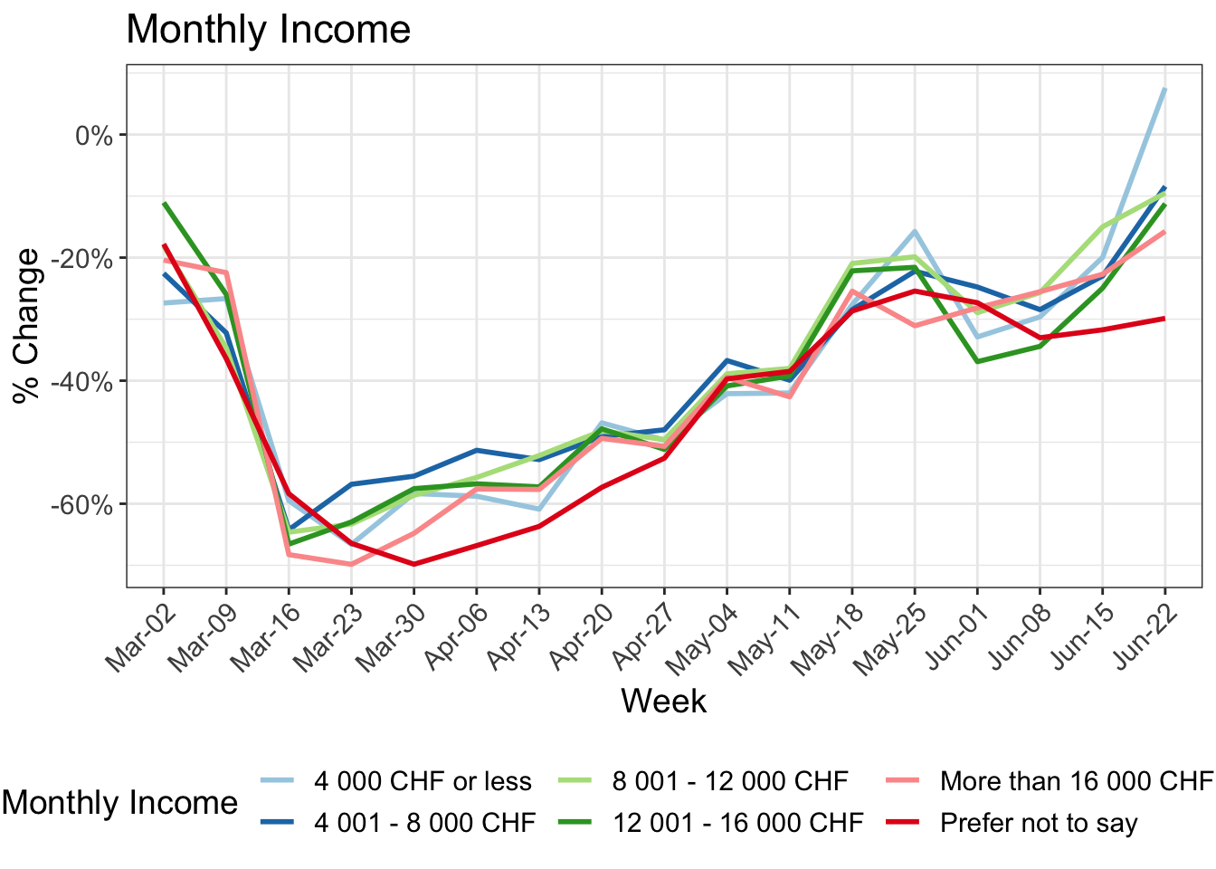
- 8 Change in kilometers travelled by:
- 9 Road travel speeds
- 10 Shifts in the transport mode share
- 11 Reduction in kilometers travelled by working arrangement
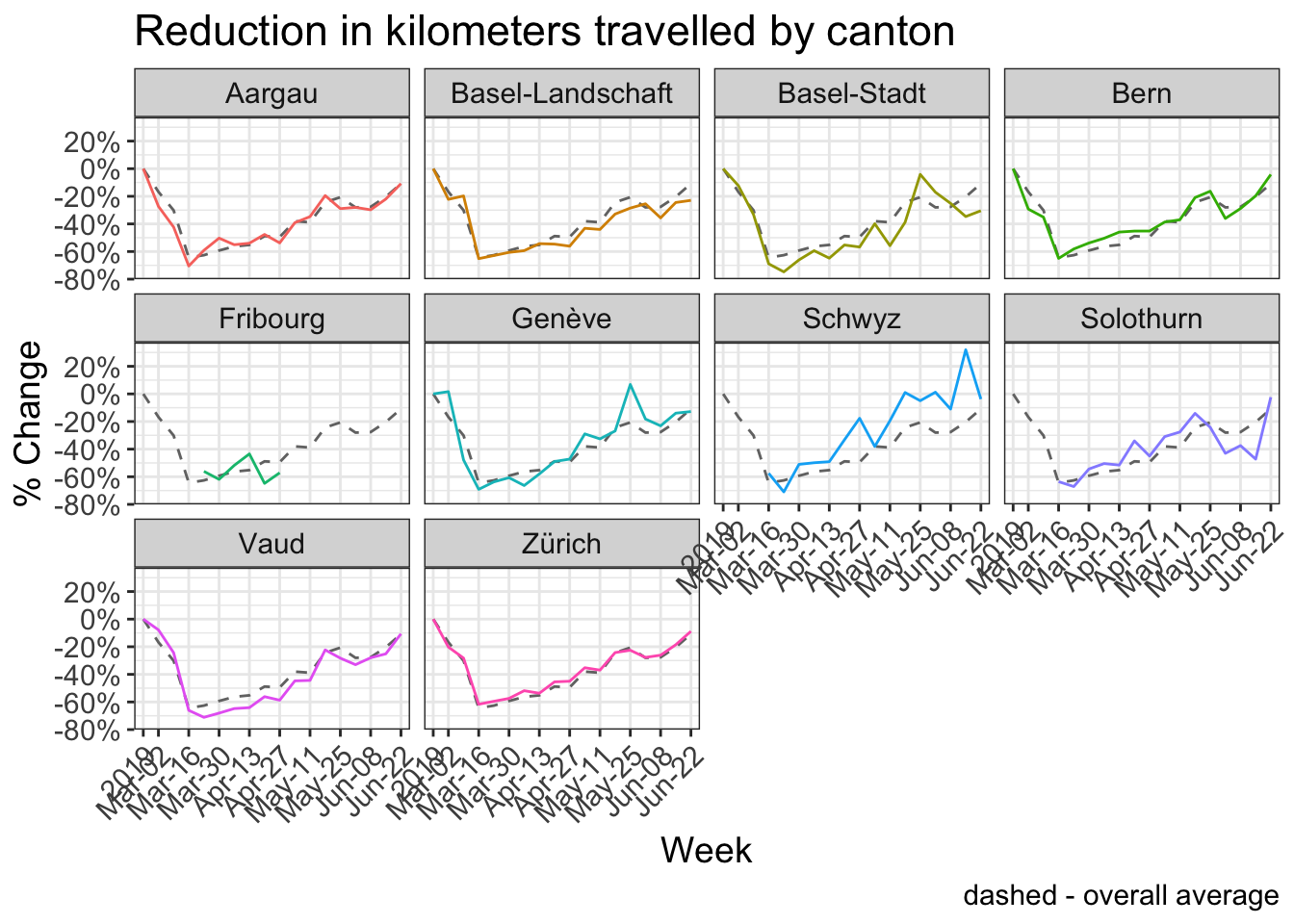
- 12 Reduction in kilometers travelled by canton
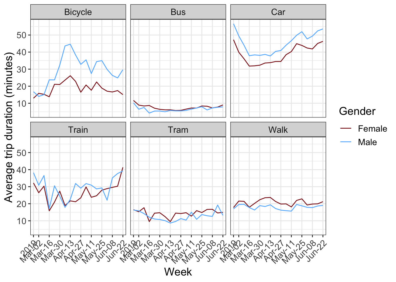
- 13 Trip duration by transport mode and gender
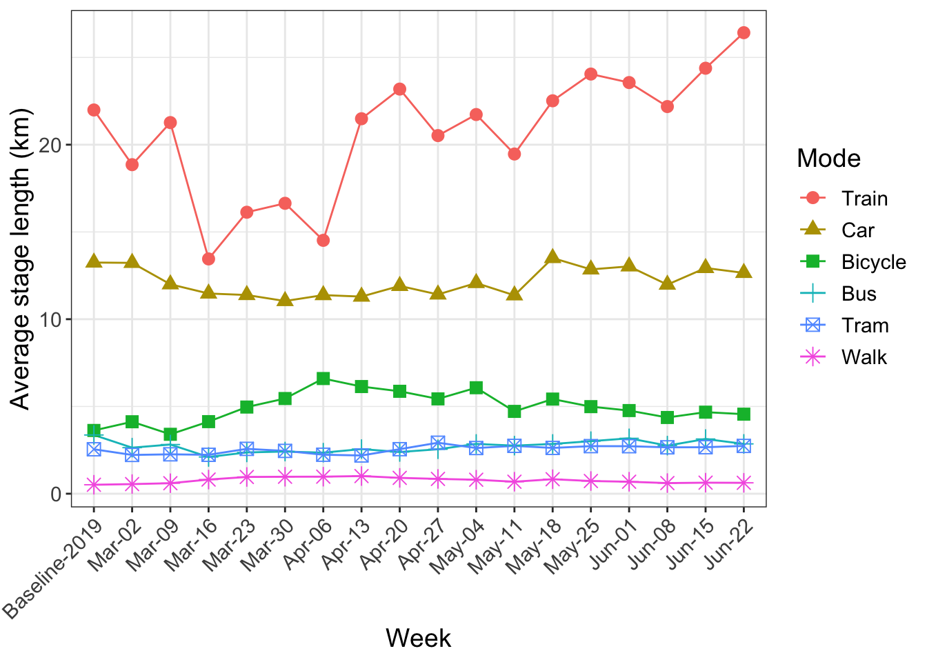
- 14 Average stage length by transport mode (km)
- 15 Activity space and daily travel radius
- 16 Hourly counts
- 17 Activity types and zoning
- 18 Participation
- 19 Differences in the distributions
1 News
29 June:
- New analysis on the shifts in the transport mode share - link.
15 June:
- The data can now be downloaded directly for certain requested charts. Please make sure to cite both the IVT, ETHZ and WWZ, Uni Basel as the source.
- Hourly counts now show the whole day - Midnight to 4am is no longer excluded.
- Analysis by home office - link.
- In response to multiple inquiries, we would like to clarify that the baseline-2019 period covers September and October 2019.
- Results by gender corrected
- New analysis of car travel speeds by distance class - link.
25 May:
- Adjusted # Activities/Day so that the first home activity per day is not included.
- Converted long tables to graphs.
18 May:
- First report after the relaxation of lockdown measures on May 11th.
- The 2019 Baseline period has been shortened to only include September and October - This mostly affects the cycling numbers.
11 May:
- New graph of activity space and daily radius - link.
4 May:
- New chart from online survey with participants on risk perception - link.
- Key points summary and formatting adjustments.
27 April:
- New chart on the change in activity type by land zoning.
20 April:
- Mobile participants per day.
- Non-mobile participants are now included in the activity-space numbers in addition to a new table on median weekly activity spaces.
- New graphs, including average trip distance by mode.
- Formatting improvements and other small corrections.
13 April:
- Earlier weeks have been grouped and colored grey in certain graphs.
2 Introduction
On March 16, 2020, 3700 participants who completed the MOBIS study between September 2019 and January 2020 were invited to reinstall the GPS Logger and Travel Diary App ‘Catch-My-Day’, developed by MotionTag, to record their mobility behaviour during the period of special measures implemented to control the spread of the Corona Virus. The first 4 weeks of mobility data from the original MOBIS Study is taken for each participant as a baseline against which to compare current mobility patterns. These 4 weeks start place anywhere between 1st September and 15th November, depending on the participant. Only trips in Switzerland are currently considered, although data on cross border travel is available.
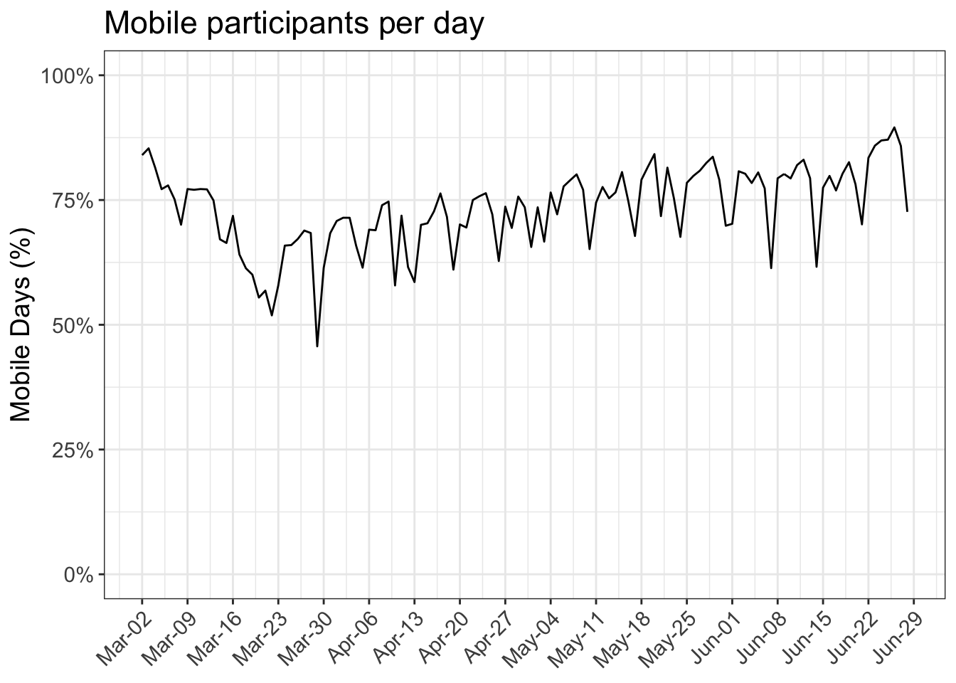
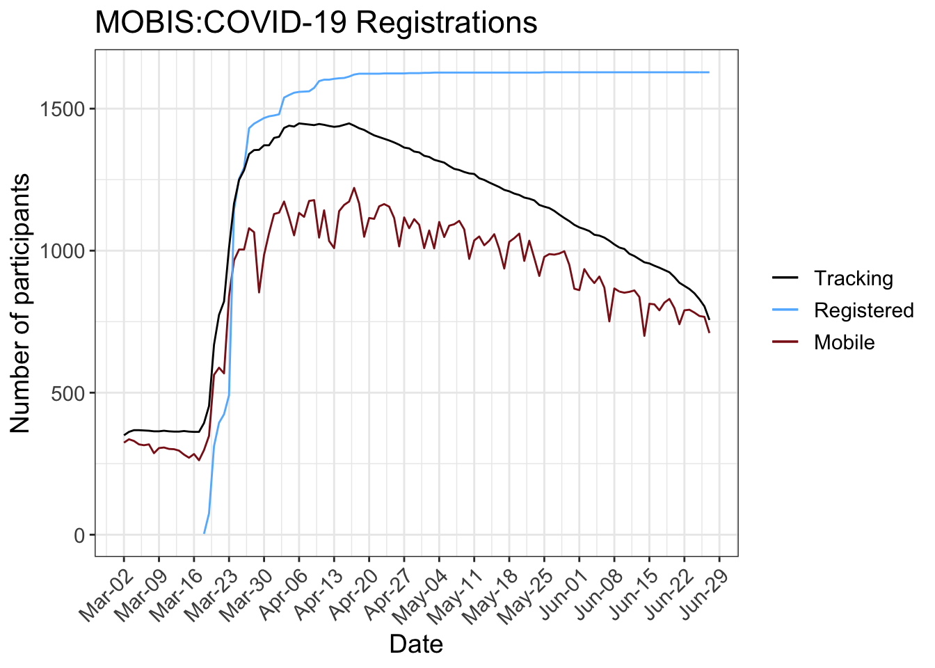
The following figure shows the number of registered and tracking participants per day. A running panel of around 250 participants were already tracking before the sample was reinvited. This allows results for the weeks before the MOBIS:COVID-19 study was officially started, although the sample size is a lot smaller, and hence the results.
In the MOBIS study, participants were only eligible if they used a car at least 3 days a week - which skews the sample away from the Swiss general population.
The number of tracking participants each day used to calculate the average daily values includes all participants who recorded tracks before or after that date. This allows the consideration of those who stay at home while still allowing for survey dropouts.
The GPS Travel diary used, Catch-My-Day (for iOS and Android) can have a 2-3 day delay before the tracks are available for analysis. The scaling by active participants accomodates for this, but the results of previous reports may change when the report is updated.
3 First key points
The MOBIS-COVID tracking study has recorded 128,288 person-days since we mobilized the participants of the MOBIS project in the light of the on-coming COVID19 restrictions: more registered 1,628 than tracked (maximum of 1,448 and a mean of 1,060 persons). In the week of April 25th we also asked them to participate in a short survey. We continue to use the Catch-My-Day app based on motion-tag technology. The sample is roughly comparable in socio-demographics to the latest federal 2015 Mikrozensus, but for a bias towards higher income season-ticket owning better educated males.
Together with the tracking and survey data of the 2019 MOBIS project we are able to show the impact of the COVID19 epidemic in the French and German speaking part of Switzerland. We have a chance to look at the socio-demographic differences in the impacts, which are not fully available in the private Intervista panel or Google data.
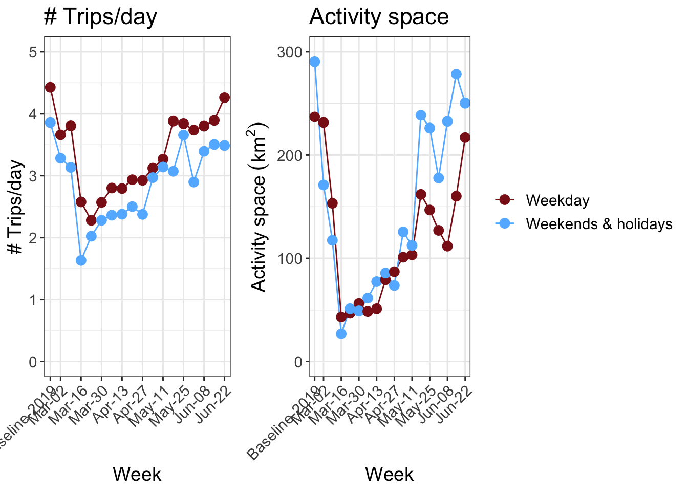
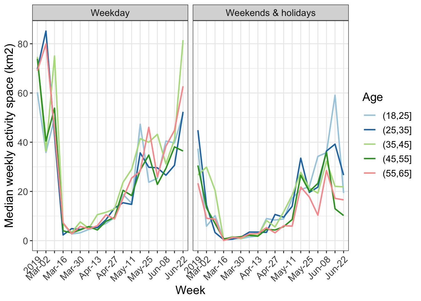
The results show that the participants anticipated the full “lock down” by starting to reduce travel two weeks in advance of March 16th 2020. The number of trips fell by 40% from about 5 to about 3 per day. The activity spaces, measured as the 95% confidence ellipse around home, collapsed by 80%, but both have since nearly fully recovered. See the weekend activity spaces for examples.
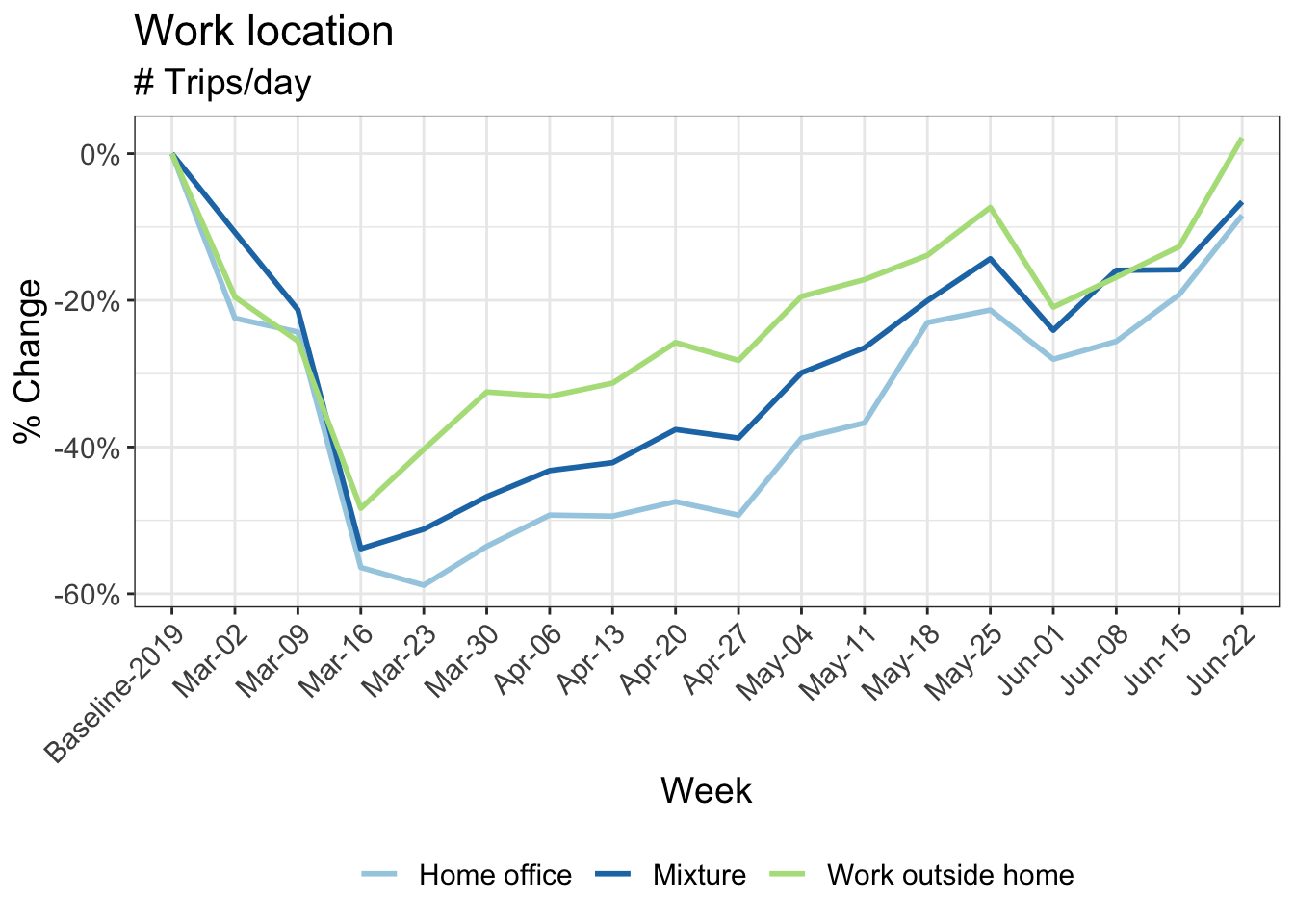
While the impact of gender and language-spoken is not large, on-going need to work at the workplace attenuated the effects. In contrast to many other observations, the effect of income is not as strong in our data: only about 8% between the lowest and highest income groups in most weeks. The impact of home office is as expected, reducing the total mileage strongly.
The distances by trip, when undertaken, do not change much except for walking and cycling. Cycling, in particular, sees a large increase in kilometers travelled. The increase is well beyond what the seasonal causes would imply. Still, the temporal patterns by time-of-day and type of day indicates its prime use as a leisure tool. More detailed analysis confirms this assessment, as do comparisons with cycle counters in Basel and Zürich.
The prime concern is the on-going strongly reduced use of public transport. While home-office goes on and the summer vacations dampen demand, no major road congestion can be observed. In the fall workers will presumably be recalled from the home-office. This will present a challenge if they choose the car, as the urban networks only work satisfactorily with the high shares of public transport use observed before COVID19.
4 Risk perception
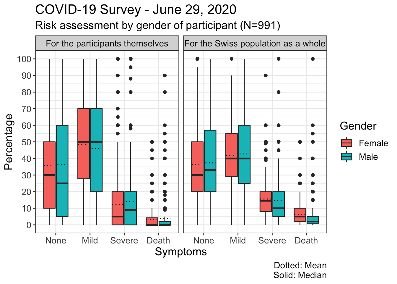
A first analysis from the survey on risk perception in the case of a COVID-19 infection shows that participants evaluate the risks of various outcomes differently for themselves and the Swiss population. The possibility that the participant experiences severe symptoms that require hospitalisation or fatal symptoms is considered somewhat lower by the participants for themselves than for the Swiss population. Both men and women appear to overestimate the probability of death by expecting the “asymptomatic” course to be less likely. While the median values for the various symptom categories do not differ greatly between men and women, the range of values for men is somewhat wider than for women
8 Change in kilometers travelled by:
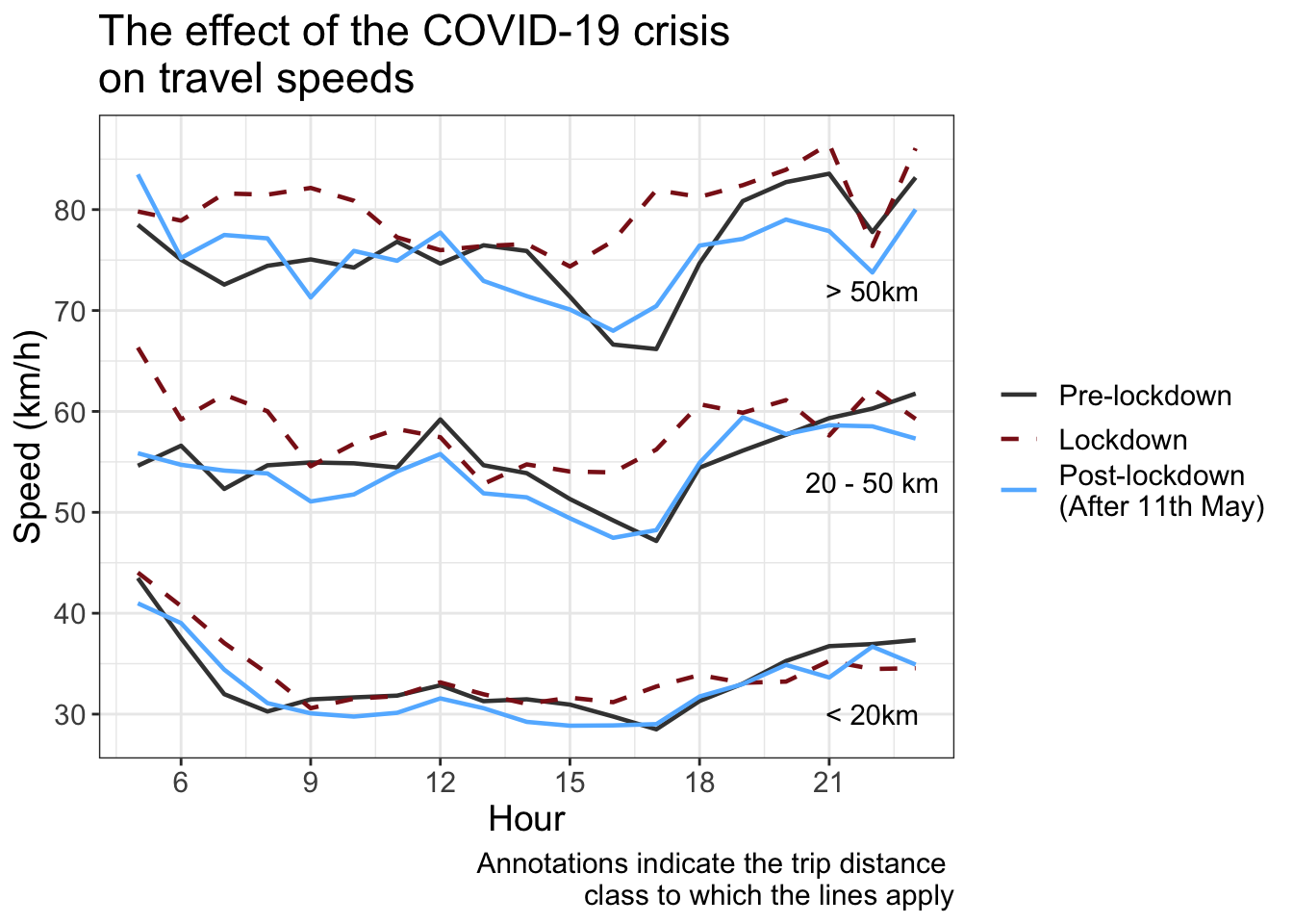
9 Road travel speeds
The following graph shows the effect of the COVID-19 crisis on median car travel speeds during the week, i.e. excluding weekends and holidays. During the lockdown period from March 16th to May 11th, an increase in the peak-hour speeds was observed, indicating a decrease in overall congestion. Since the relaxation of the measures, peak-hour speeds have returned to pre-COVID-19 values, a sign that congestion is back to usual levels.
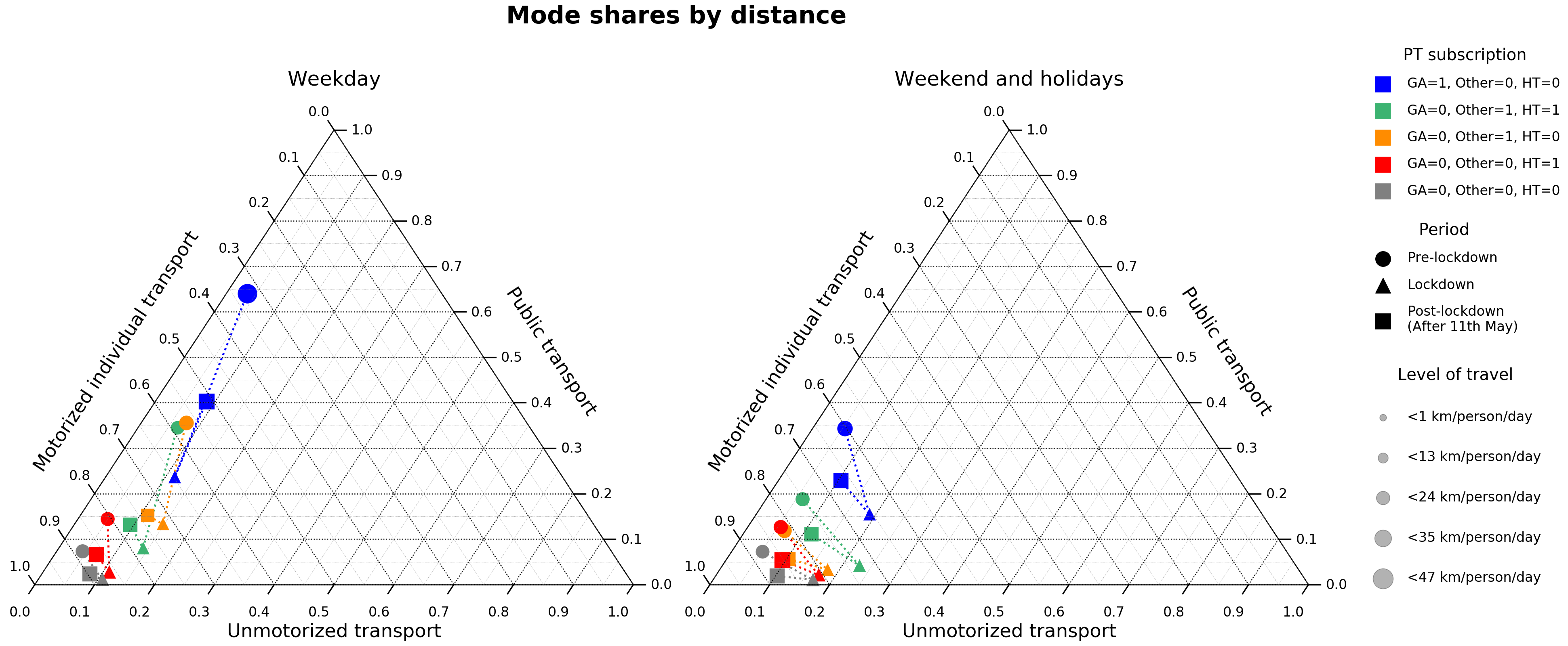
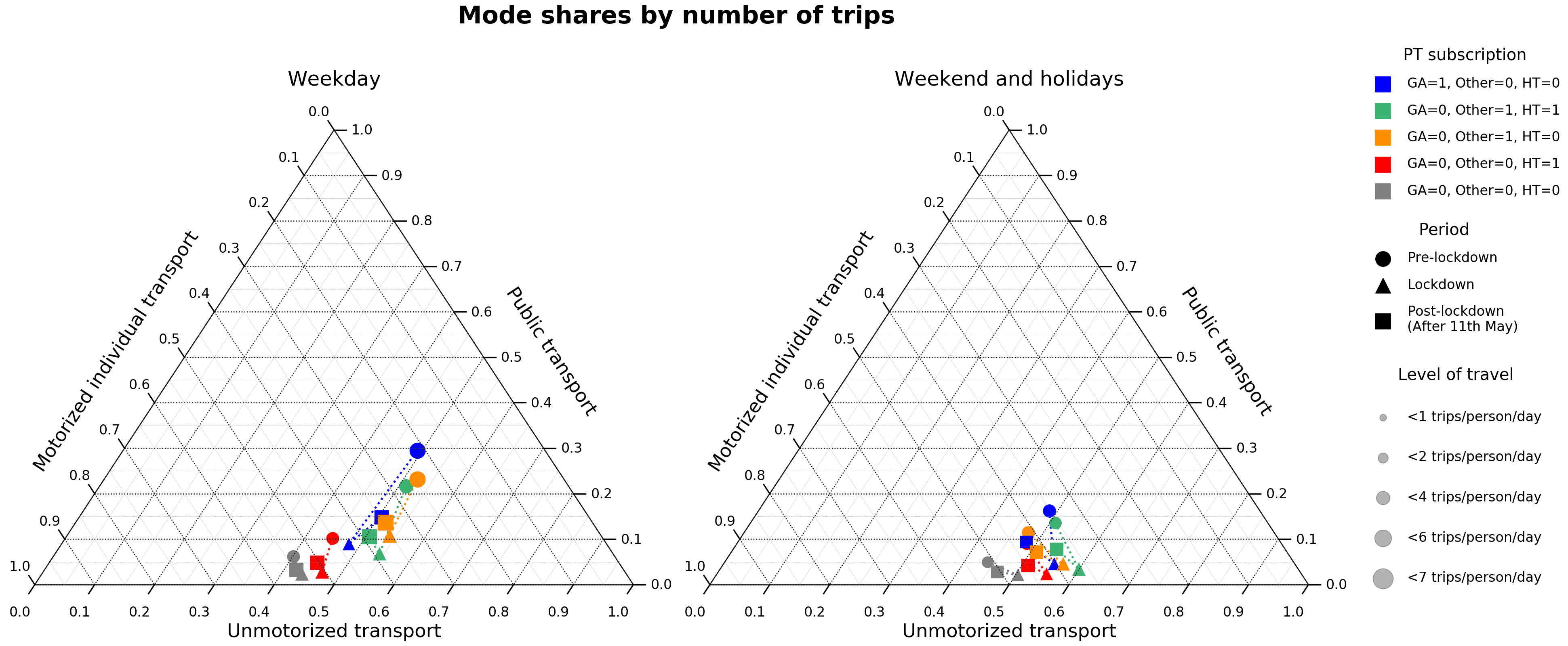
10 Shifts in the transport mode share
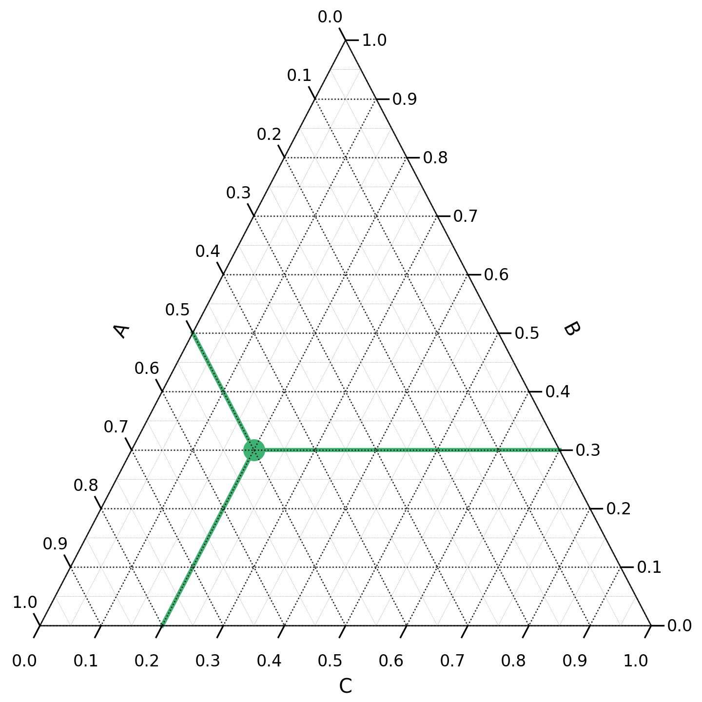
A ternary plot is the graphical representation of triplets of numerical data. It is suitable for representing a constant sum, which is broken down into three summands. The following figure shows an example of such a plot with a single point. The triplet corresponding to this point can be read by following the green lines: A=0.5, B=0.3 and C=0.2. The sum of the three values is equal to 1.
The following ternary plots show the change in mode shares over the course of the COVID-19 crisis, for different types of public transport subscriptions (GA, Halbtax and other). The modes are grouped into the following categories:
- Motorized individual transport (car, motorbike, taxi, Uber)
- Public transport (bus, tram, ferry, metro, train)
- Unmotorized transport (walk, bike)
During the lockdown, a higher share of kilometers and trips were performed using motorized individual and unmotorized modes as compared to the reference period. After the lockdown, the share of public transport has increased and the share unmotorized modes has decreased, both slightly. The share of motorized individual modes it still greater than during the reference period.
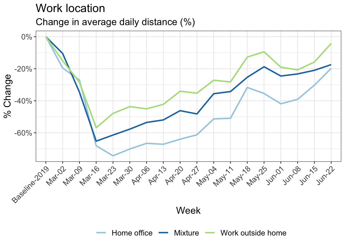
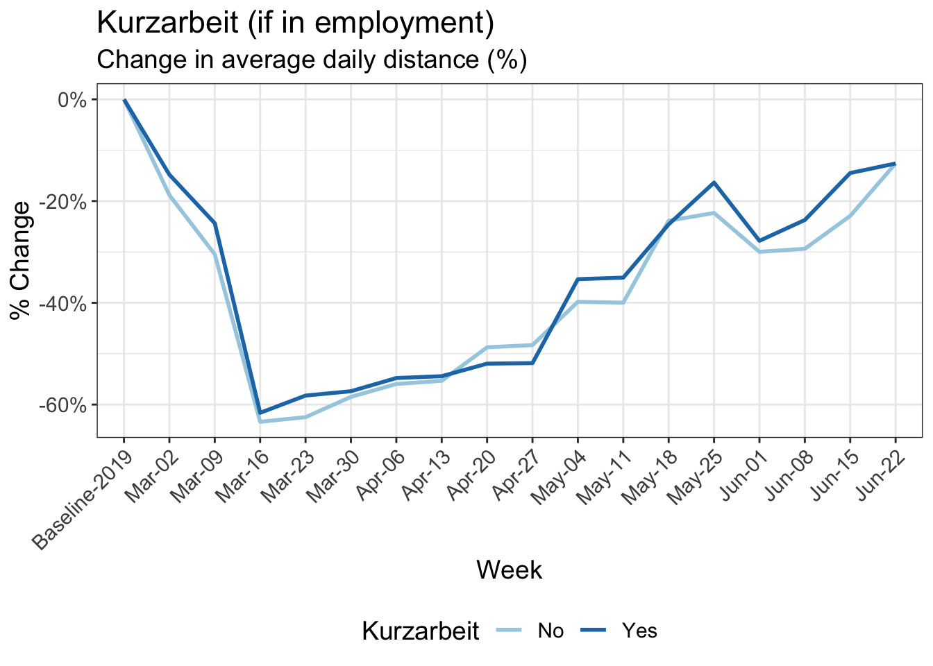
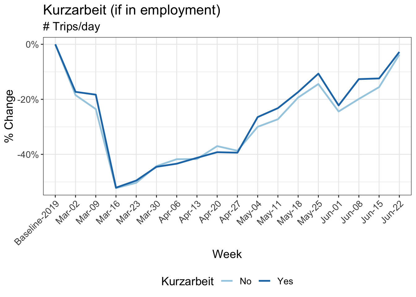
11 Reduction in kilometers travelled by working arrangement
Participants in MOBIS-Covid19 were asked to report their working status on 24/4/2020. The following charts use these results, with the working status imputed using sociodemographic indicators for those who didn’t respond. Specifically, we asked for the number of days working both at home and out of home, and these were then grouped into the categories used below:
- Working only at home
- Only working out of home
- A mix of home office and normal conditions
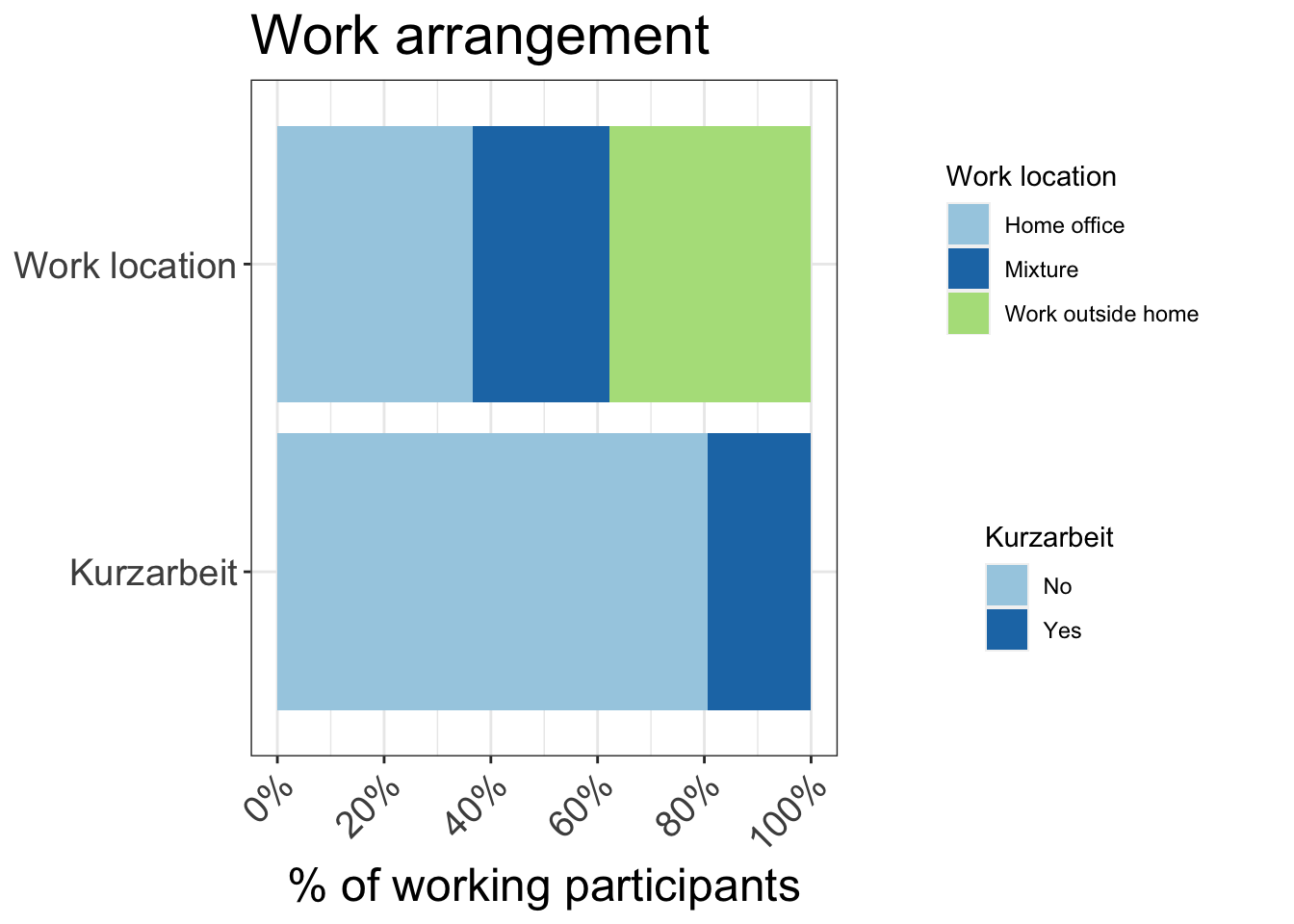
Download chart data (Work location)
Download chart data (Kurzarbeit)
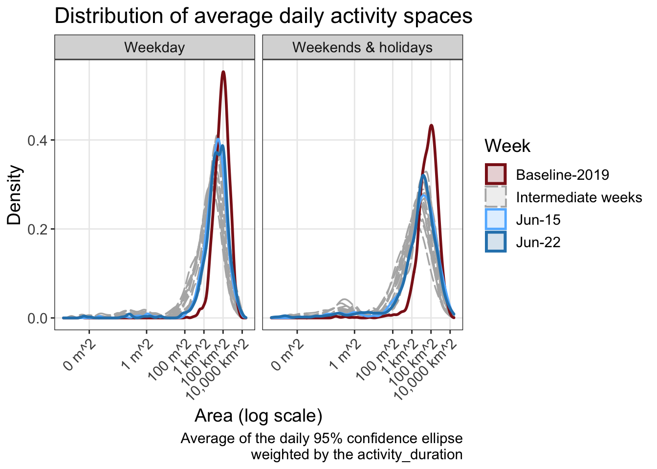
15 Activity space and daily travel radius
A commonly used definition of the activity space is the 95% confidence ellipse of the activity locations, in this case weighted by duration. In the following analysis, the activities at the home location are included, for those that had the app activated on that day. This is an important metric which gives an idea of the area in which travel is being performed. The daily travel radius is also presented.
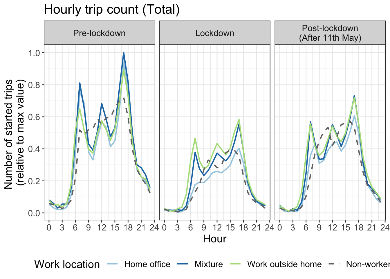
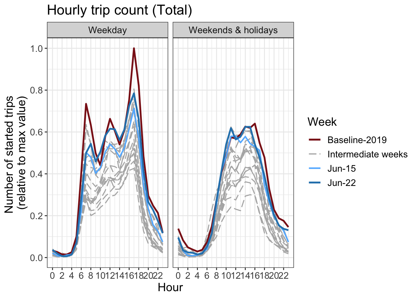
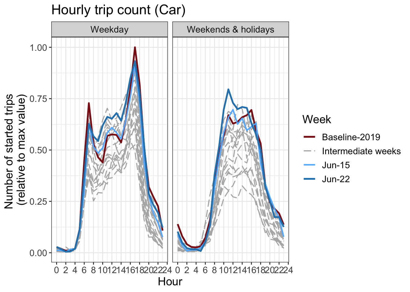
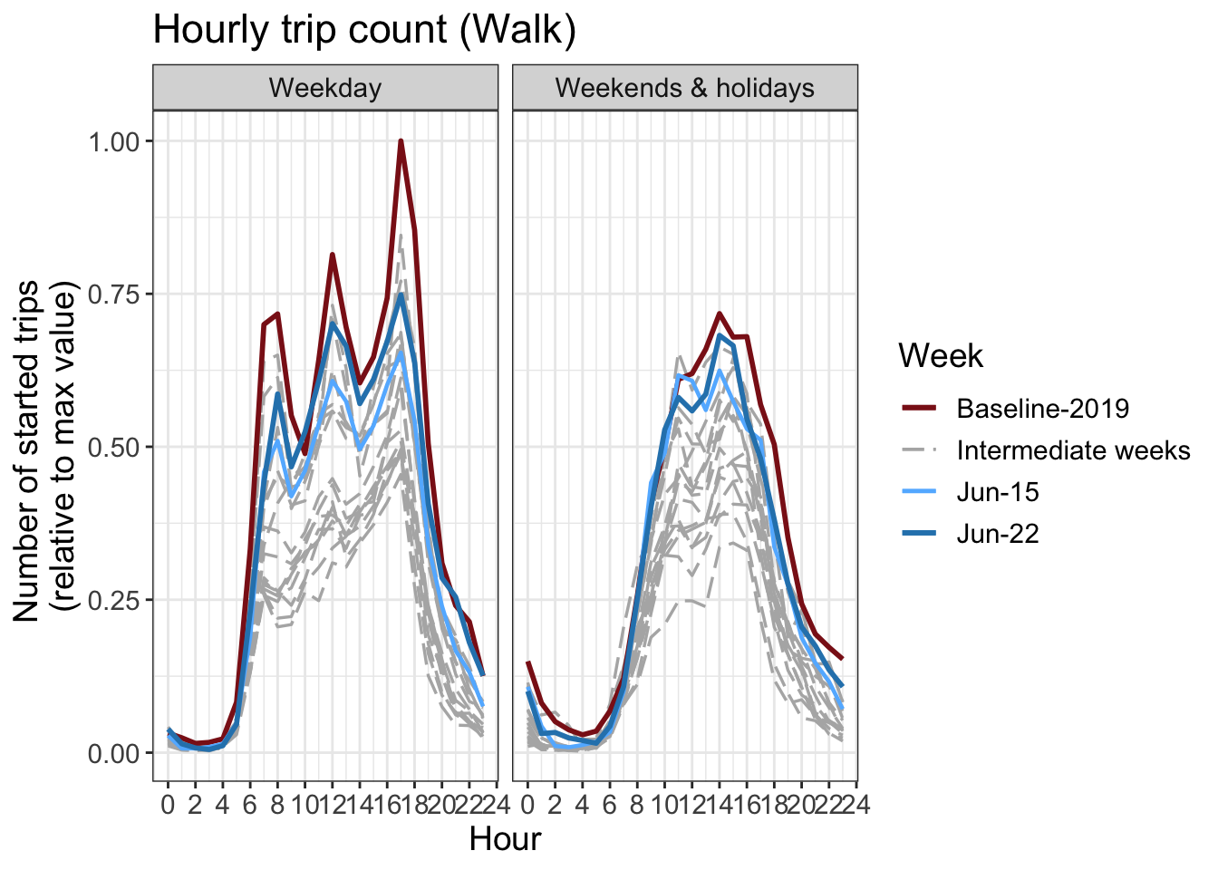
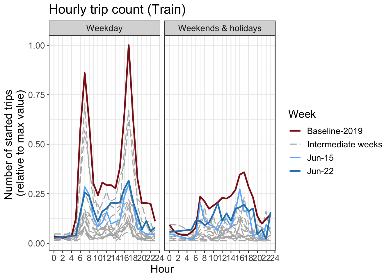
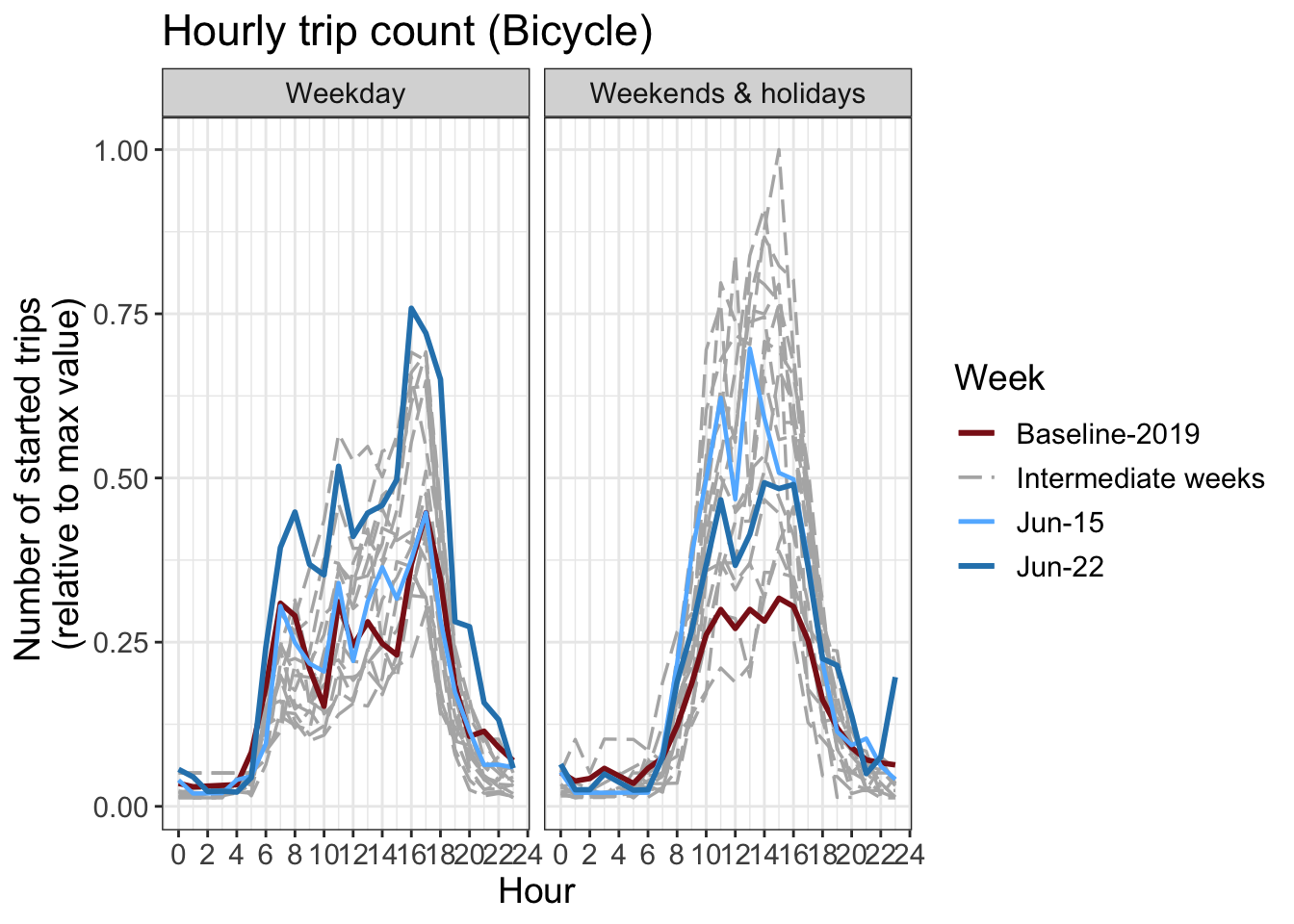
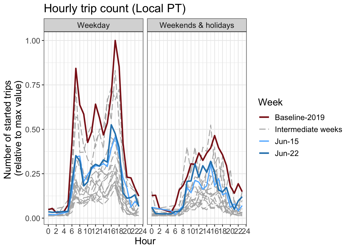
16 Hourly counts
The number of trips started per hour. The y axis is normalized by the maximum hourly value in the graph.
Download chart data (by transport mode)
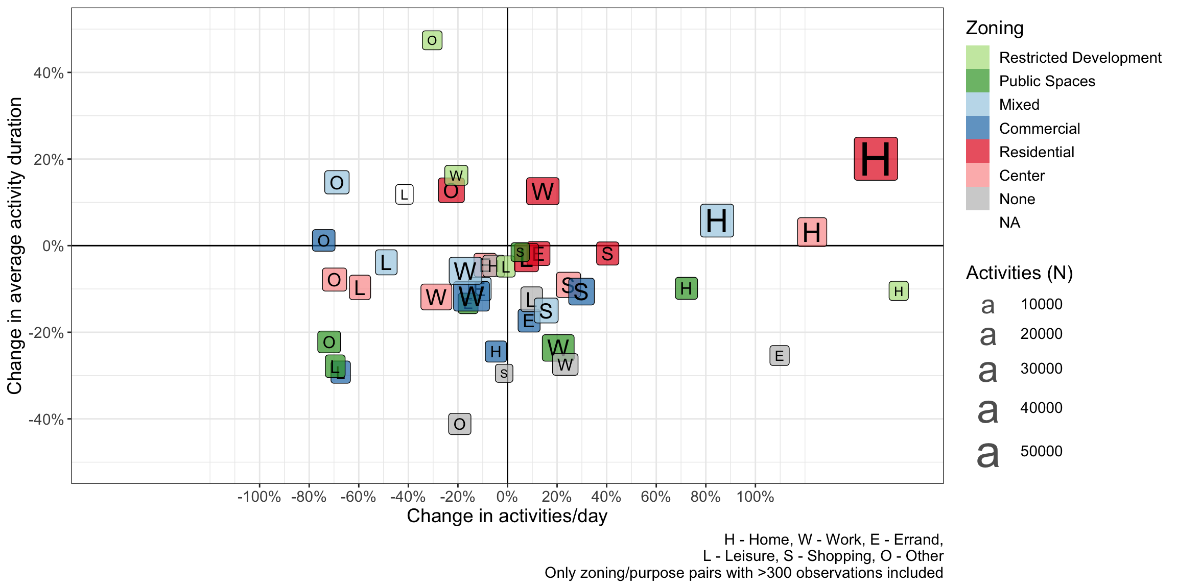
17 Activity types and zoning
Around 30% of activities were voluntarily labelled with their purpose by participants using the app. Work is ongoing to impute the purposes for the rest of the activities. Using simplification of the ARE development zoning classification, the activities are assigned with the closest zone classification within a 100m radius. The following graph shows how both the activity duration and the number of activites has changed from the baseline period in 2019 to the COVID-19 period.
Please note that only stationary leisure activites are included, not walking/cycling/hiking/etc
18 Participation
19 Differences in the distributions
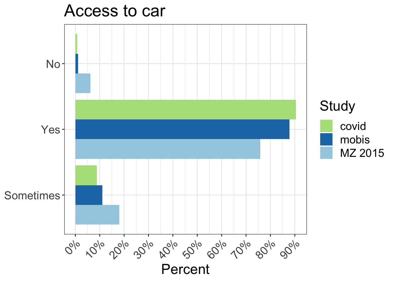
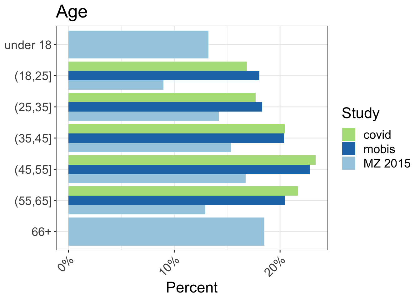
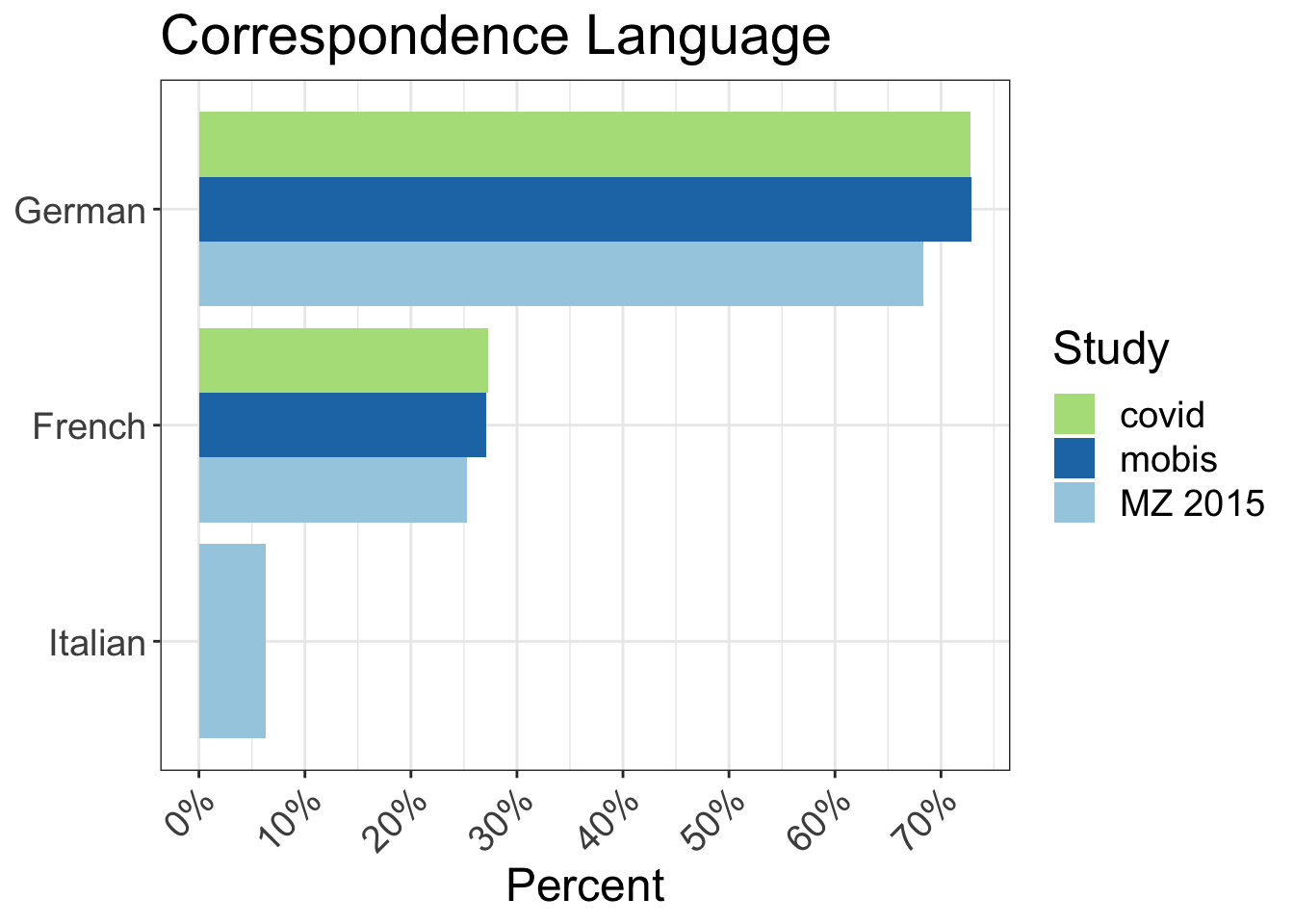
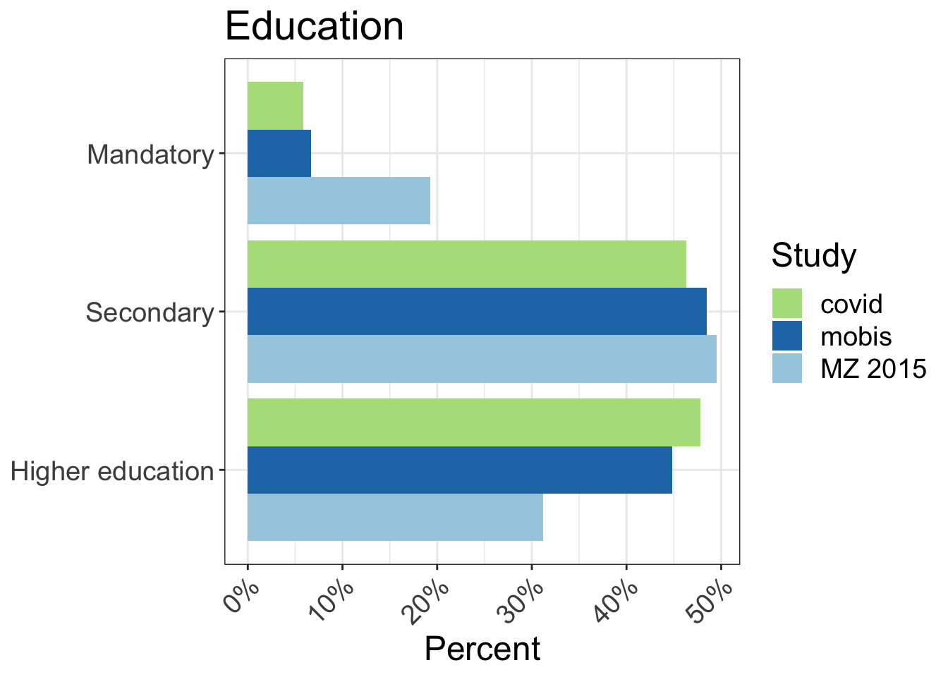
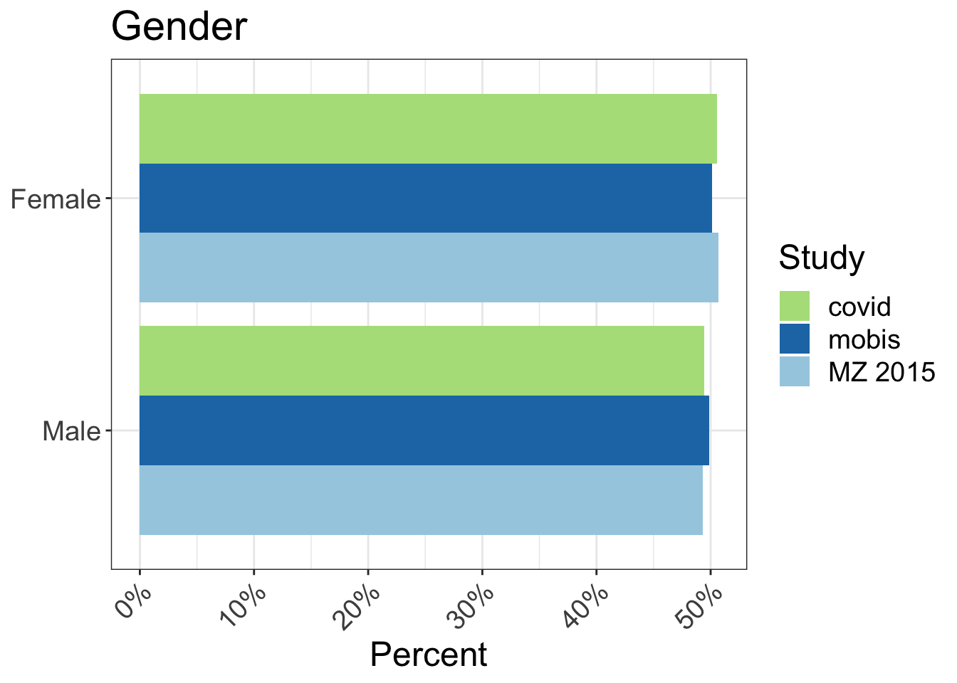
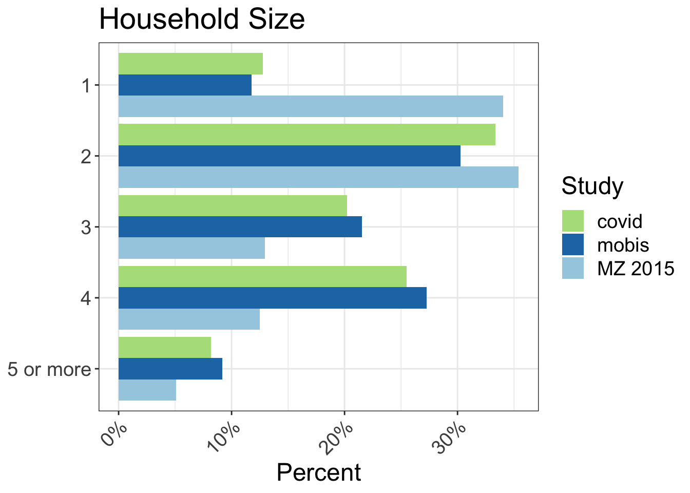
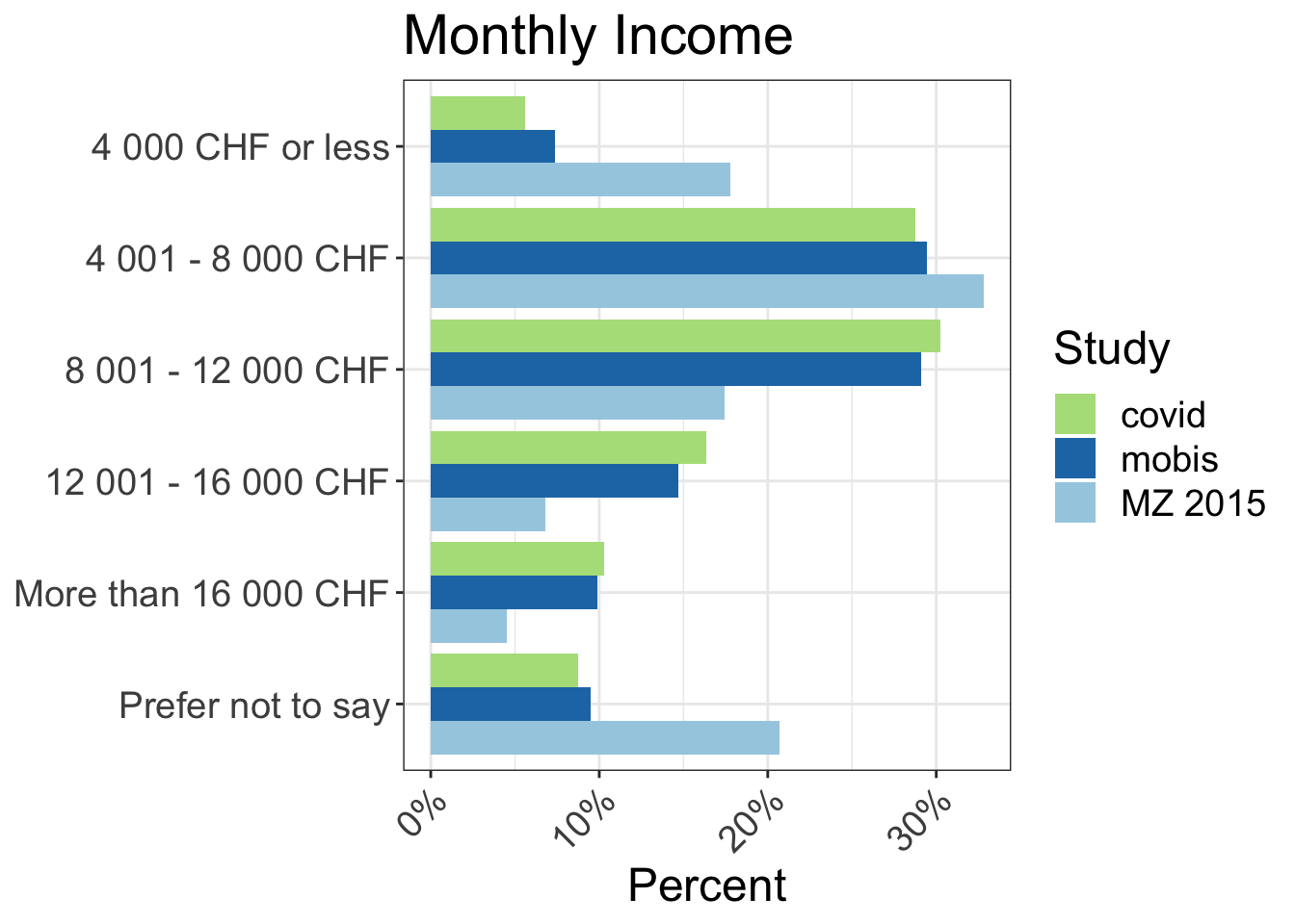
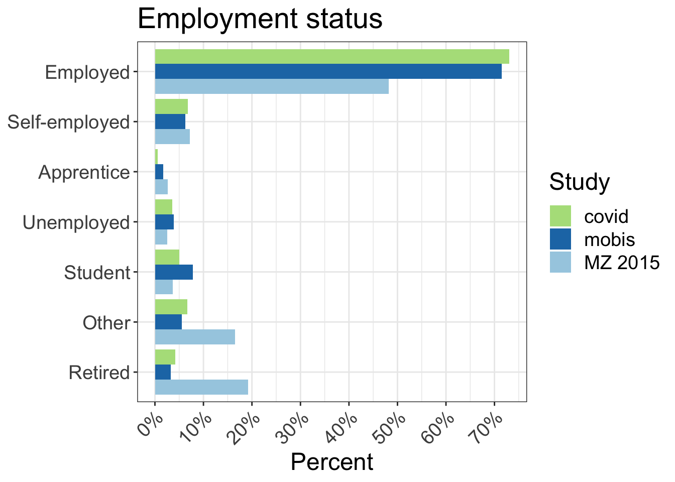
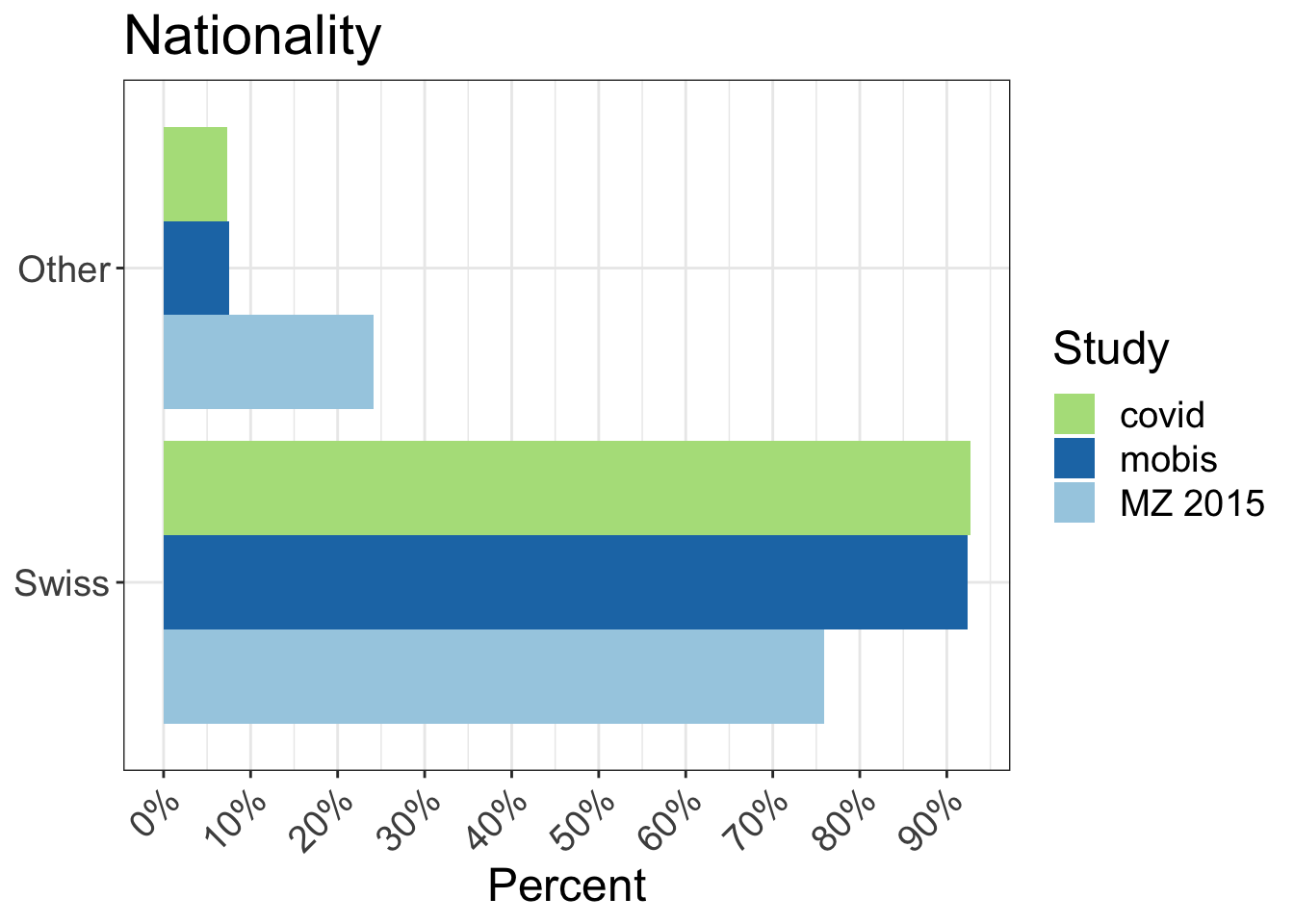
The following charts show the characteristics of the MOBIS:COVID-19 sample compared to the original MOBIS Sample. There are some small differences, but generally the samples are consistent. This chart will be extended to compare to the relevant census data.
| Covid | MZ | Covid | MZ | |
|---|---|---|---|---|
| Aargau | 81 | 4,325 | 4.9 | 7.6 |
| Basel-Landschaft | 186 | 1,940 | 11.4 | 3.4 |
| Basel-Stadt | 39 | 1,555 | 2.4 | 2.7 |
| Bern | 191 | 7,244 | 11.7 | 12.7 |
| Fribourg | 8 | 1,942 | 0.5 | 3.4 |
| Geneva | 129 | 3,062 | 7.9 | 5.4 |
| Schwyz | 17 | 1,005 | 1.0 | 1.8 |
| Solothurn | 18 | 1,813 | 1.1 | 3.2 |
| Vaud | 293 | 5,303 | 17.9 | 9.3 |
| Zurich | 672 | 10,410 | 41.1 | 18.2 |
| Other | 3 | 18,491 | 0.2 | 32.4 |