MOBIS-COVID19/25
Results as of 19/10/2020 (Post-lockdown)
A Project of IVT, ETH Zurich and WWZ, University of Basel
This work is licensed under Creative Commons 
Contact: Joseph Molloy (joseph.molloy@ivt.baug.ethz.ch)
Previous and future reports can be found at: https://ivtmobis.ethz.ch/mobis/covid19/en
- 1 News
- 2 Introduction
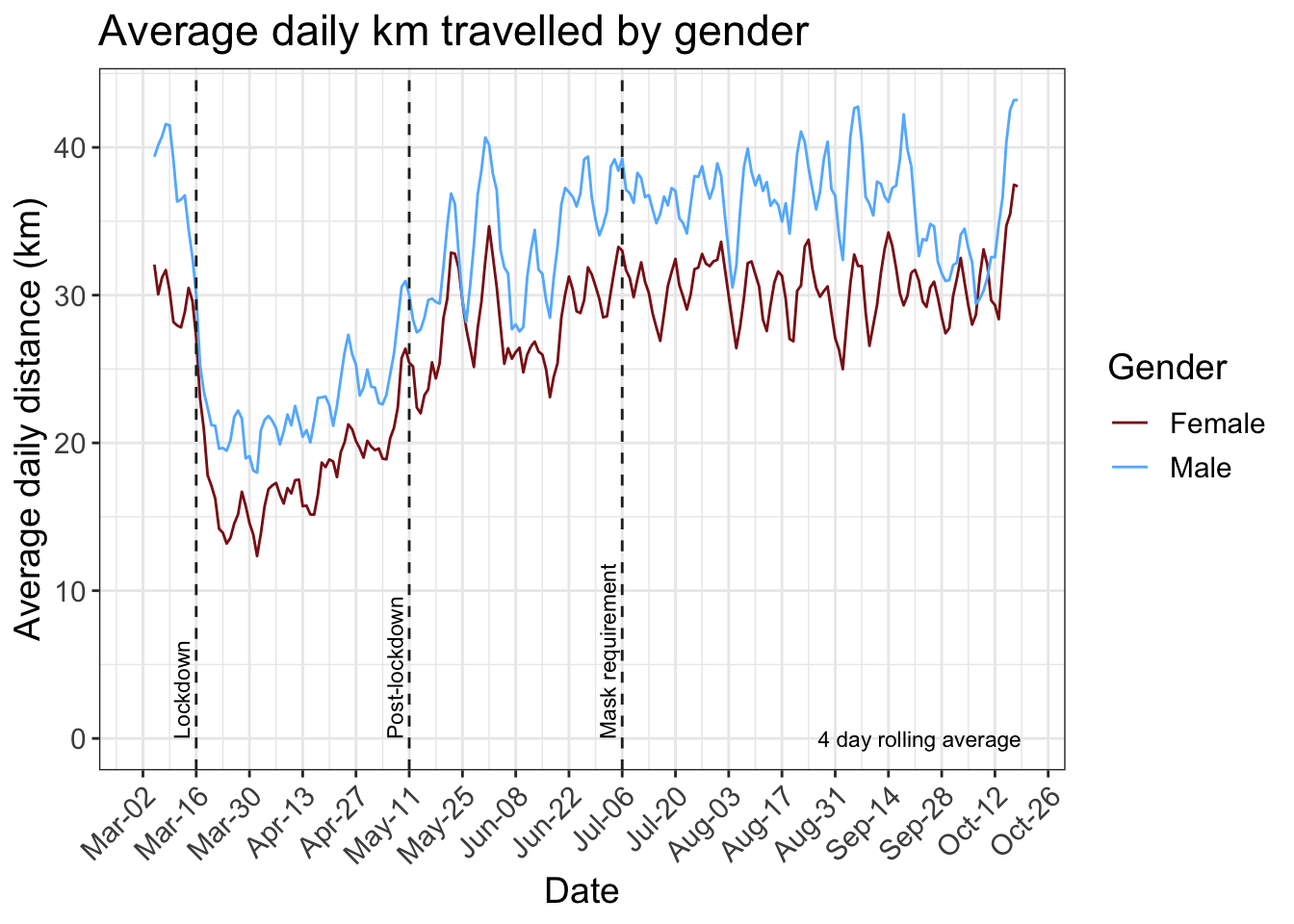
- 3 Average daily distance
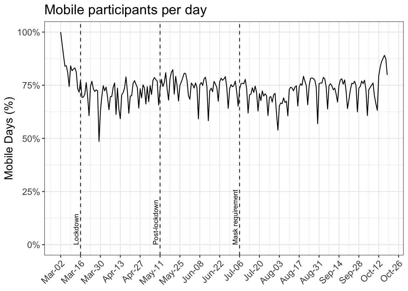
- 4 Active days
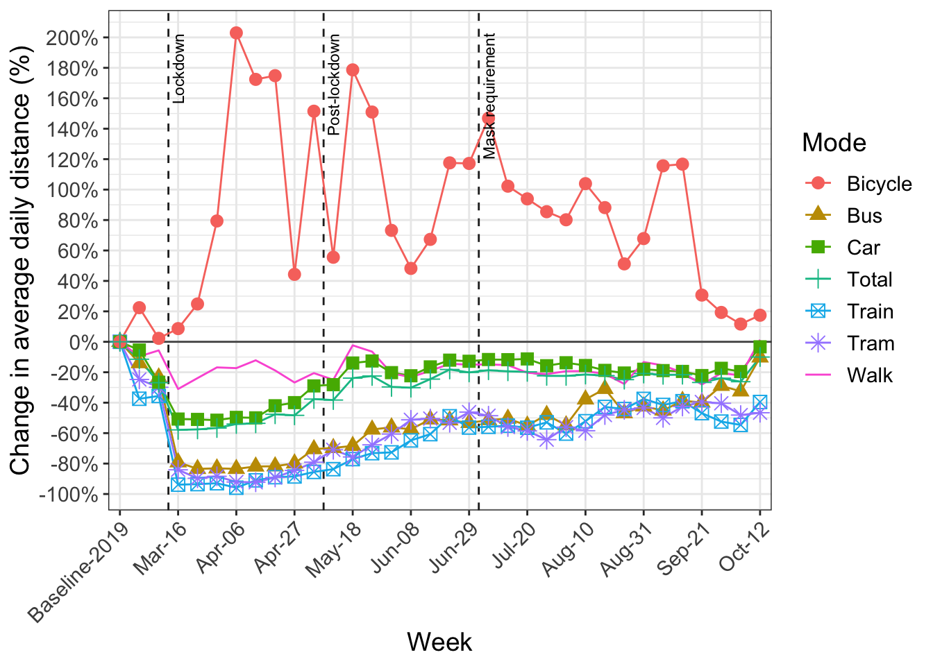
- 5 Change in kilometers travelled by transport mode
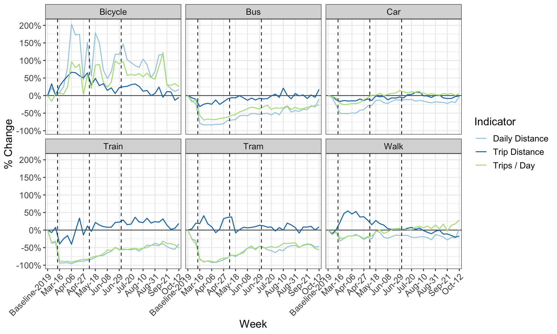
- 6 Key indicators by mode
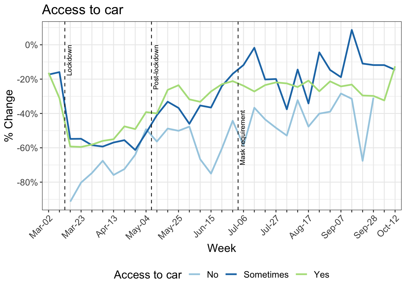
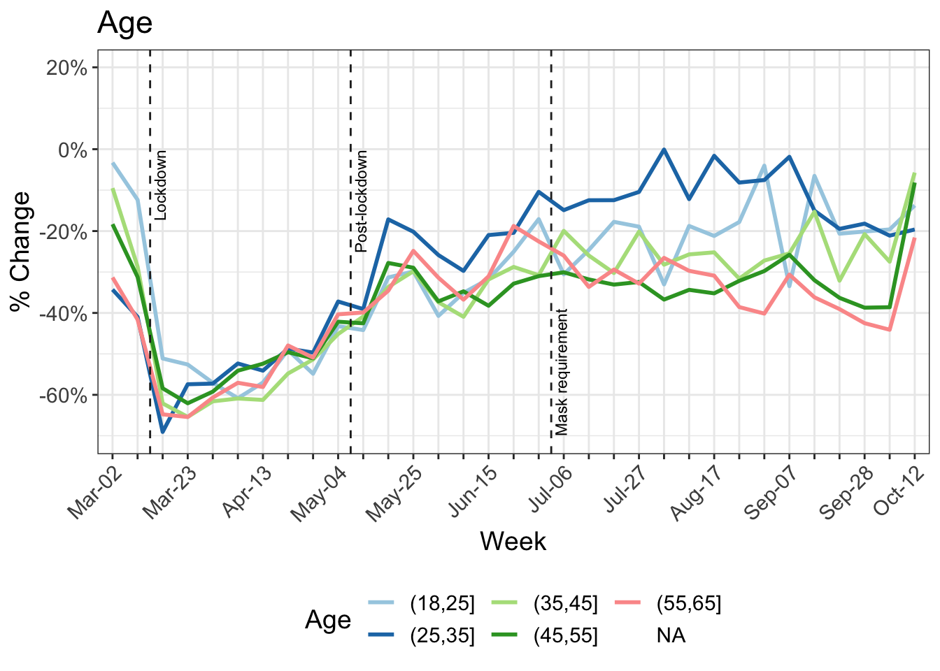
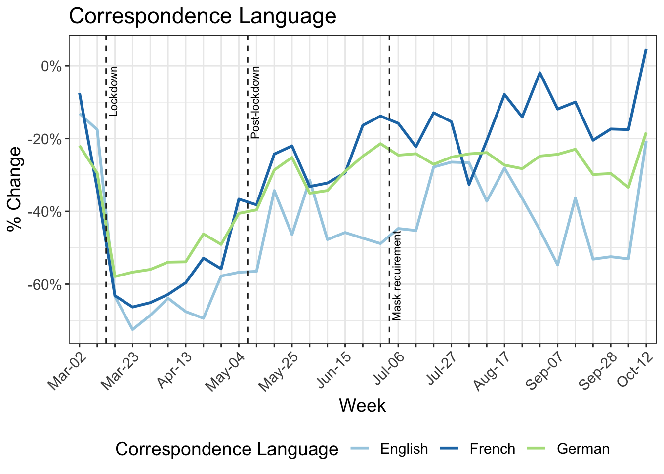
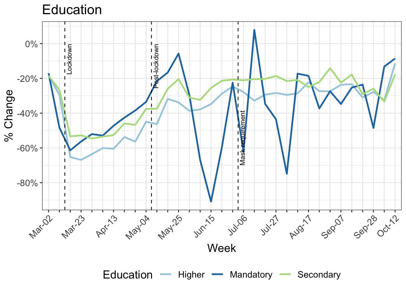
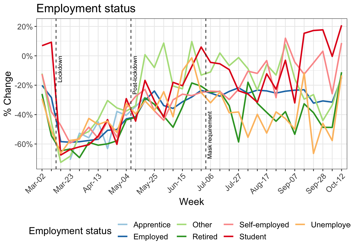
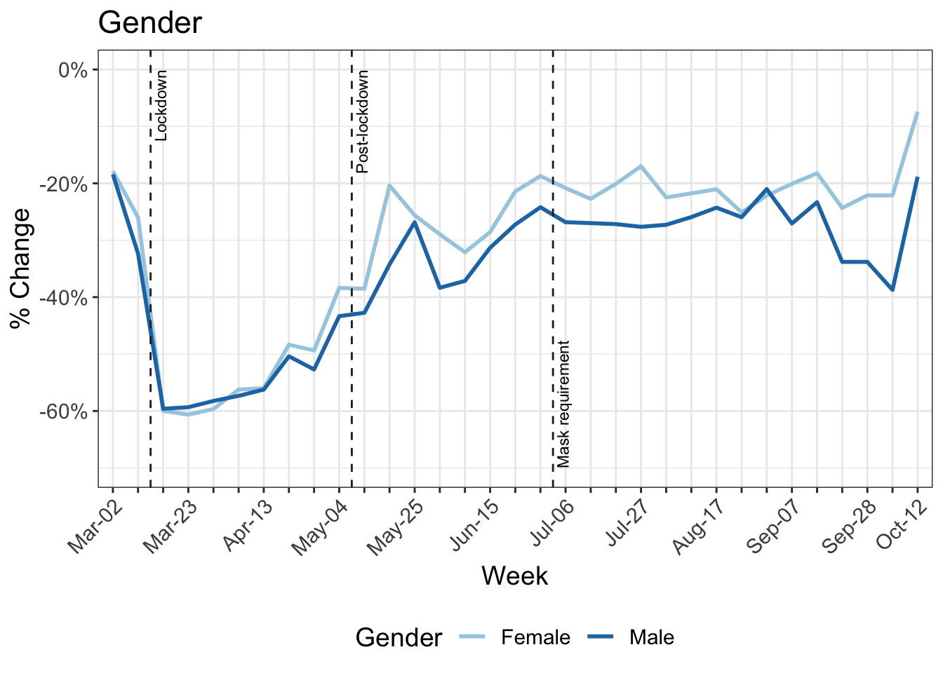
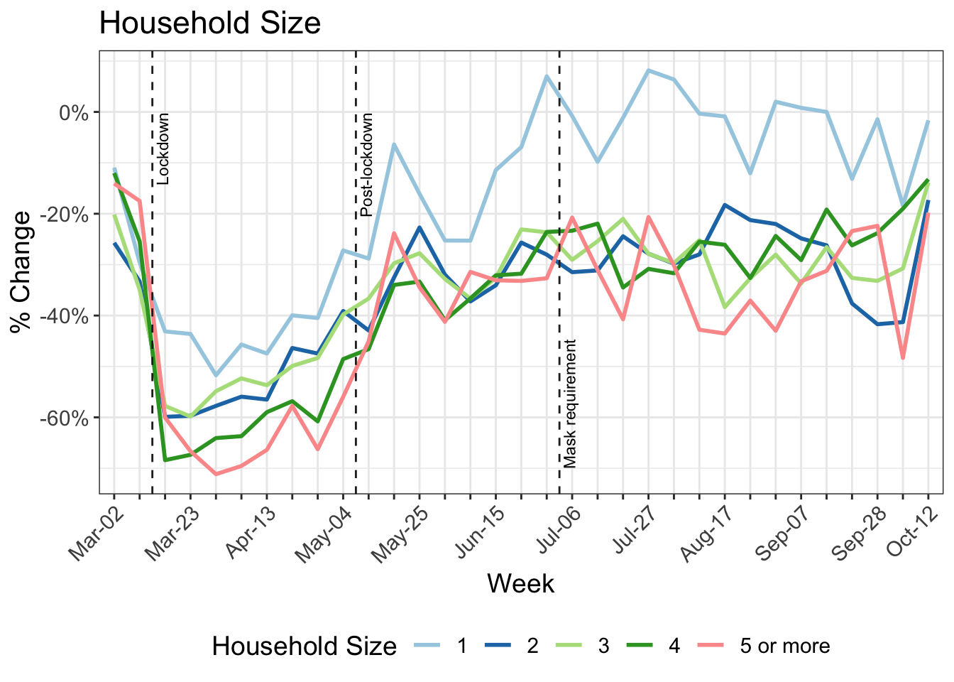
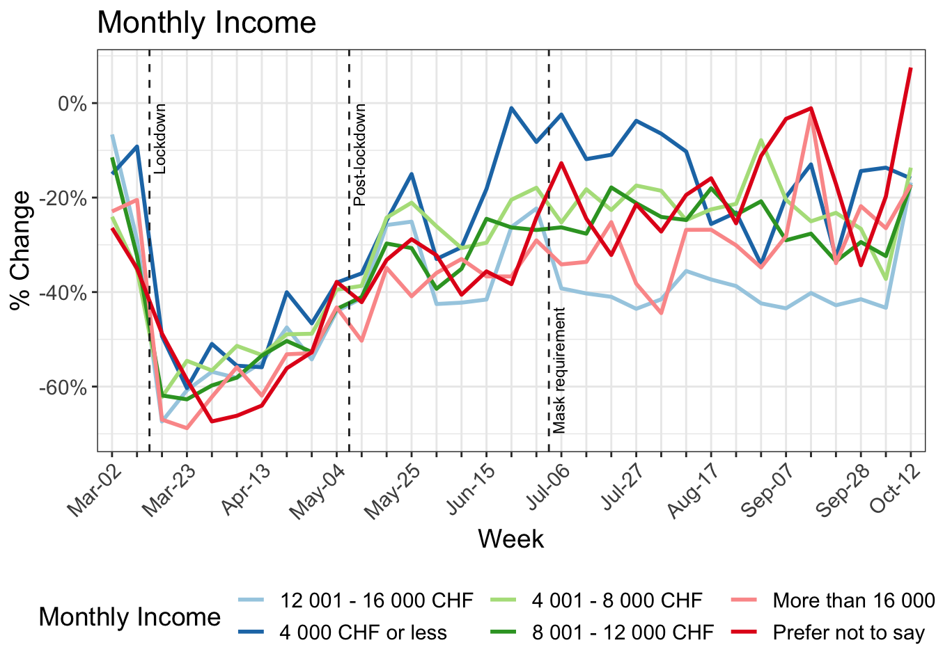
- 7 Change in kilometers travelled by:
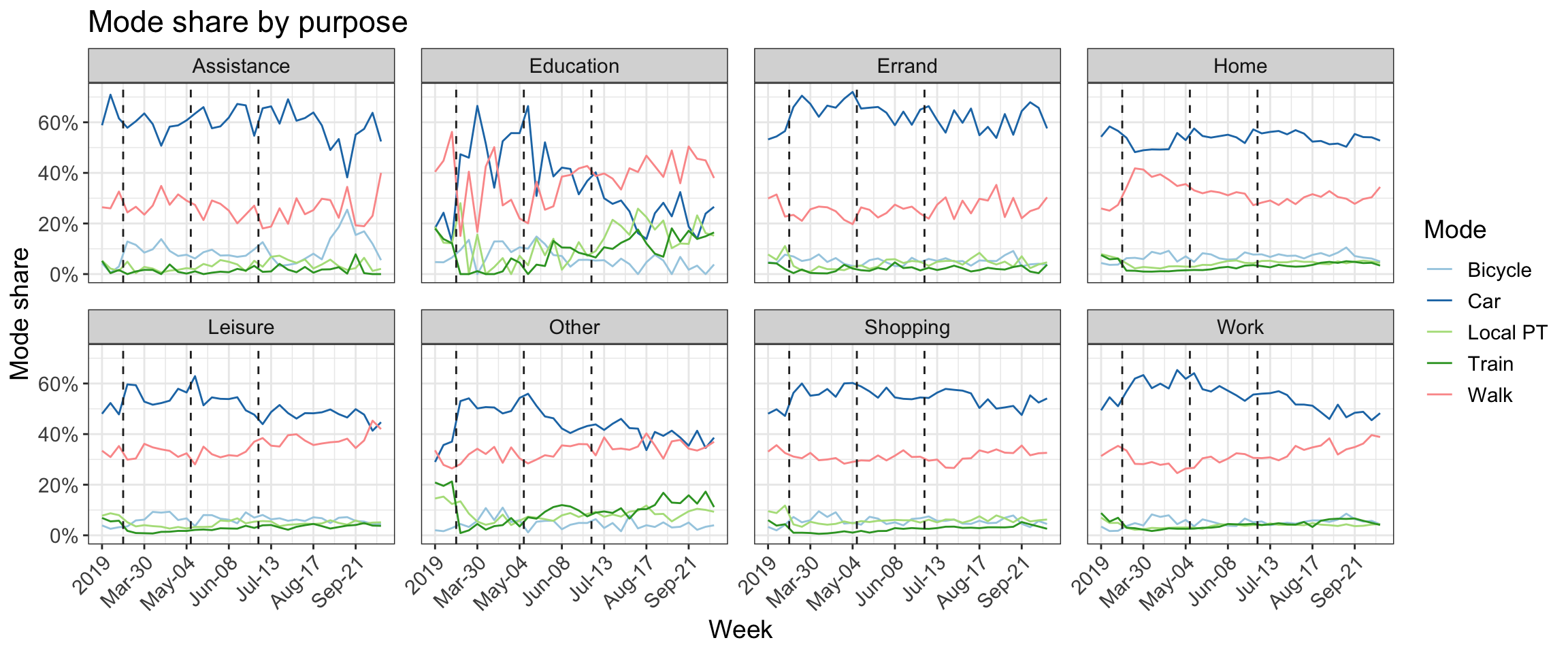
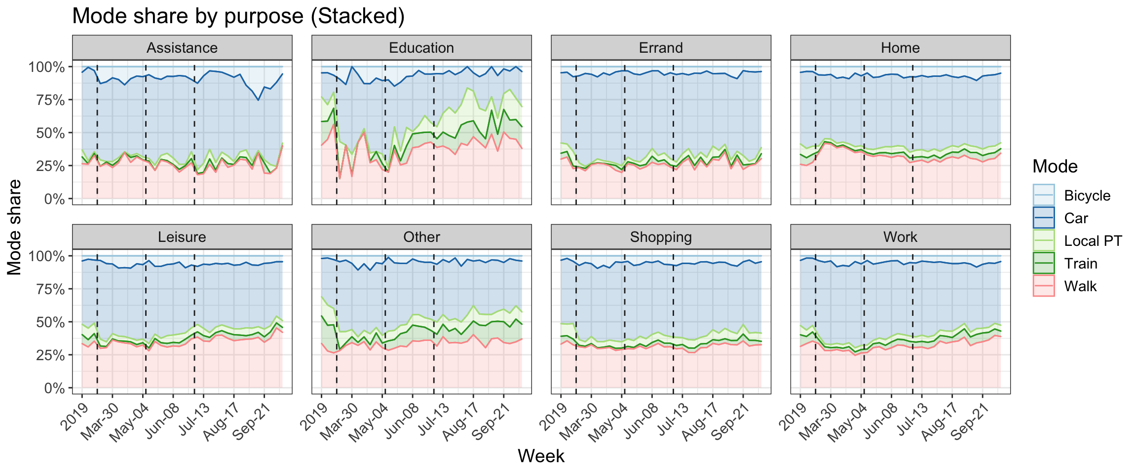
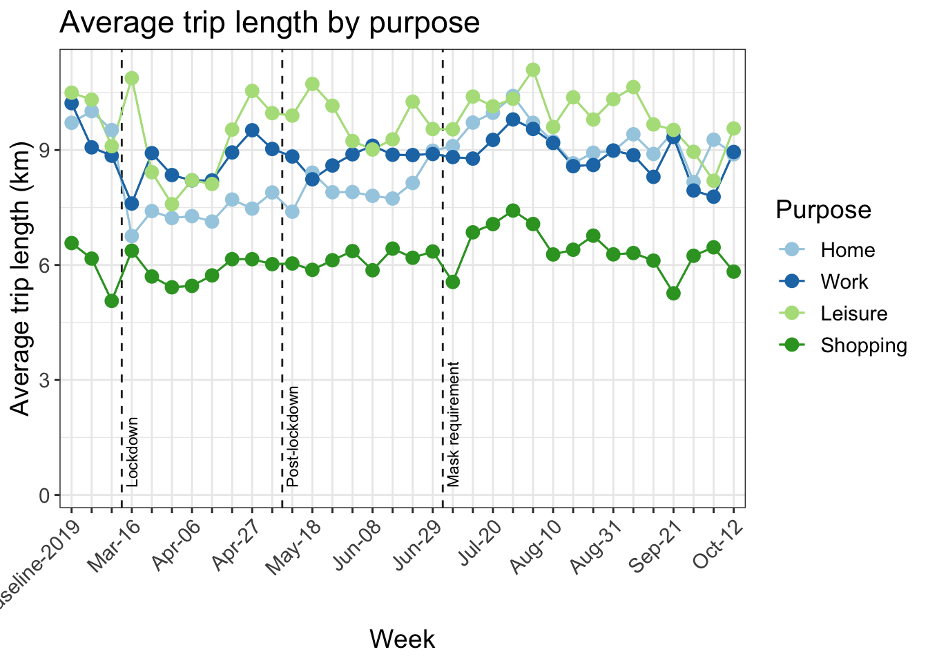
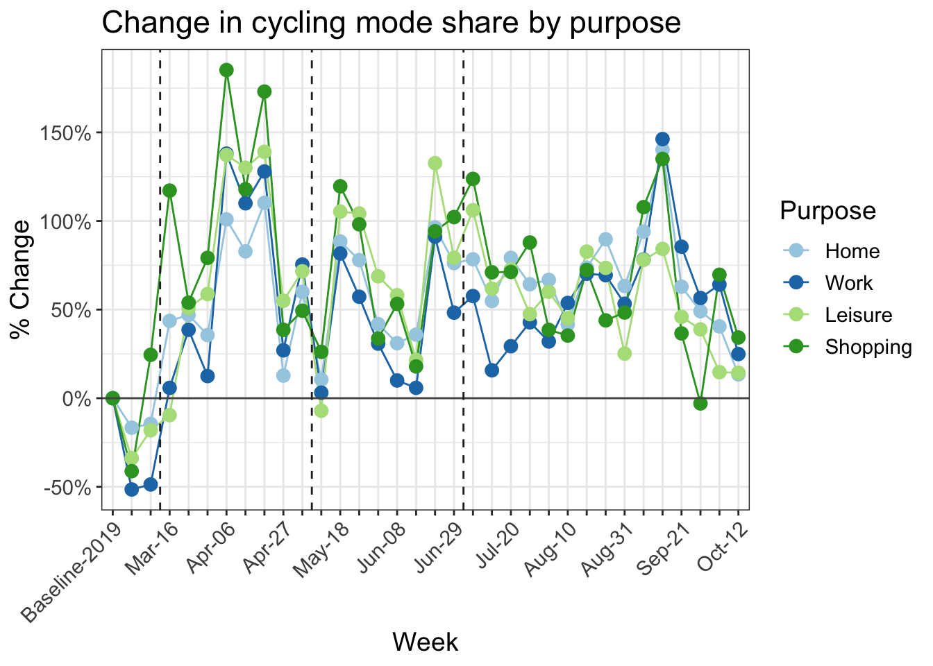
- 8 Analysis of trip purpose
- 9 Road travel speeds
- 10 Shifts in the transport mode share
- 11 Reduction in kilometers travelled by working arrangement
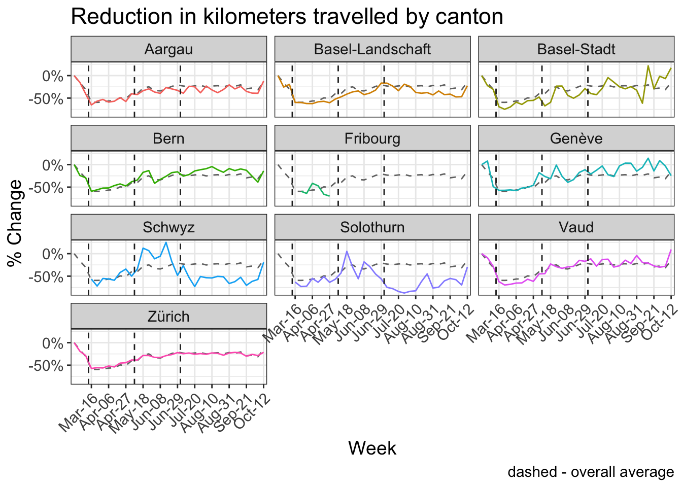
- 12 Reduction in kilometers travelled by canton
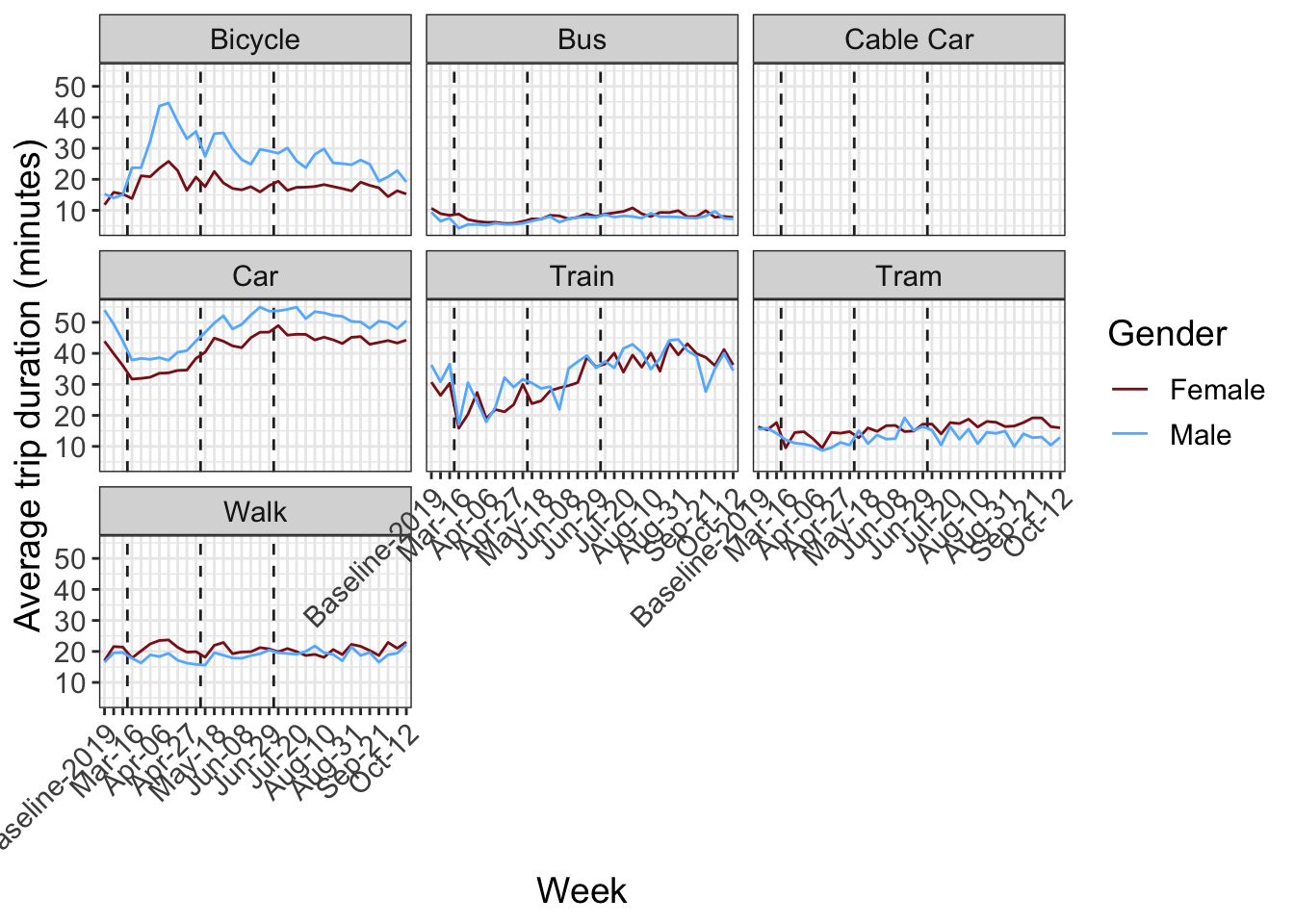
- 13 Trip duration by transport mode and gender
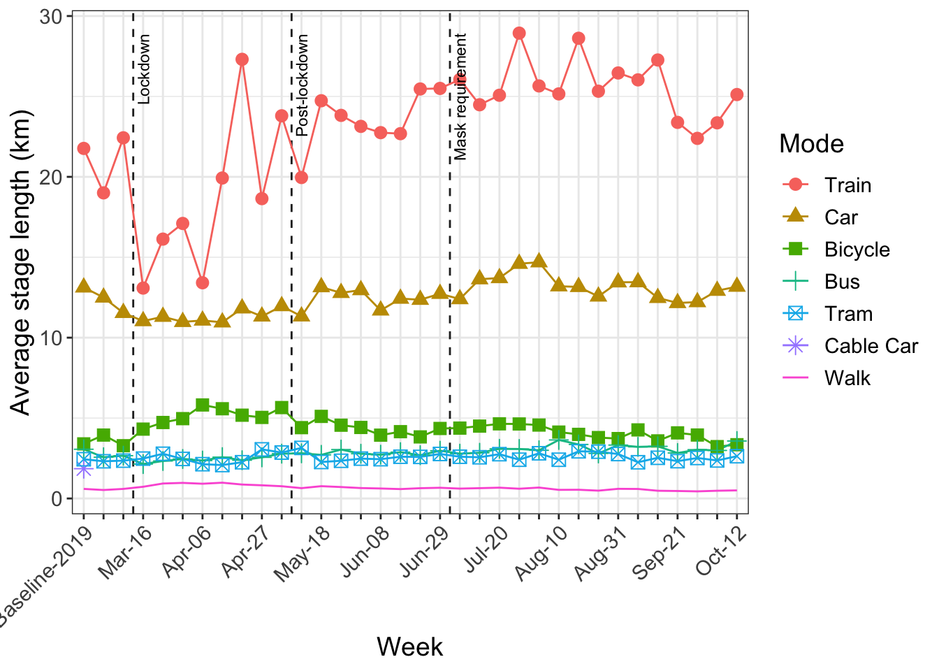
- 14 Average stage length by transport mode (km)
- 15 Activity space and daily travel radius
- 16 Hourly counts
- 17 Activity types and zoning
- 18 Participation
- 19 Risk perception
- 20 Differences in the distributions
- 21 Sample weighting
- 22 Updated conlcusions
1 News
6 October:
- The chart showing the daily average distance by gender has been corrected to show total distance, whereas it previously included only car travel. Also the same graph now dispalys a 4 day rolling average for visibility. The original values are still available in the downloadable data.
28 September:
- New chart with key transport-mode indicators added. link
24 August:
- Updated conclusions.
- The report will now be updated every second week.
11 August:
- New analysis of trip purpose (mode shares and hourly counts). link
- Weekly weights of the sample against the original MOBIS study have been applied to all results. link
6 August:
- Added breakdown of the current sample to the section Differences in the distributions
13 July:
- As of July 6th, face masks are compulsory on public transport in Switzerland.
- To reflect this development, the relevant graphs have vertical lines added indicating the start of the lockdown (March 16th), relaxation of the lockdown (May 11th) and the introduction of the mask requirement (July 6th).
Previous news (click to expand)
29 June:
- New analysis on the shifts in the transport mode share - link
15 June:
- The data can now be downloaded directly for certain requested charts. Please make sure to cite both the IVT, ETHZ and WWZ, Uni Basel as the source.
- Hourly counts now show the whole day - Midnight to 4am is no longer excluded.
- Analysis by home office - link.
- In response to multiple inquiries, we would like to clarify that the baseline-2019 period covers September and October 2019.
- Results by gender corrected
- New analysis of car travel speeds by distance class - link.
25 May:
- Adjusted # Activities/Day so that the first home activity per day is not included.
- Converted long tables to graphs.
18 May:
- First report after the relaxation of lockdown measures on May 11th.
- The 2019 Baseline period has been shortened to only include September and October - This mostly affects the cycling numbers.
11 May:
- New graph of activity space and daily radius - link.
4 May:
- New chart from online survey with participants on risk perception - link.
- Key points summary and formatting adjustments.
27 April:
- New chart on the change in activity type by land zoning.
20 April:
- Mobile participants per day.
- Non-mobile participants are now included in the activity-space numbers in addition to a new table on median weekly activity spaces.
- New graphs, including average trip distance by mode.
- Formatting improvements and other small corrections.
13 April:
- Earlier weeks have been grouped and colored grey in certain graphs.
2 Introduction
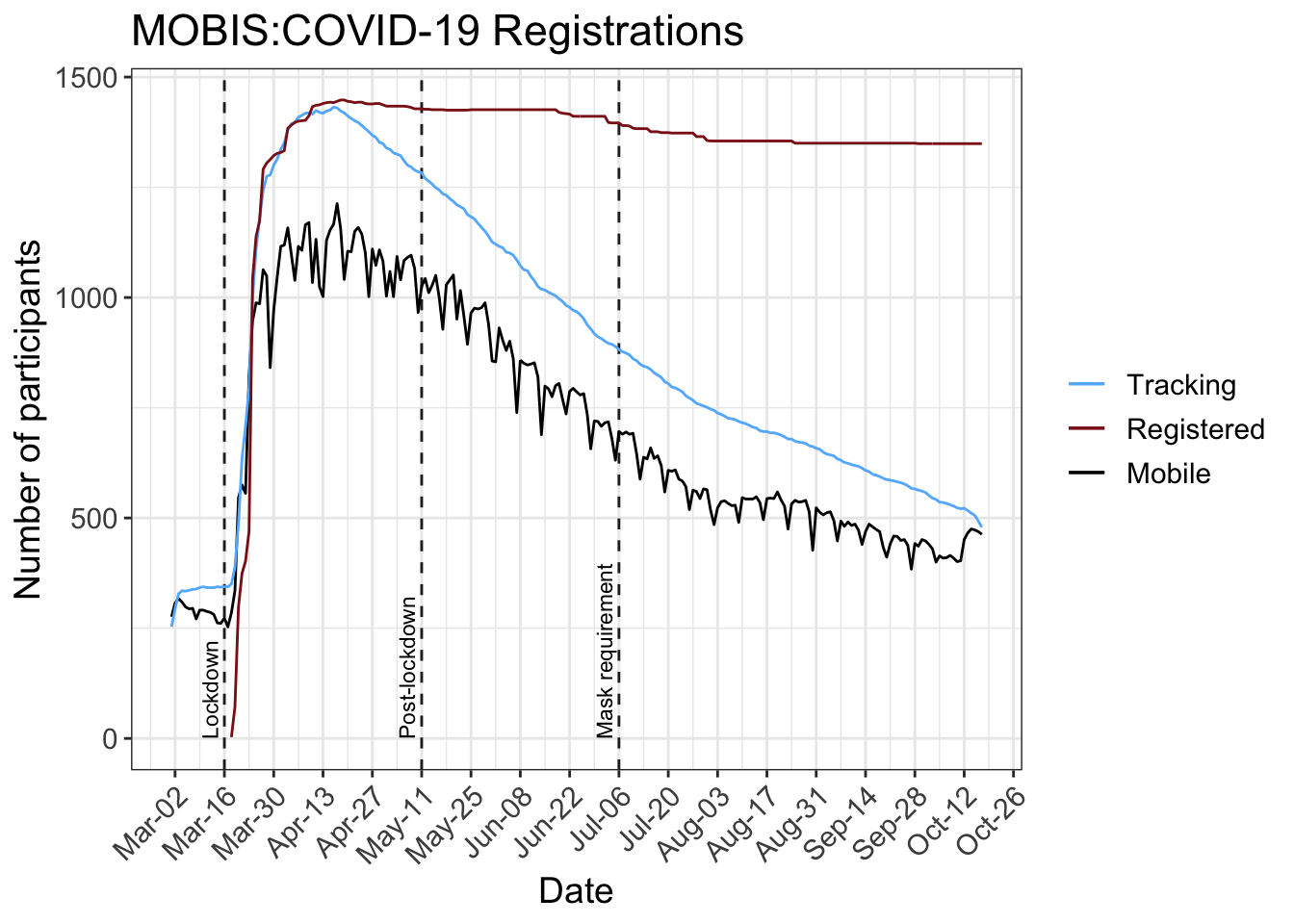
On March 16, 2020, 3700 participants who completed the MOBIS study between September 2019 and January 2020 were invited to reinstall the GPS Logger and Travel Diary App ‘Catch-My-Day’, developed by MotionTag, to record their mobility behaviour during the period of special measures implemented to control the spread of the Corona Virus. The first 4 weeks of mobility data from the original MOBIS Study is taken for each participant as a baseline against which to compare current mobility patterns. These 4 weeks start place anywhere between 1st September and 15th November, depending on the participant. Only trips in Switzerland are currently considered, although data on cross border travel is available.
A running panel of around 250 participants were already tracking before the sample was reinvited. This allows results for the weeks before the MOBIS:COVID-19 study was officially started, although the sample size is a lot smaller, and hence the results.
In the MOBIS study, participants were only eligible if they used a car at least 3 days a week - which skews the sample away from the Swiss general population.
The number of tracking participants each day used to calculate the average daily values includes all participants who recorded tracks before or after that date. This allows the consideration of those who stay at home while still allowing for survey dropouts.
The GPS Travel diary used, Catch-My-Day (for iOS and Android) can have a 2-3 day delay before the tracks are available for analysis. The scaling by active participants accomodates for this, but the results of previous reports may change when the report is updated.
7 Change in kilometers travelled by:
8 Analysis of trip purpose
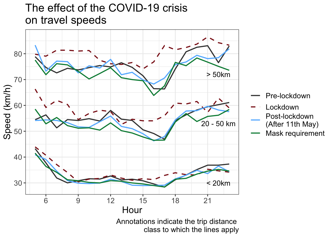
9 Road travel speeds
The following graph shows the effect of the COVID-19 crisis on median car travel speeds during the week, i.e. excluding weekends and holidays. During the lockdown period from March 16th to May 11th, an increase in the peak-hour speeds was observed, indicating a decrease in overall congestion. Since the relaxation of the measures, peak-hour speeds have returned to pre-COVID-19 values, a sign that congestion is back to usual levels.
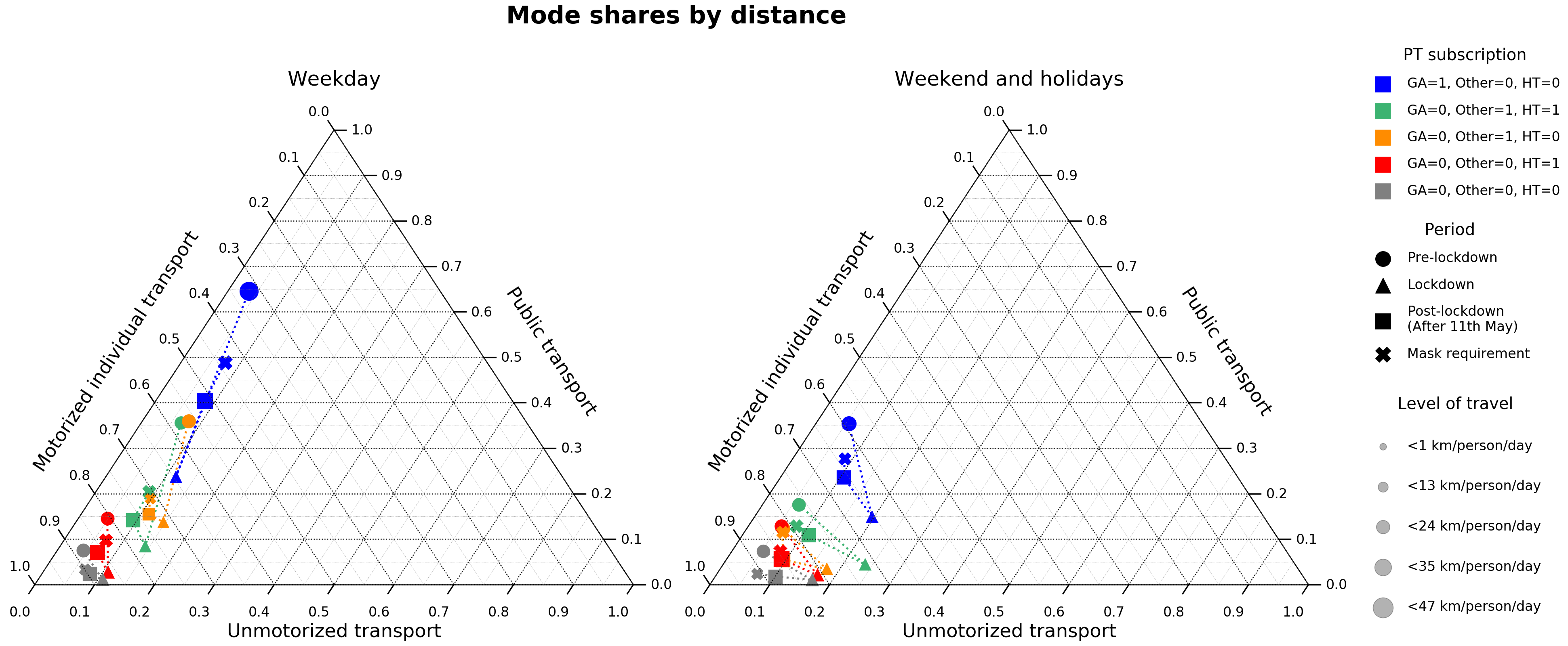
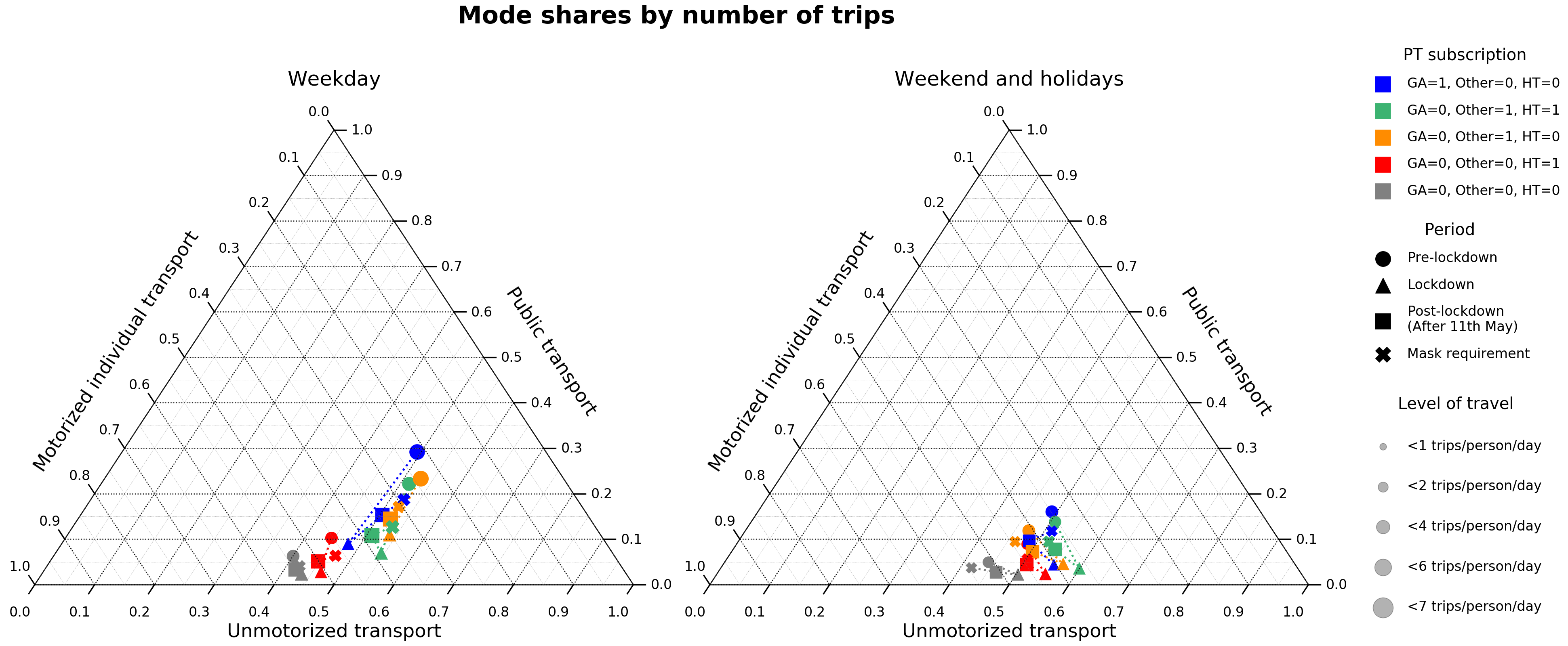
10 Shifts in the transport mode share
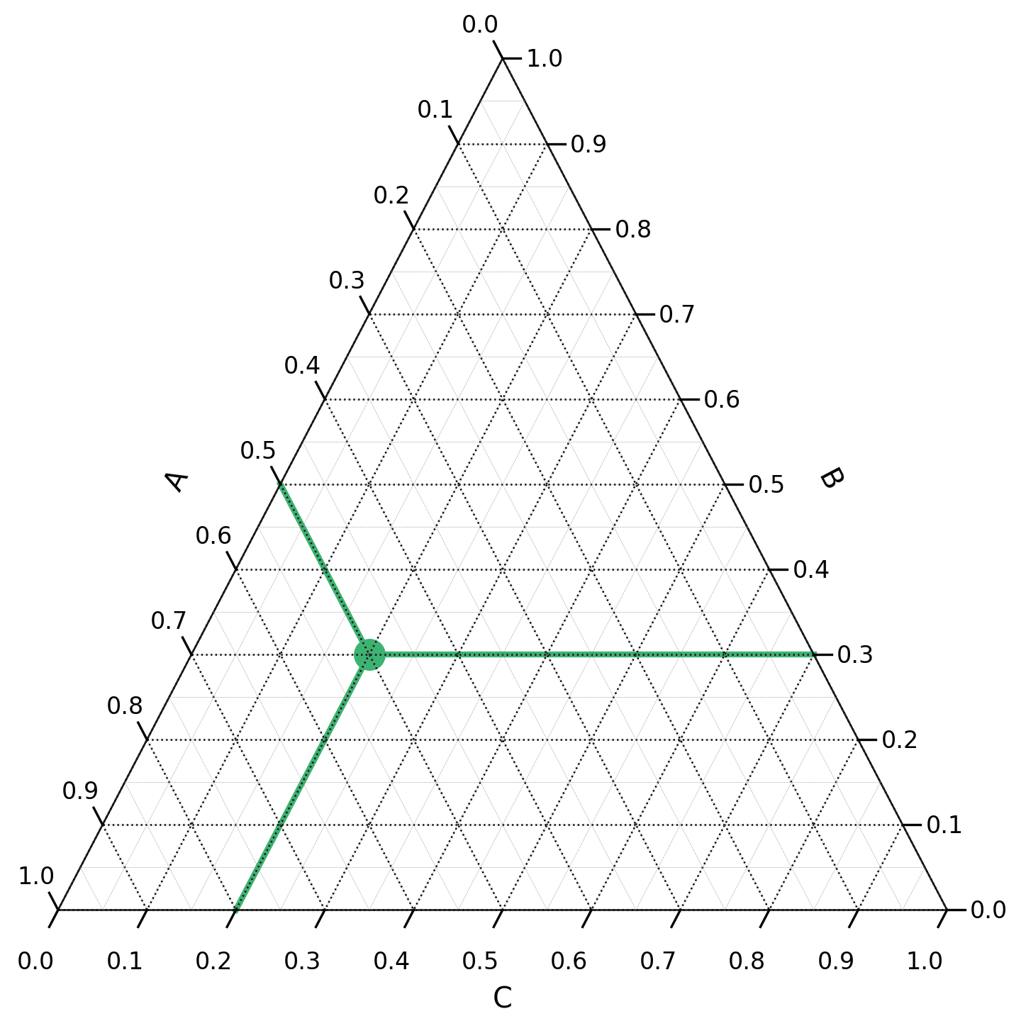
A ternary plot is the graphical representation of triplets of numerical data. It is suitable for representing a constant sum, which is broken down into three summands. The following figure shows an example of such a plot with a single point. The triplet corresponding to this point can be read by following the green lines: A=0.5, B=0.3 and C=0.2. The sum of the three values is equal to 1.
The following ternary plots show the change in mode shares over the course of the COVID-19 crisis, for different types of public transport subscriptions (GA, Halbtax and other). The modes are grouped into the following categories:
- Motorized individual transport (car, motorbike, taxi, Uber)
- Public transport (bus, tram, ferry, metro, train)
- Unmotorized transport (walk, bike)
During the lockdown, a higher share of kilometers and trips were performed using motorized individual and unmotorized modes as compared to the reference period. After the lockdown, the share of public transport has increased and the share unmotorized modes has decreased, both slightly. The share of motorized individual modes it still greater than during the reference period.
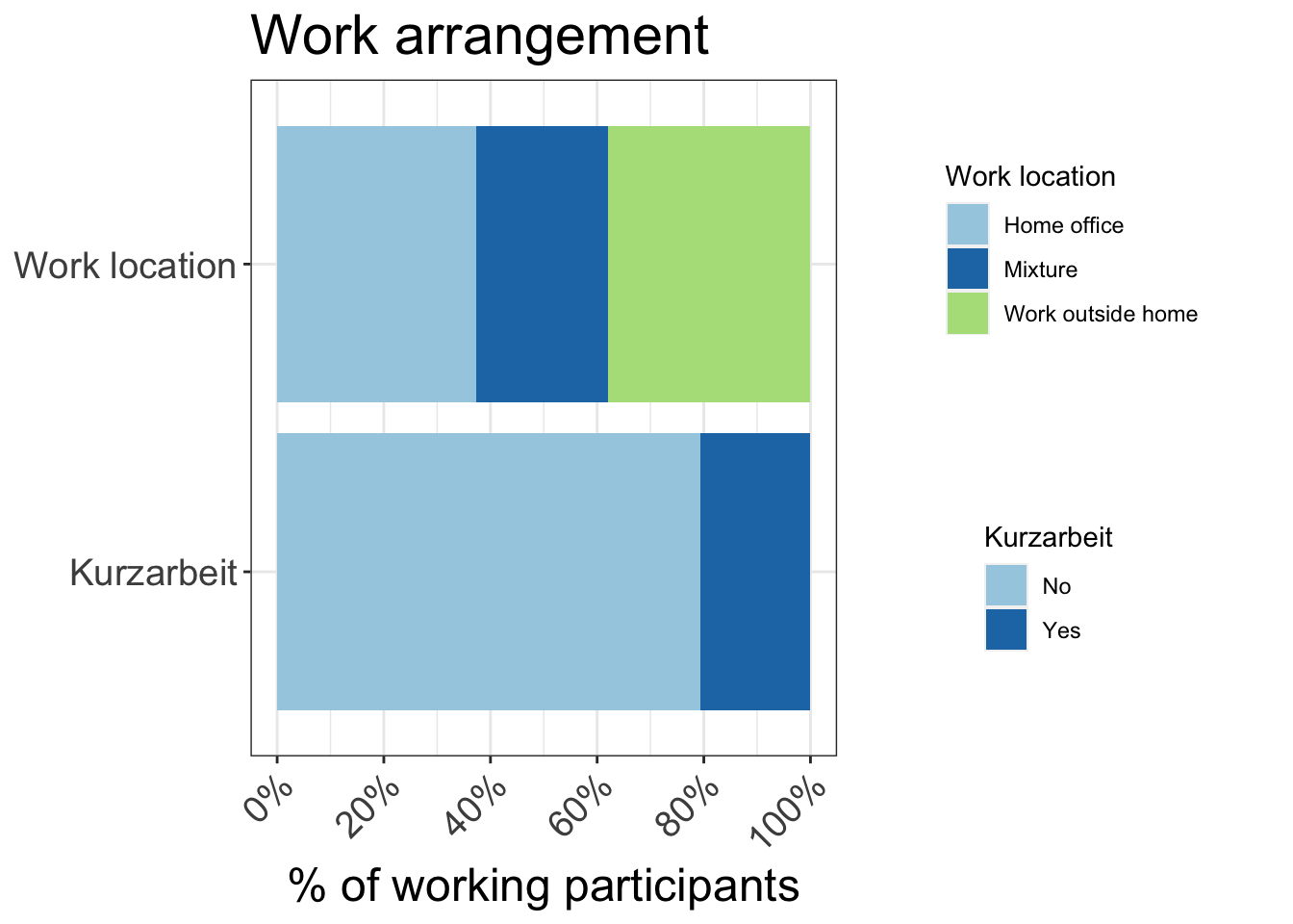
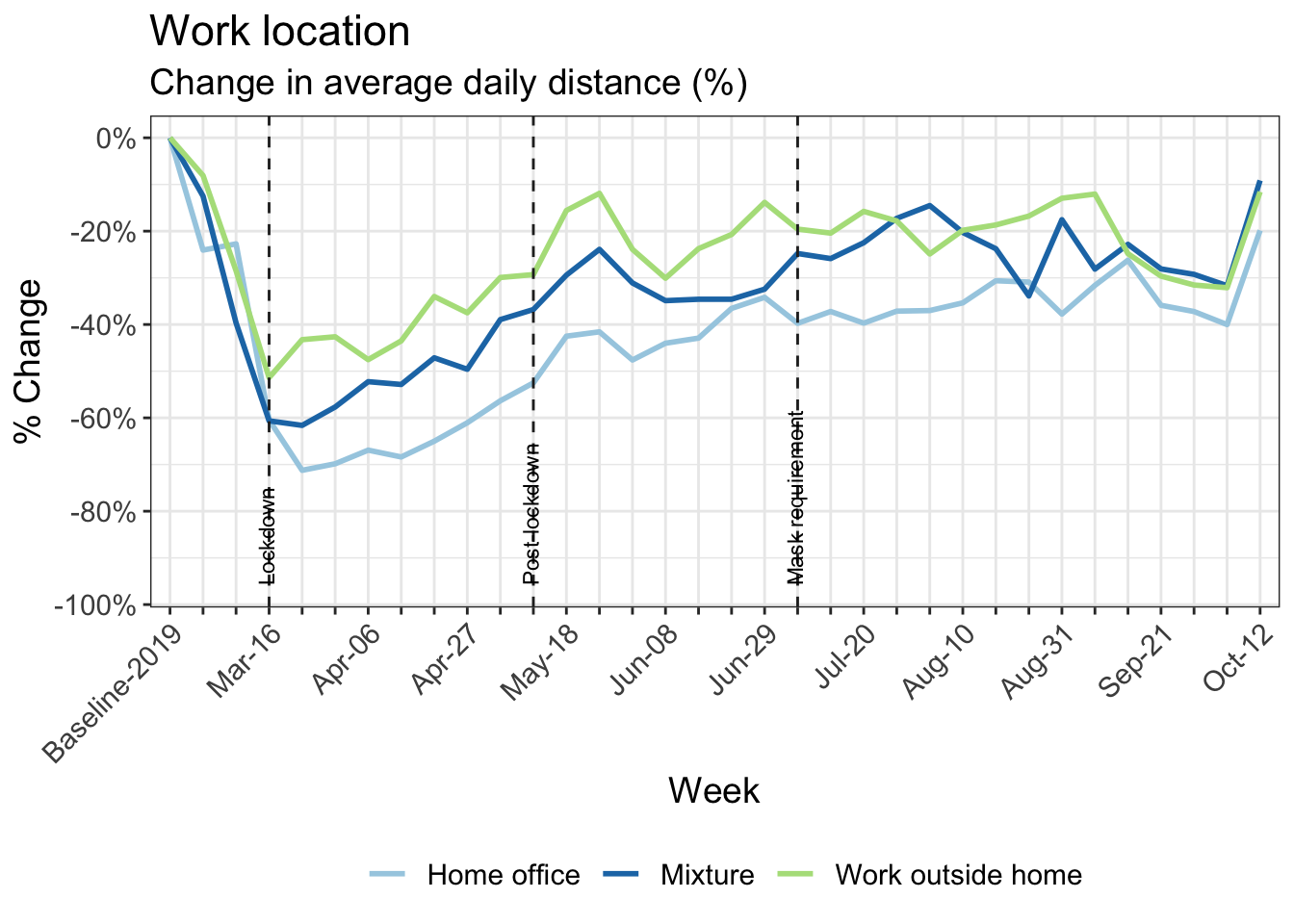
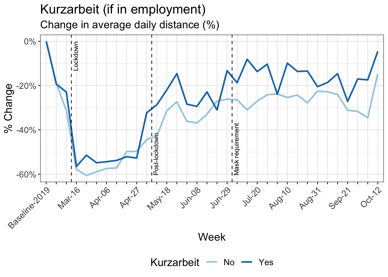
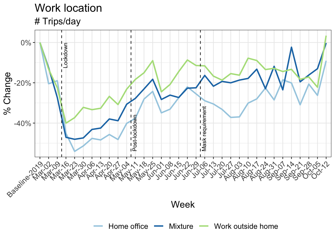
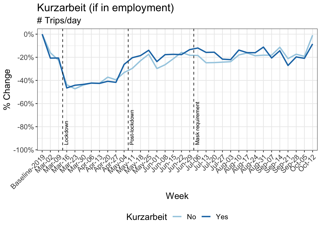
11 Reduction in kilometers travelled by working arrangement
Participants in MOBIS-Covid19 were asked to report their working status on 24/4/2020. The following charts use these results, with the working status imputed using sociodemographic indicators for those who didn’t respond. Specifically, we asked for the number of days working both at home and out of home, and these were then grouped into the categories used below:
- Working only at home
- Only working out of home
- A mix of home office and normal conditions
Download chart data (Work location)
Download chart data (Kurzarbeit)
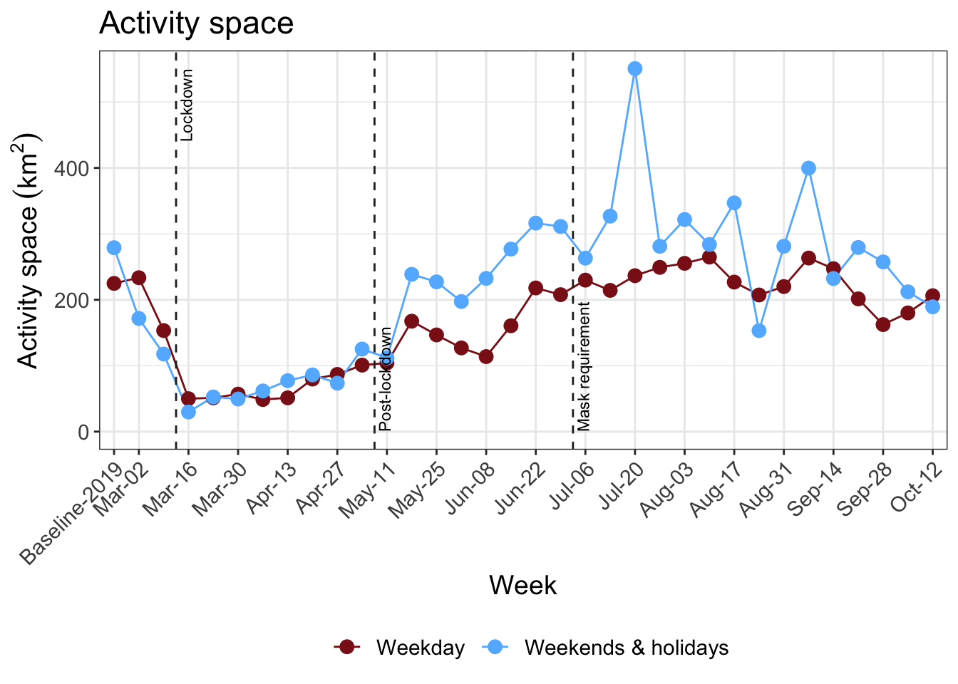
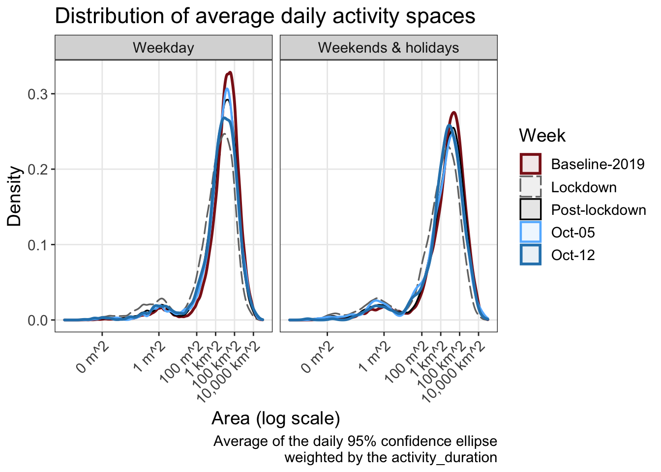
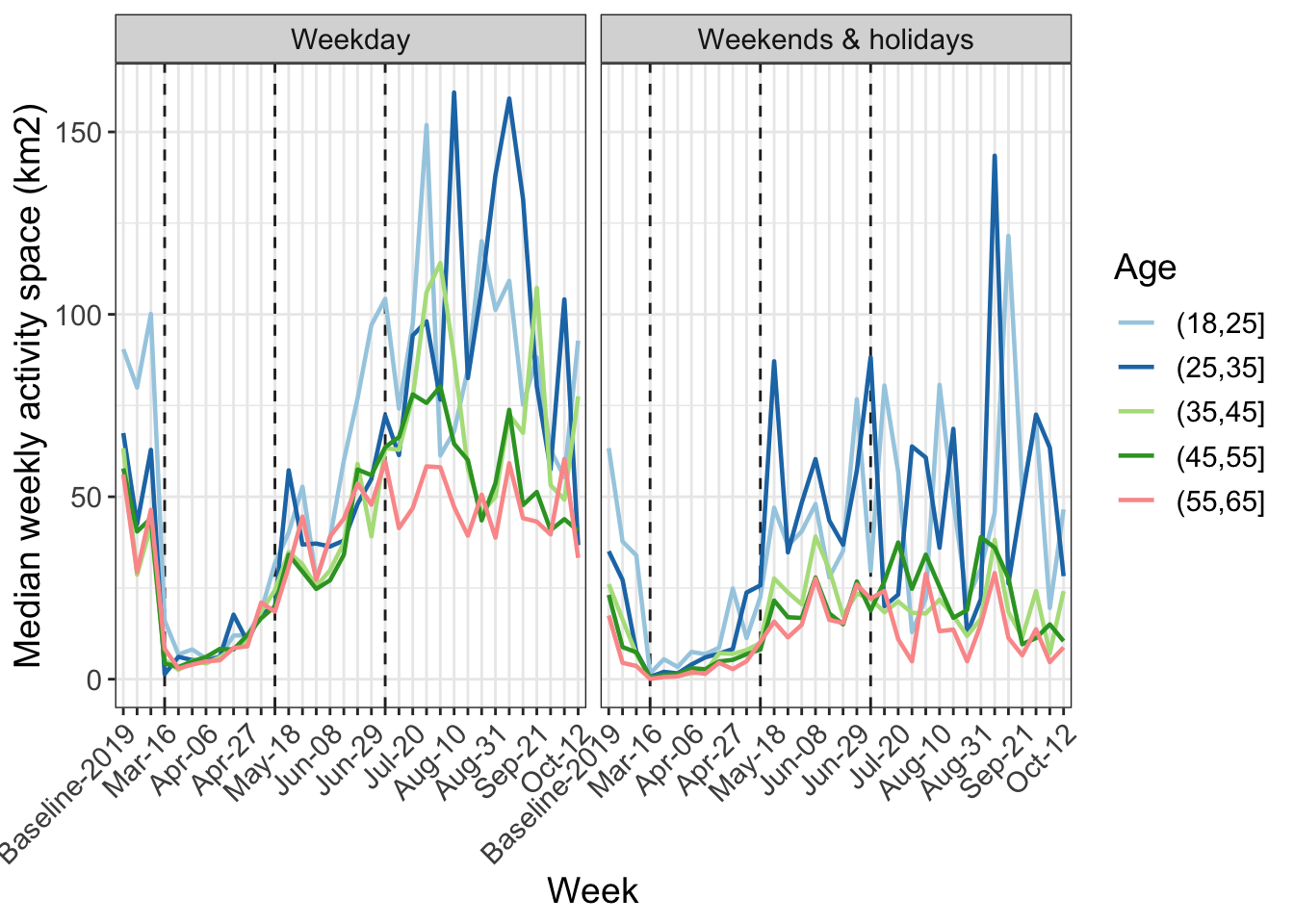
15 Activity space and daily travel radius
A commonly used definition of the activity space is the 95% confidence ellipse of the activity locations, in this case weighted by duration. In the following analysis, the activities at the home location are included, for those that had the app activated on that day. This is an important metric which gives an idea of the area in which travel is being performed. The daily travel radius is also presented.
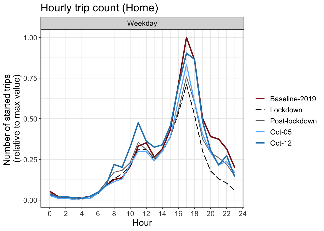
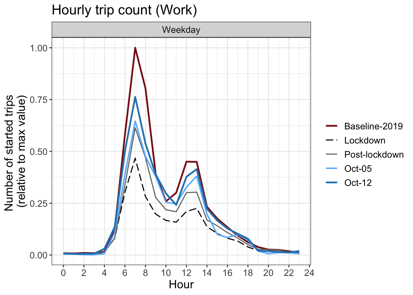
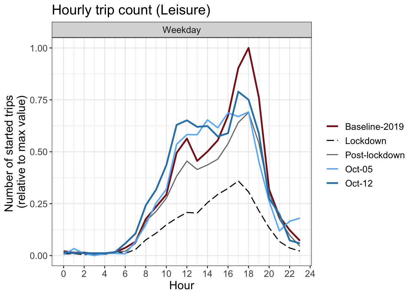
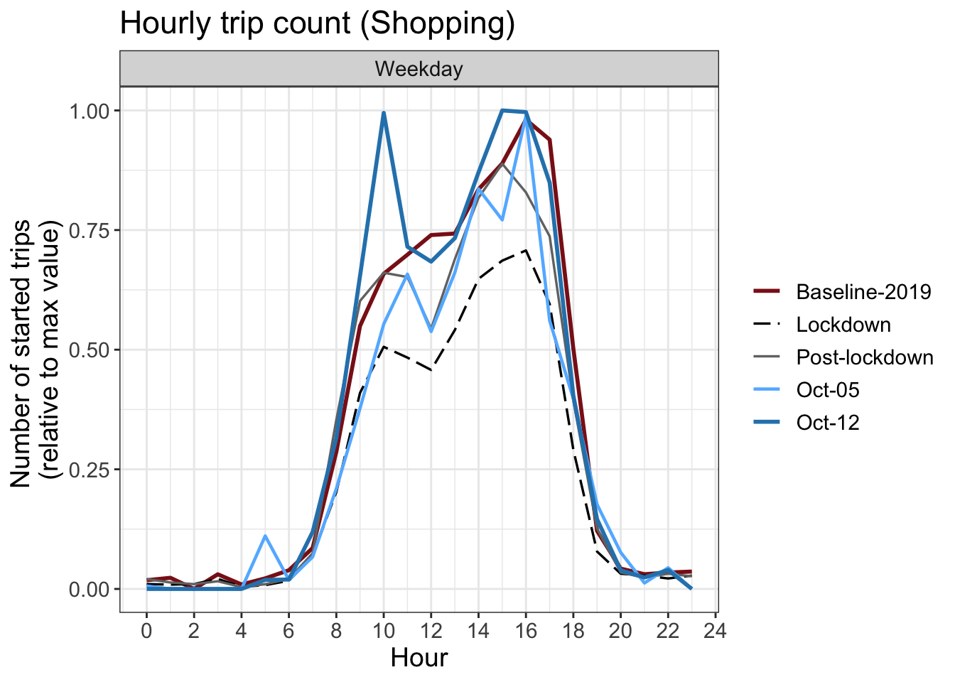
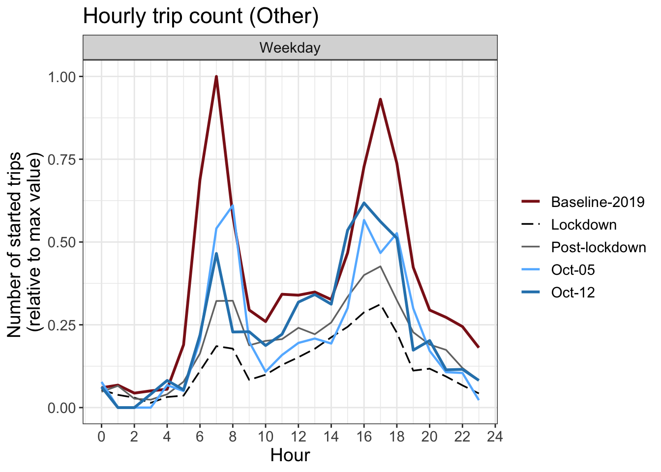
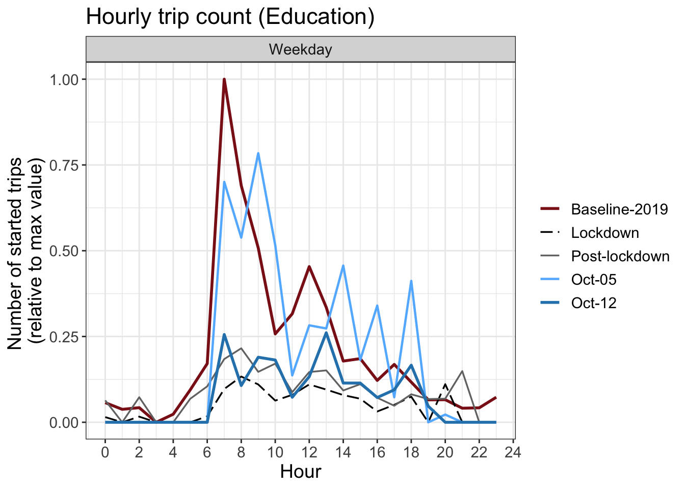
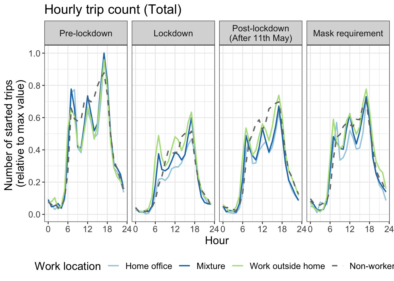
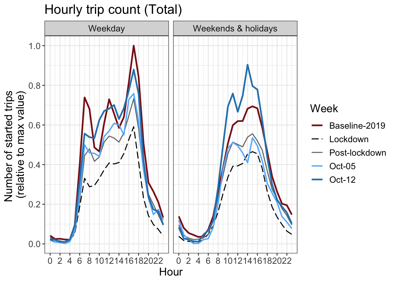
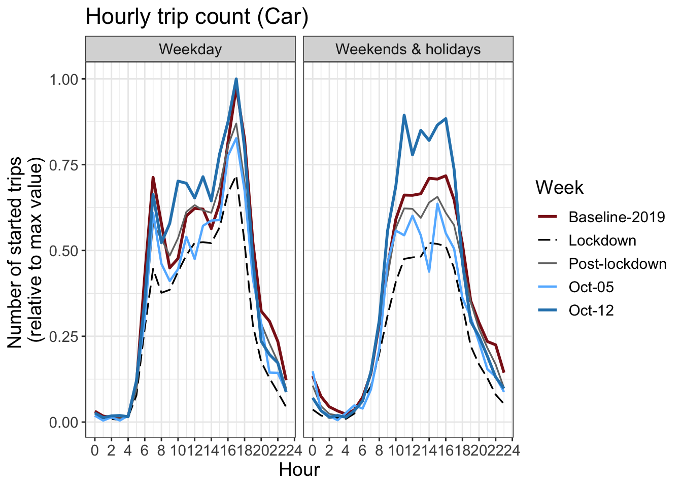
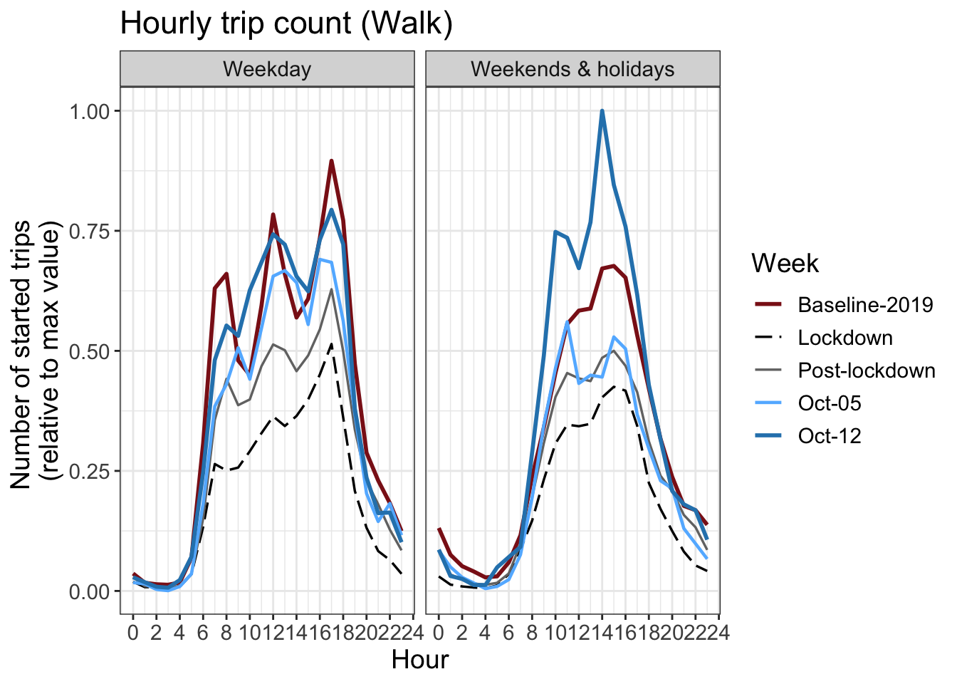
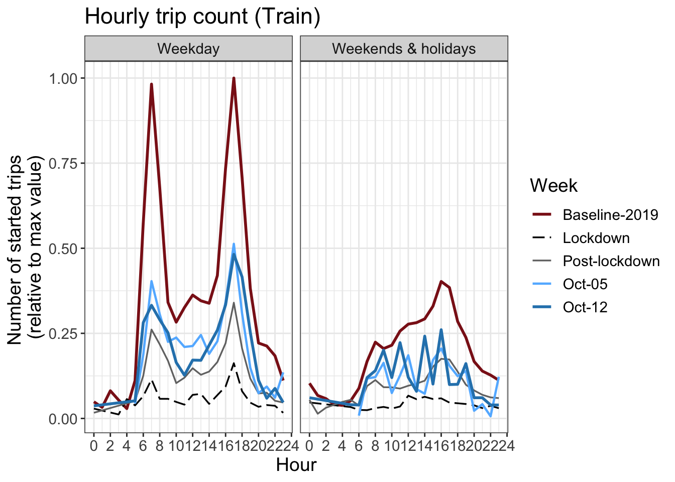
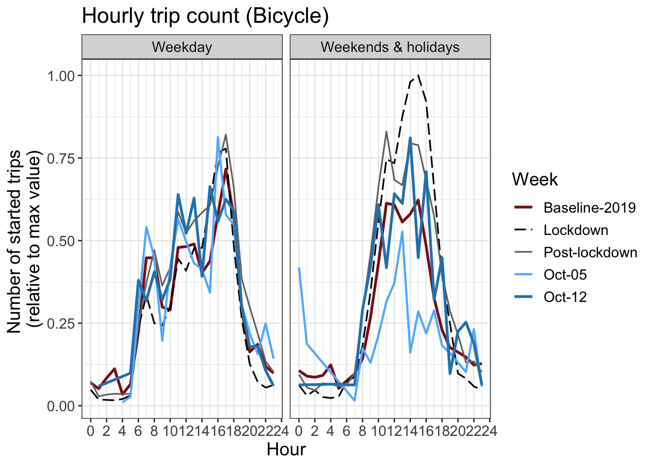
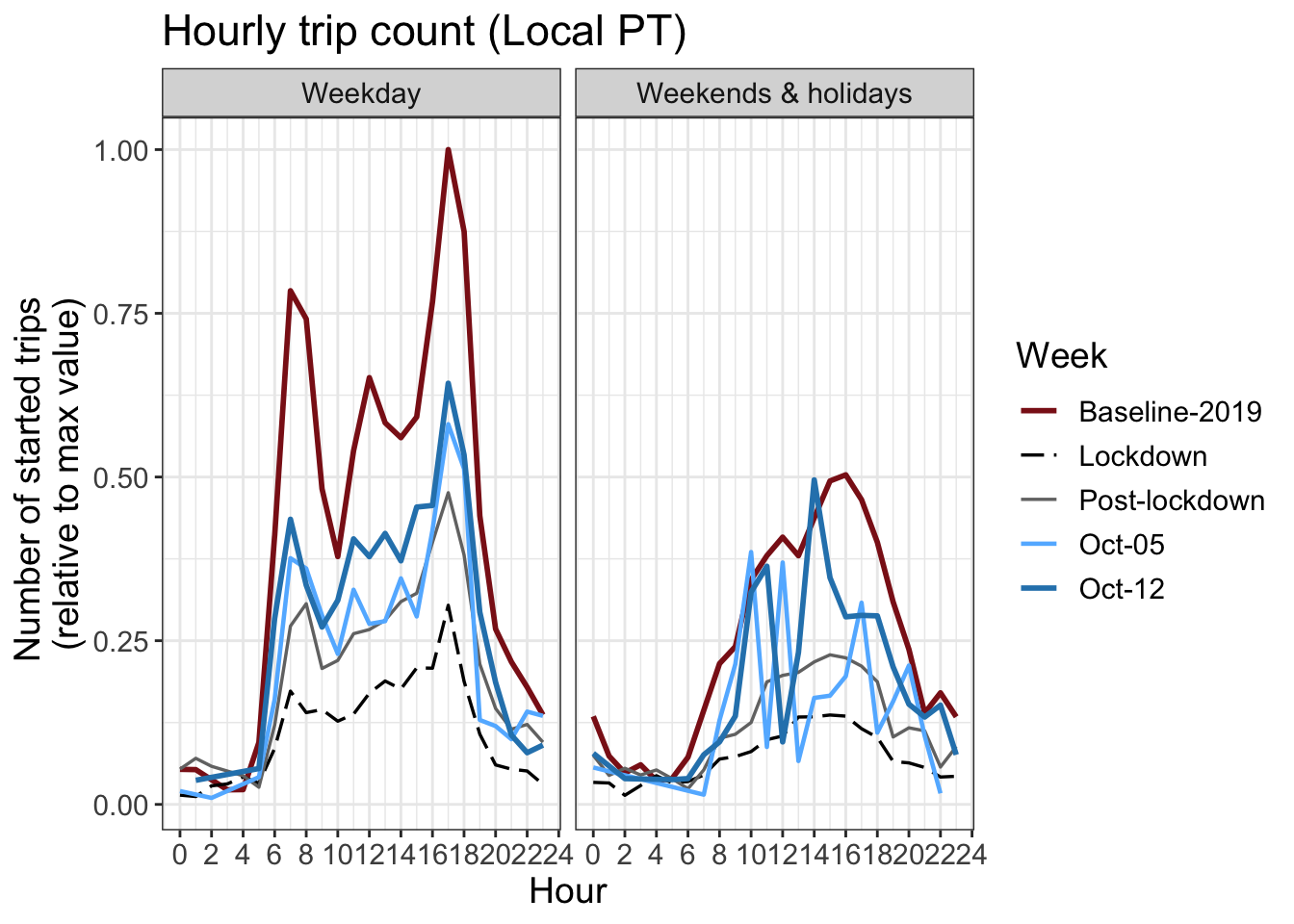
16 Hourly counts
The number of trips started per hour. The y axis is normalized by the maximum hourly value in the graph.
Download chart data (by transport mode)
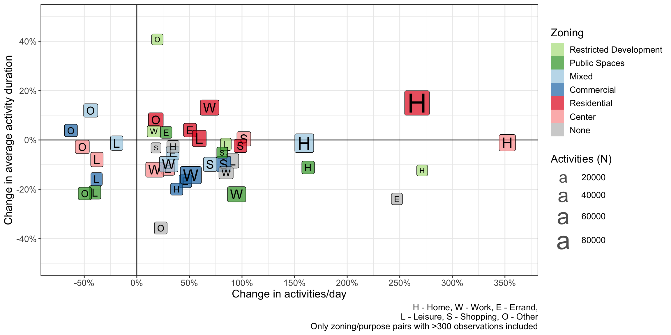
17 Activity types and zoning
Around 30% of activities were voluntarily labelled with their purpose by participants using the app. Work is ongoing to impute the purposes for the rest of the activities. Using simplification of the ARE development zoning classification, the activities are assigned with the closest zone classification within a 100m radius. The following graph shows how both the activity duration and the number of activites has changed from the baseline period in 2019 to the COVID-19 period.
Please note that only stationary leisure activites are included, not walking/cycling/hiking/etc
18 Participation
19 Risk perception
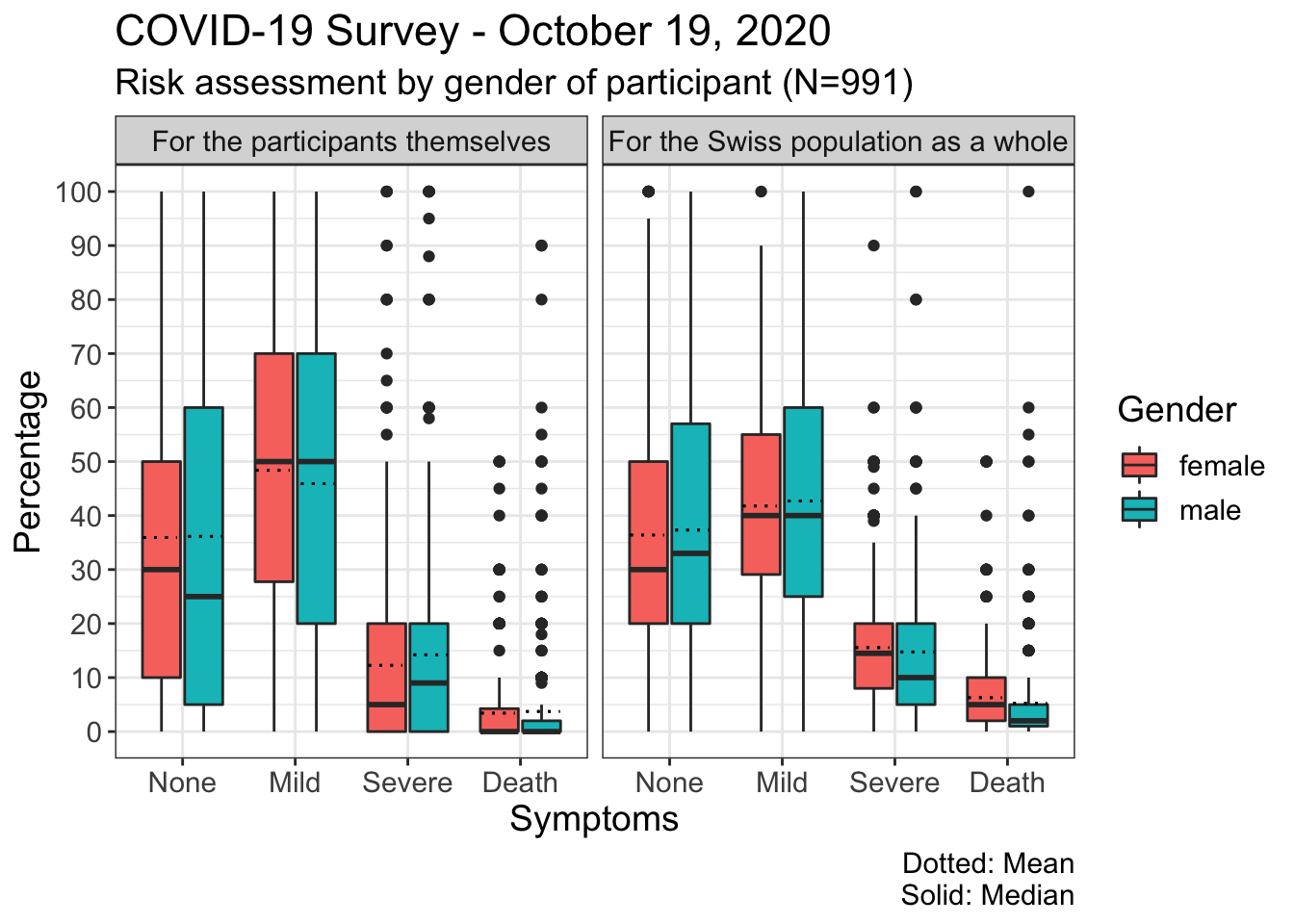
A first analysis from the survey on risk perception in the case of a COVID-19 infection shows that participants evaluate the risks of various outcomes differently for themselves and the Swiss population. The possibility that the participant experiences severe symptoms that require hospitalisation or fatal symptoms is considered somewhat lower by the participants for themselves than for the Swiss population. Both men and women appear to overestimate the probability of death by expecting the “asymptomatic” course to be less likely. While the median values for the various symptom categories do not differ greatly between men and women, the range of values for men is somewhat wider than for women
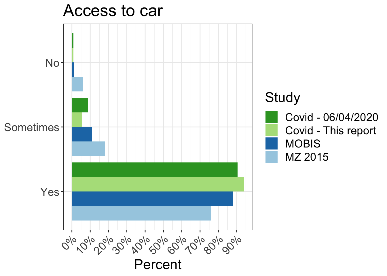
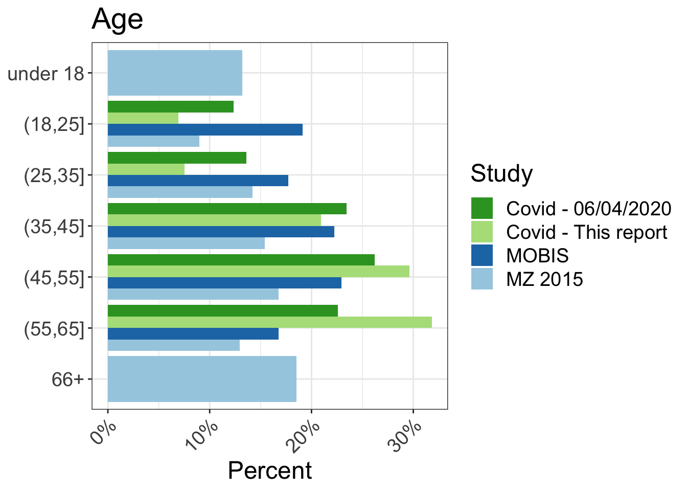
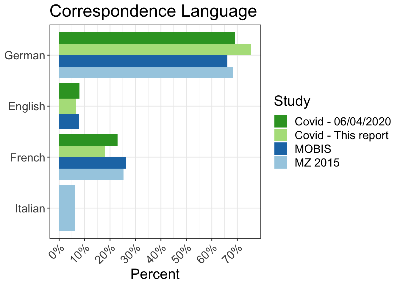
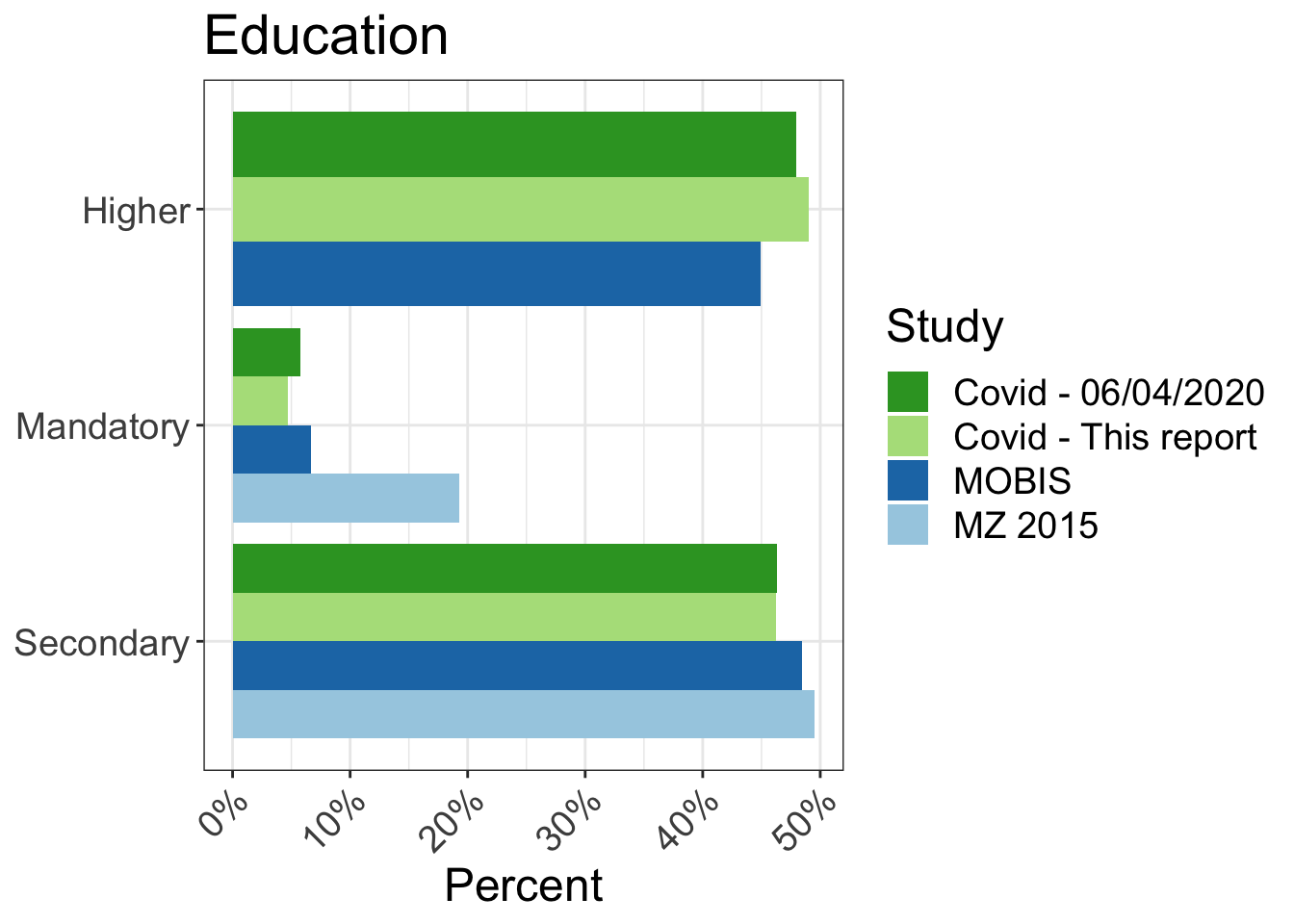
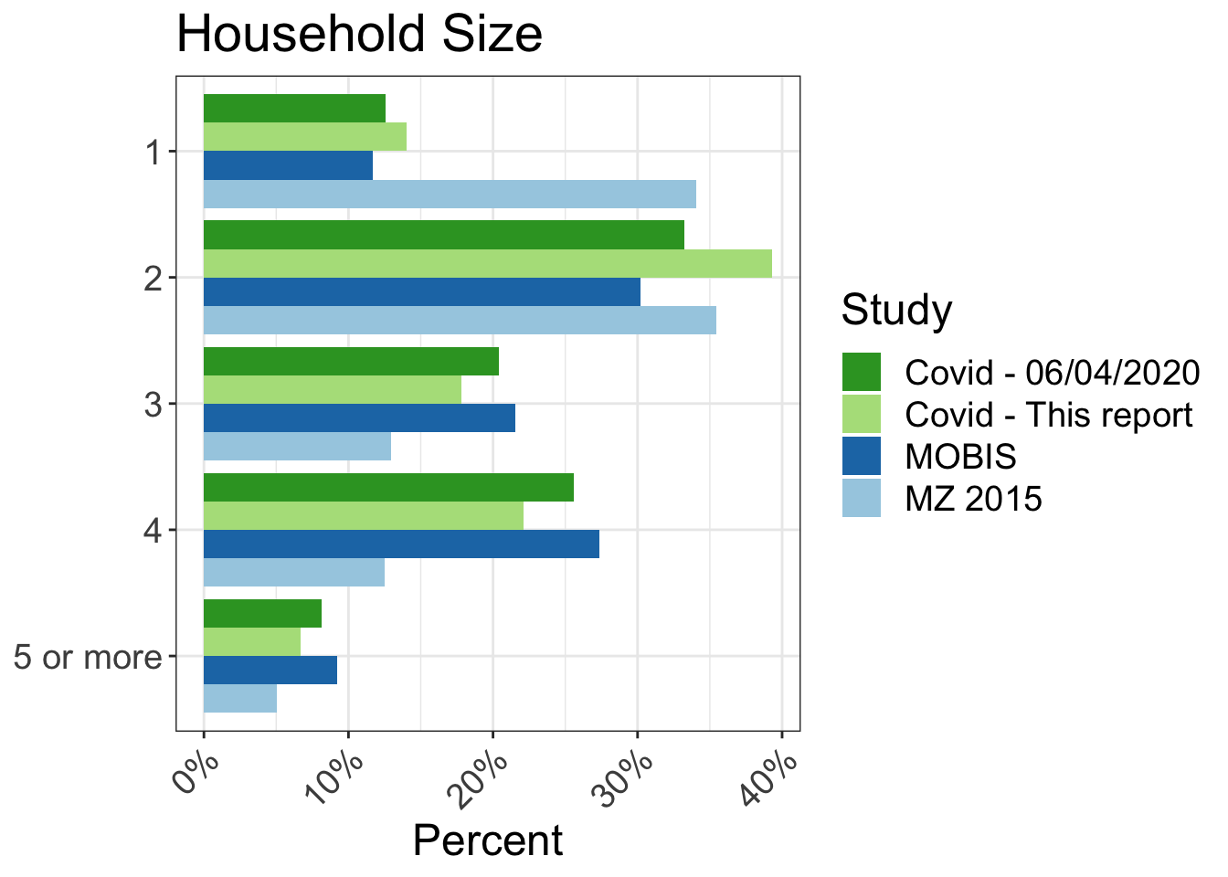
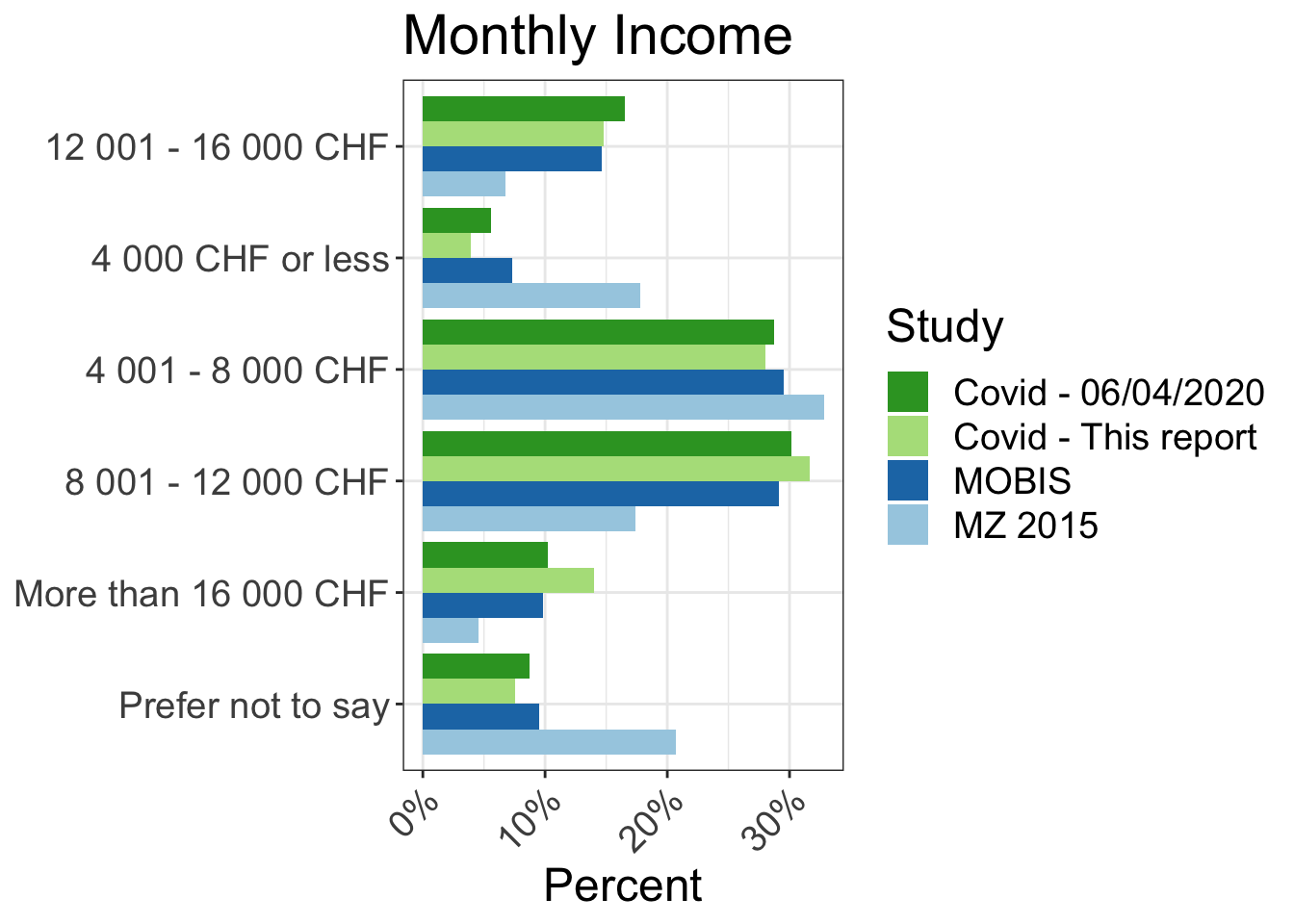
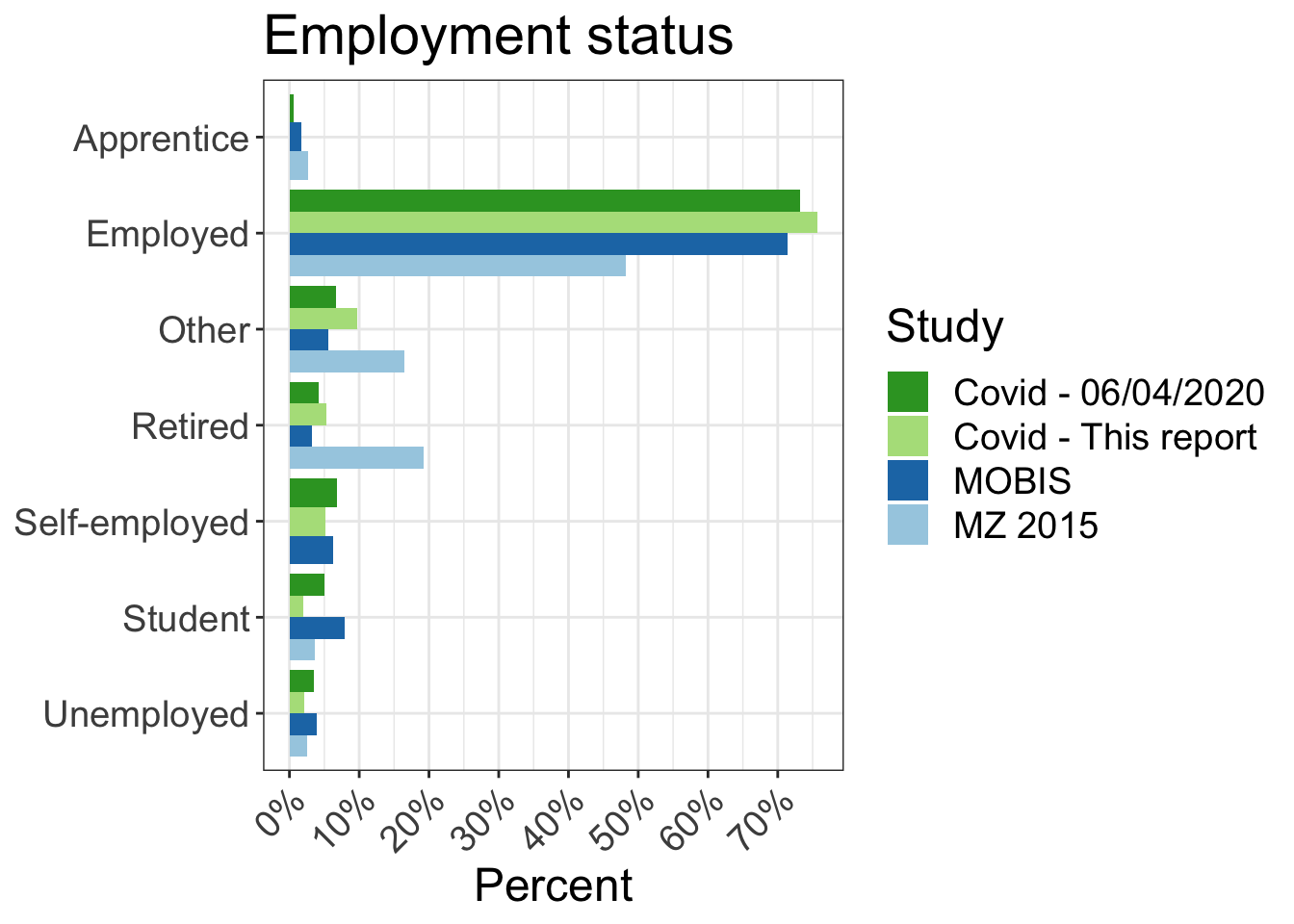
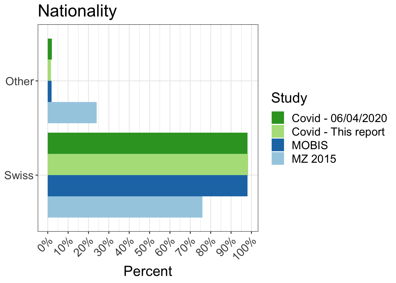
20 Differences in the distributions
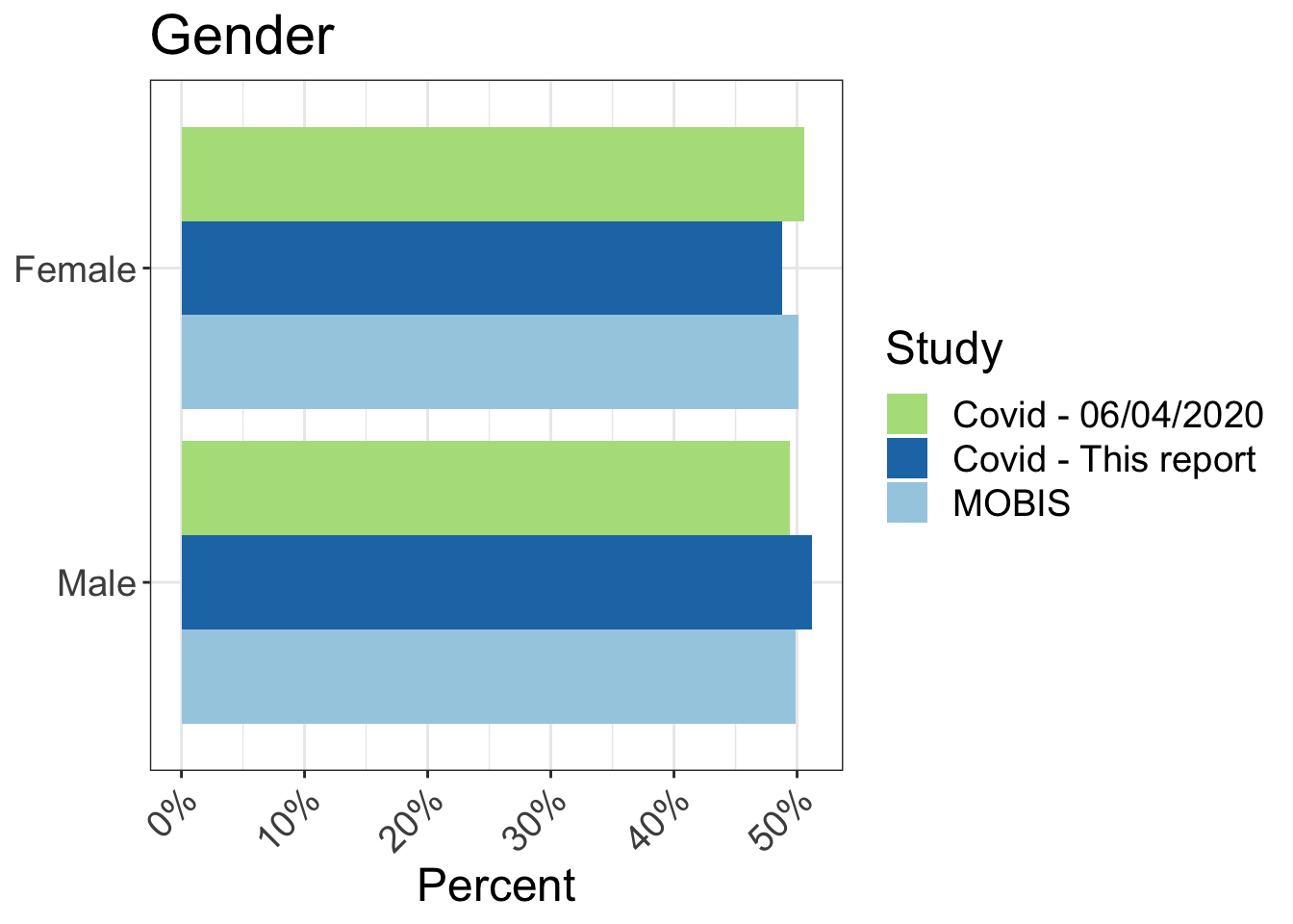
The following charts show the characteristics of the MOBIS:COVID-19 sample compared to the original MOBIS Sample. There are some small differences, but generally the samples are consistent. This chart will be extended to compare to the relevant census data.
| N | % | N | % | N | % | |
|---|---|---|---|---|---|---|
| Aargau | 85 | 5.1 | 33 | 6.5 | 4,325 | 7.6 |
| Basel-Landschaft | 189 | 11.4 | 58 | 11.5 | 1,940 | 3.4 |
| Basel-Stadt | 40 | 2.4 | 17 | 3.4 | 1,555 | 2.7 |
| Bern | 192 | 11.6 | 59 | 11.7 | 7,244 | 12.7 |
| Fribourg | 8 | 0.5 |
|
|
1,942 | 3.4 |
| Geneva | 128 | 7.7 | 31 | 6.1 | 3,062 | 5.4 |
| Schwyz | 17 | 1.0 | 8 | 1.6 | 1,005 | 1.8 |
| Solothurn | 19 | 1.1 | 7 | 1.4 | 1,813 | 3.2 |
| Vaud | 297 | 17.9 | 67 | 13.2 | 5,303 | 9.3 |
| Zurich | 680 | 41.0 | 224 | 44.3 | 10,410 | 18.2 |
| Other | 4 | 0.2 | 2 | 0.4 | 18,491 | 32.4 |
21 Sample weighting
In order to account for the fluctuating size and composition of the sample, participant weights have been calculated and applied for each week of MOBIS-Covid Study (including the weeks in the baseline period). Hence, the results are corrected for weeks where more participants from a certain demographic group started or stopped tracking. The weighting was performed against the original 21,571 participants who completed the introductory questionnaire in the MOBIS Study using IPF (Iterative Proportional Fitting) using the following variables: age, gender, income, education, mobility tool ownership and accessibility. The weighting of the data did not lead to large changes in the results.
22 Updated conlcusions
Since commencing in this spring, the MOBIS:COVID-19 tracking study has recorded 628,652 person-trips as of 2020-10-19. It includes two small surveys about the work situation and the health of the participants. A maximum of 1,432 persons participated and an average of 883. We use the Catch-my-Day smartphone app, which is based on MotionTag technology. The sample is roughly comparable in socio-demographics to the latest federal 2015 Mikrozensus, but for a bias towards higher income season-ticket owning better educated males. The denser parts of the German and French speaking parts of the country are also overrepresented in our sample. The conclusions are based on weighted results which ensure that the sample matches the representative sample of around 20,000 invited persons in the original MOBIS study. The weights were calculated based on age, sex, education, income, mobility tool ownership and the accessibility level of a person’s home location.
Our study is not the only source for Switzerland which traced the impact of the pandemic and of the measures implemented to contain it. The Intervista panel has been funded by different federal offices during these months. The available Google data has the advantage of being available worldwide, but only for high-level geographies and without any socio-demographics. We can draw on a more detailed self-description of the participants using their socio-demographics and their attitudes.
The central observations focus on the ongoing acceptance of “Working from Home (WFH)” or in German “Home-office” and the modal shift in the recovery of the trip volumes and in the miles driven. Equally important is the comparatively much lower social selectivity of the impacts in Switzerland.
The share of active, i.e. mobile, days shows the anticipation of the lockdown and then the recovery and stabilization to about 80% in August. This is substantially below the 90+% share, which one can expect (Madre et al., 2007). This lower share must be a mixture of WFH, persons furloughed or newly unemployed. We don’t yet know how firms will handle WFH in the coming weeks. There have been prominent announcements of firms not calling staff back to the office, e.g. Facebook, twitter, PSA, but equally prominent ones calling their employees back, e.g, Stadler. If mobilized, this suppressed demand would meet a road system where the average speeds are already at pre pandemic levels – conditions which could lead to increased congestion.
The population has shifted away from space-efficient large vehicles, as busses, trams and trains remain unpopular. Usage is down between 40% to 60% of the 2019 ridership after a near complete avoidance in the first weeks after the lockdown. On average, car travel has fully recovered. Equally, walking has fully recovered. It is worth noting that demand never dropped in the same way as for the other modes. The surprise was, and still is the increased bicycle usage backed up by a boom in cycle acquisition. While the increase seemed initially to be mostly a fitness, leisure boom, the recent imputation of the trip purposes has shown that the cycle gained for all purposes with leisure and shopping the most prominent ones. Commuting to work by bike also increased, but not as strongly (about 40% versus 60-80% for the other purposes). It is interesting to see how the increasing competition for road space since the end of the lockdown has dampened cycling. The new freedom in time allocation is visible in the cycling for leisure during the day.
Finally, the experience of the COVID19 period confirms the results of earlier telecommuting experiments (Pendyala et al., 1991). They had shown that the total mileage is not reduced, as the persons used the liberated time for other travel. Here, the Kurzarbeiter (furloughed) track the trends and actually travel a bit more than the other workers. Those working from home do travel less than those who have to go to their workplaces, but the difference is not nearly as large as one would expect.
References:
Madre, J.-L., K.W. Axhausen and W. Brög (2007) Immobility in travel diary surveys, Transportation, 34 (1) 107-128.
Pendyala, R.M., Goulias, K.G. and R. Kitamura (1991) Impact of telecommuting on spatial and temporal patterns of household travel, Transportation, 18 (4) 383-409.